Tailwind CSS Animation
Add CSS animations in Tailwind with animate-spin, animate-pulse, animate-bounce, and animate-ping. Covers custom keyframes and transition utilities.
Interactive Animation Playground
Try each class live and inspect the CSS output.
animate-pulseanimation: pulse 2s cubic-bezier(0.4, 0, 0.6, 1) infinite;Tailwind CSS provides a powerful and customizable set of utility classes for adding animations to your web pages. With Tailwind's animation classes, you can easily add eye-catching motion effects to elements, creating engaging and interactive user experiences.
How to use Tailwind CSS Animation
To apply animations in Tailwind CSS, you can use the animate-{name} utility class, where {name} represents the name of the animation. Tailwind CSS includes a variety of predefined animation classes that you can use out of the box.
1<div class="animate-pulse ...">This element will pulse with animation.</div>
This element will pulse with animation.
Predefined Tailwind Animation Classes
Tailwind CSS provides several predefined animation classes that you can use without any additional configuration. Some of the commonly used ones include:
-
animate-pulse: Causes the element to continuously fade in and out, creating a pulsating effect. -
animate-spin: Rotates the element 360 degrees in a clockwise direction. -
animate-bounce: Causes the element to bounce up and down. -
animate-none:This disables any animations. -
animate-ping: Creates a single pulse of scale + fade (used for pings/ripples).
Responsive Tailwind Animation
Tailwind CSS allows you to apply animations responsively at different breakpoints. To use responsive tailwind animation classes, you can append the breakpoint prefix to the animation class. For example, md:animate-pulse applies the pulse animation starting from the medium breakpoint and above.
1<div class="animate-pulse md:animate-none">2 This element will pulse by default, but the animation will be disabled3 starting from the medium breakpoint.4</div>
This element will pulse by default, but the animation will be disabled starting from the medium breakpoint.
In the above example, the animate-pulse class is applied by default, causing the element to pulse. However, starting from the medium breakpoint and above (md:animate-none), the animation is disabled.
Interaction State Use (hover/focus)
Yes, you can apply animations on hover, focus, or group-hover.
1<button class="hover:animate-bounce transition">Hover to bounce</button>
Or group-hover for parent-child behavior:
1<div class="group p-4">2 <span3 class="group-hover:animate-ping h-3 w-3 bg-red-500 rounded-full inline-block"4 ></span>5</div>
Arbitrary Value Usage
Tailwind does not support animate-[...] arbitrary values directly. But you can use [animation:...] if needed:
1<div class="animate-[wiggle_1s_ease-in-out_infinite]">2 Wiggle without config3</div>
Just be cautious with long CSS values inside class attributes — it gets hard to read quickly.
Customization in tailwind.config.js
You can add your own keyframes and animation names here.
1// tailwind.config.js2module.exports = {3 theme: {4 extend: {5 keyframes: {6 "fade-in": {7 "0%": { opacity: 0 },8 "100%": { opacity: 1 },9 },10 wiggle: {11 "0%, 100%": { transform: "rotate(-3deg)" },12 "50%": { transform: "rotate(3deg)" },13 },14 },15 animation: {16 "fade-in": "fade-in 1s ease-out",17 wiggle: "wiggle 0.5s ease-in-out infinite",18 },19 },20 },21};
Then use them like any other utility:
1<div class="animate-fade-in">This fades in</div>2<div class="animate-wiggle">This wiggles</div>
Combining Animations with Other Utilities
Tailwind's utility classes can be combined to create complex effects. For instance, you can pair animations with transitions, transforms, and opacity changes.
Example:
1<div2 class="animate-bounce transform hover:scale-110 transition duration-500 bg-purple-500 text-white p-4 rounded"3>4 Interactive Element5</div>
Interactive Element
Here, the element bounces continuously, scales up on hover, and transitions smoothly over 500 milliseconds.
Real UI Component Examples
Notification Bell (Hover Wiggle)
1<button class="relative">2 <svg3 class="w-6 h-6 hover:animate-wiggle"4 fill="none"5 stroke="currentColor"6 viewBox="0 0 24 24"7 >8 <path9 stroke-linecap="round"10 stroke-linejoin="round"11 stroke-width="2"12 d="M15 17h5l-1.405-1.405A2.032 2.032 0 0118 14.158V11a6.002 6.002 0 00-4-5.659V5a2 2 0 10-4 0v.341C7.67 6.165 6 8.388 6 11v3.159c0 .538-.214 1.055-.595 1.436L4 17h5m6 0v1a3 3 0 11-6 0v-1m6 0H9"13 />14 </svg>15</button>
Toast Notification (Fade in)
1<div2 class="fixed top-4 right-4 bg-green-100 text-green-800 px-4 py-2 rounded animate-fade-in"3>4 ✅ Your changes were saved5</div>
✅ Your changes were saved
Practical Use Cases
Animations can enhance user interfaces in various ways:
Loading Indicators: Use animate-spin for spinners.
Attention Grabbers: Apply animate-bounce to call-to-action buttons.
Feedback Messages: Use animate-pulse to highlight success or error messages.
Remember to use animations sparingly to avoid overwhelming users.
Best Practices for Devs/Designers
-
Keep animations short. Stick to
<1sunless looping (e.g., spinners). -
Don’t overdo it. A single pulse or bounce draws attention. More than that becomes noise.
-
Combine with transition if you're animating hover states — so it feels smooth.
-
Group state animations let you animate icons inside buttons and cards on hover — use them.
-
Performance tip: Prefer transform and opacity in your animations for smoother GPU rendering.
Tailwind Animation Class Table
| Class | Properties |
|---|---|
| .animate-none | animation-none |
| .animate-spin | animation: spin 1s linear infinite; @keyframes spin { from { transform: rotate(0deg); } to { transform: rotate(360deg); } } |
| .animate-ping | animation: ping 1s cubic-bezier(0, 0, 0.2, 1) infinite; @keyframes ping { 75%,100% { transform: scale(2); opacity: 0; } } |
| .animate-pulse | animation: pulse 2s cubic-bezier (0.4, 0, 0.6, 1) infinite; @keyframes pulse { 0%,100% {opacity: 1; } } |
| .animate-bounce | animation: bounce 1s infinite; @keyframes bounce { 0%, 100% { transform: translateY(-25%); animation-timing-function: cubic-bezier(0.8, 0, 1, 1); } 50% { transform: none; animation-timing-function: cubic-bezier(0, 0, 0.2, 1); } } |
| animate-(<custom-property>) | animation: var(<custom-property>) |
| .animate-[<value>] | animation: [<value>] |
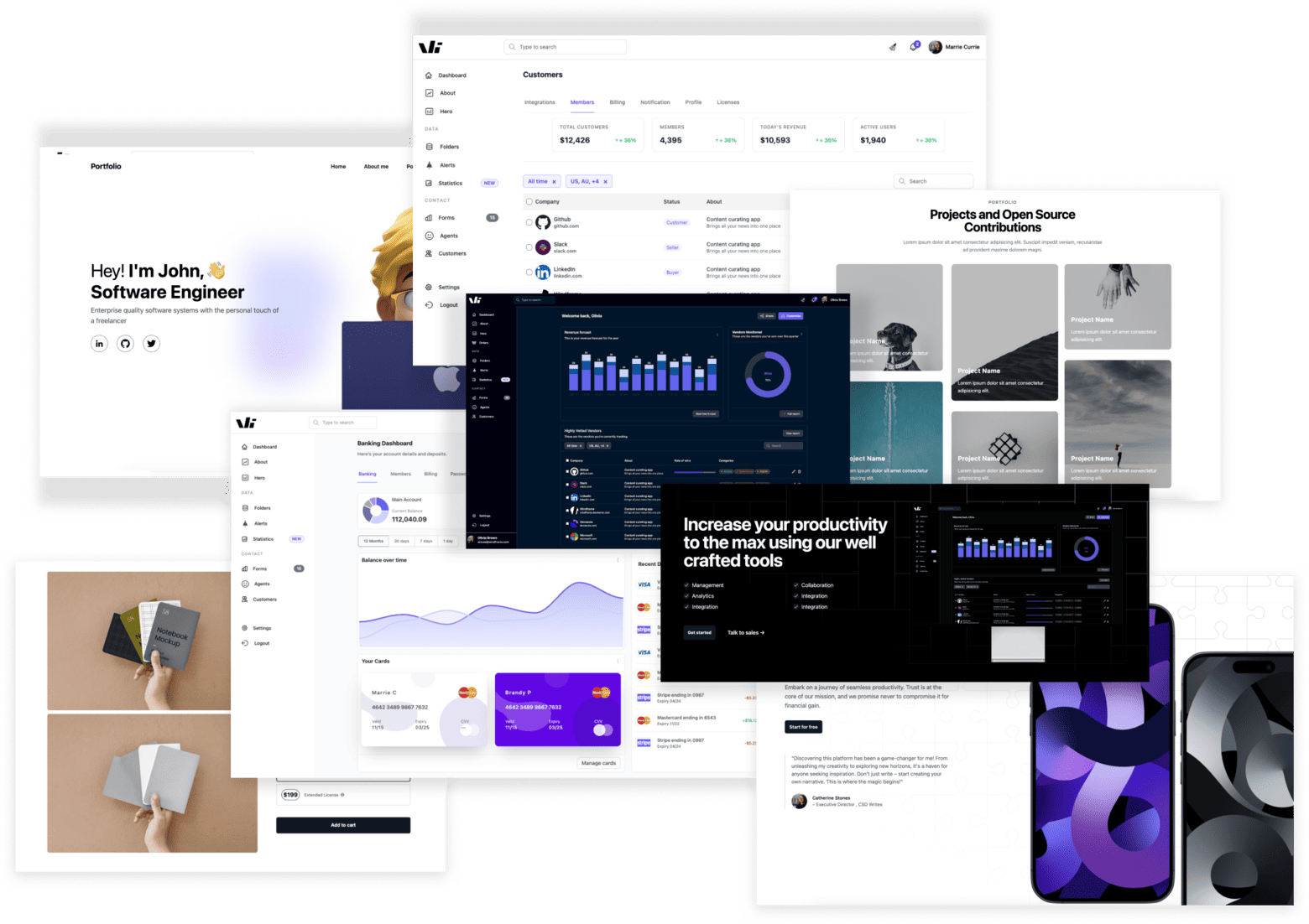
Windframe Tailwind blocks
Windframe is an AI visual editor for rapidly building stunning web UIs & websites
Start building stunning web UIs & websites!

