Notion style guide
A complete style guide inspired by the notion design language. Use it with Windframe AI to generate pages, sections, and components for your own project that follow these same design principles, or start from one of the templates below and customize it in the editor.
 HTML
HTML React
React Next.js
 Vue
Vue Nuxt
Nuxt AngularSvelte
 Astro
Astro SolidJS
 Rails
RailsDesign System
The Notion design language
Content-first workspace interfaces inspired by Notion. Bold Inter headings, centered or split editorial compositions, neutral card surfaces, clear borders, and generous section rhythm keep dense information readable and organized.
Typography
Inter
font-bold tracking-tight for display; font-medium to font-normal for UI and body
The quick brown fox
Design is not how it looks. Design is how it works.
Small body copy, clear and readable
Spacing
Generous editorial rhythm
Centered max-w-screen-lg content, compact navigation, 64-96px section spacing, and 16-32px card padding.
Border Radius
4-8px controls, 12-16px content cards
rounded-md to rounded-2xl
Colors
Design paletteCanvas
Root, navigation, and footer surfaces
Grouped Surface
Trust bars, grouped regions, and quiet sections
Card
Feature, quote, stat, and resource cards
Primary Text
Headings and primary actions
Muted Text
Body copy and supporting labels
Border
Dividers, cards, and inputs
More pronounced swatches for quick light/dark comparison.
Shadows
Use elevation selectively: shadow-sm for active tabs, shadow-lg for framed media, shadow-xl for mega menus, and stronger shadows only for showcase imagery.
Matching Assets
Notion-style UI generations can include matching avatars and supporting assets inside the interface, so the final result feels cohesive and polished.
Notion in practice
Polished designs inspired by the best design systems
Companies like Linear, Notion, and Vercel invest heavily in their design systems. Windframe studies those systems and bakes their principles into styles you can use out of the box, so your project gets the same level of polish. These are some example images of UIs generated with this style.
Every component, every page: consistent by design. Browse all Notion templates →
AI Playground
Build something new with the Notion style
Describe any UI and Windframe generates it using the same Notion design tokens shown above. Your output stays consistent with every template on this page.
Try an example:
Pre-built components and pages
Browse 17 production-ready templates built with Notion design principles. Preview any template, export the code to your framework, or open it in the visual editor to customize.


Workflow builder landing page
Full Page


Project Mgmt app landing page
Full Page


Project Management page
Admin Pages
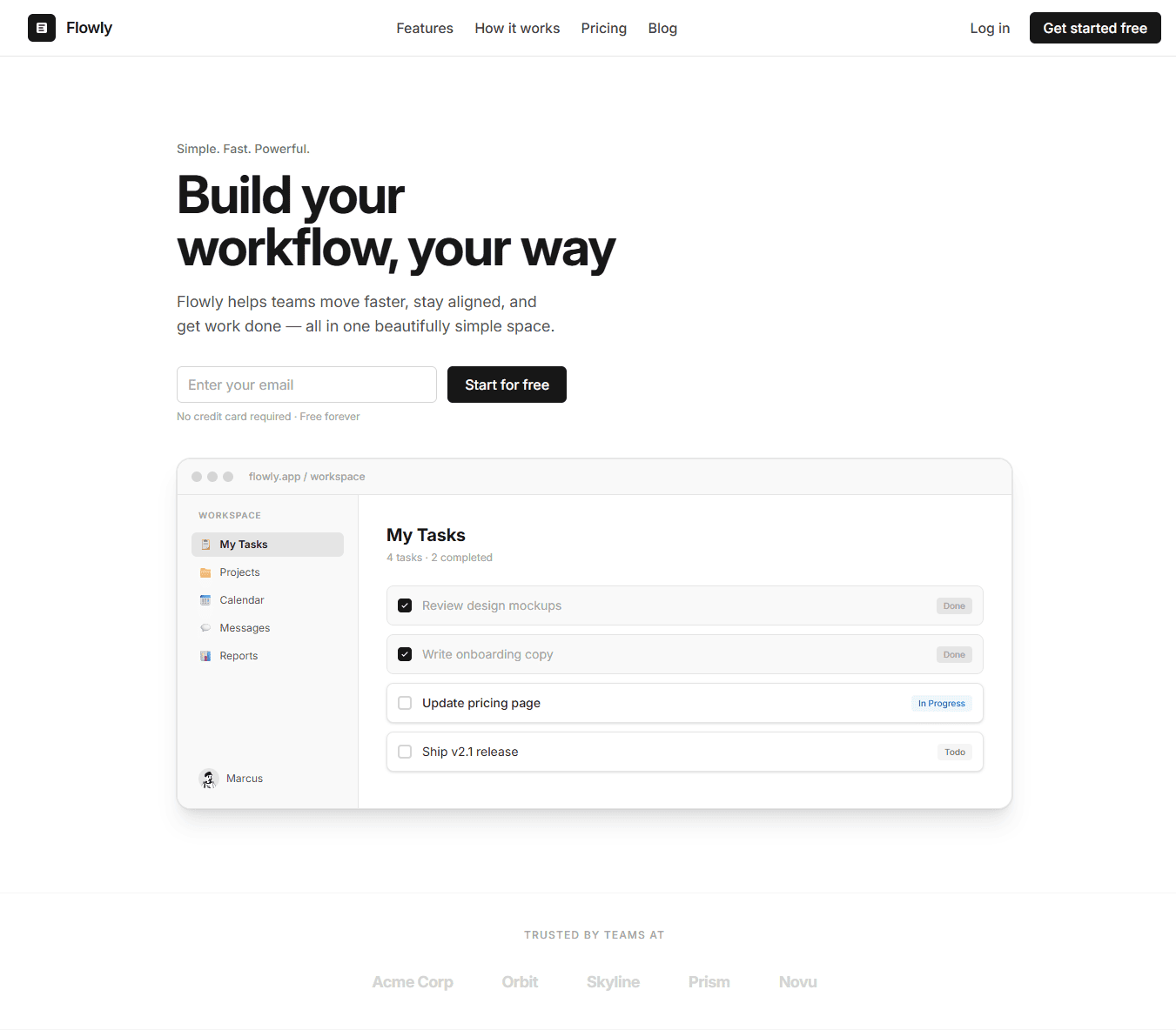
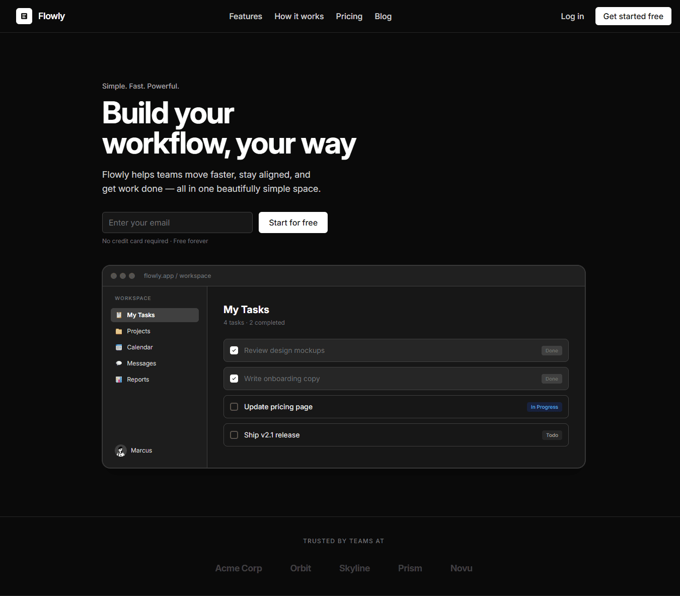
Hero Component
Hero
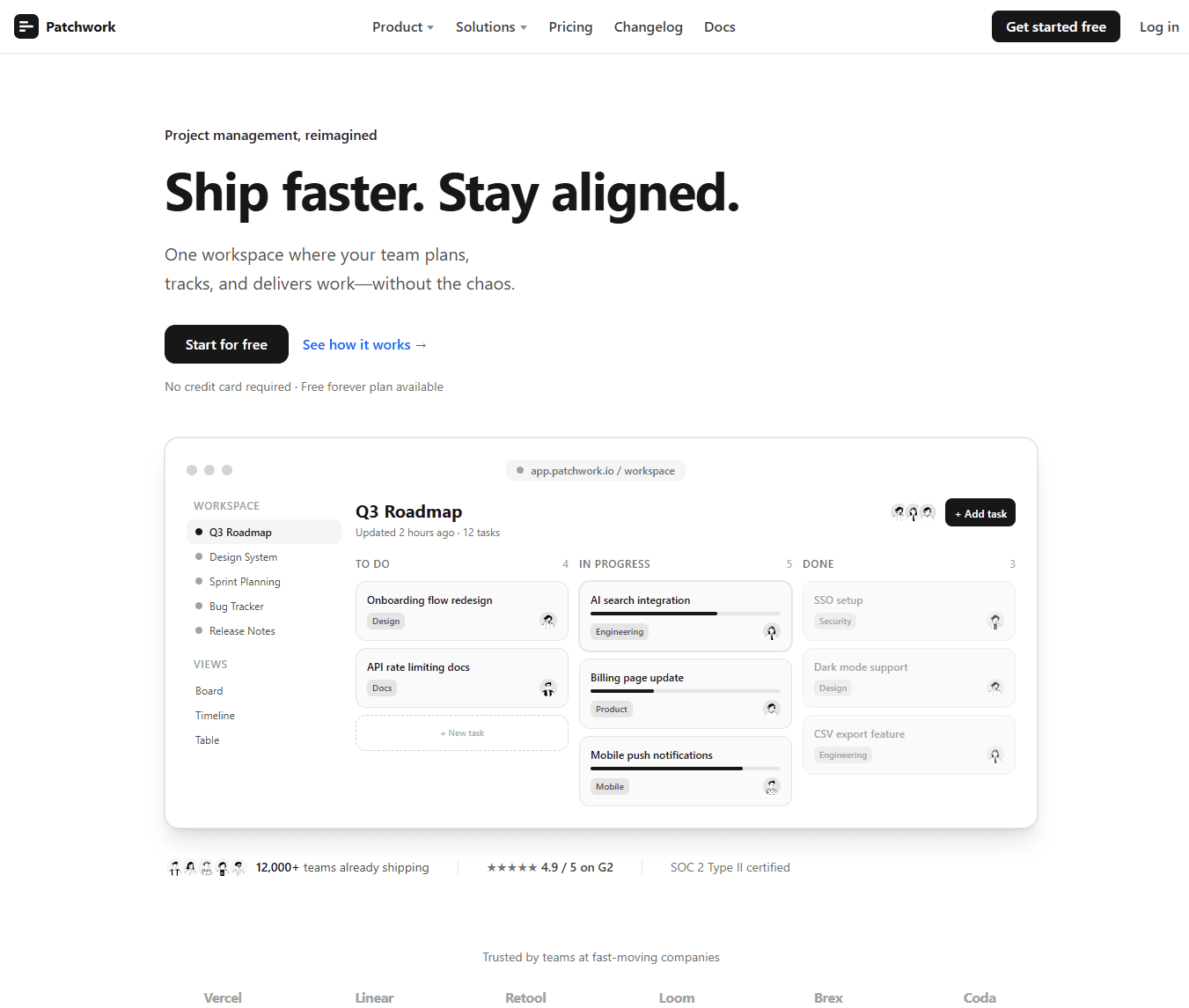
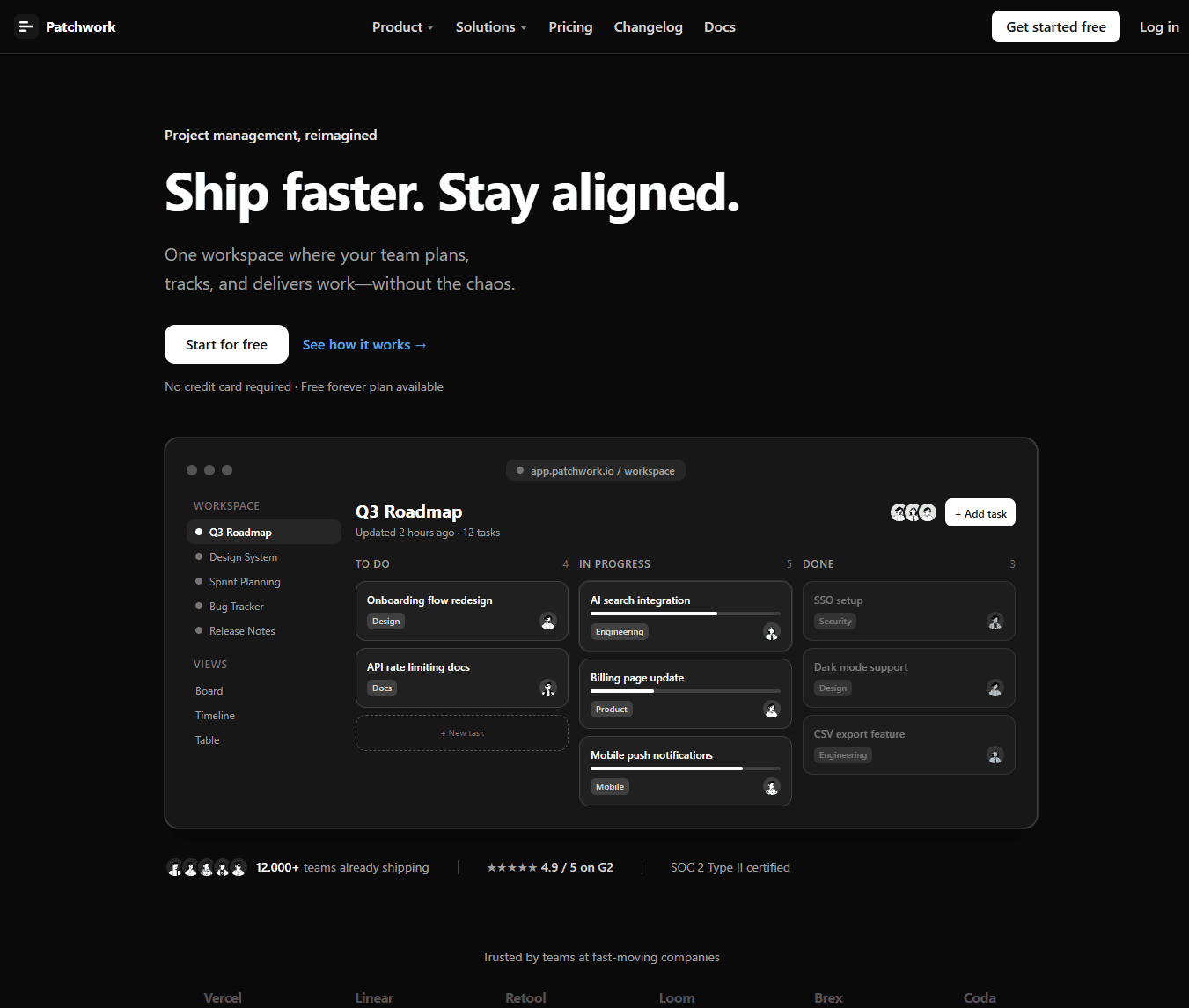
Hero Component 2
Hero
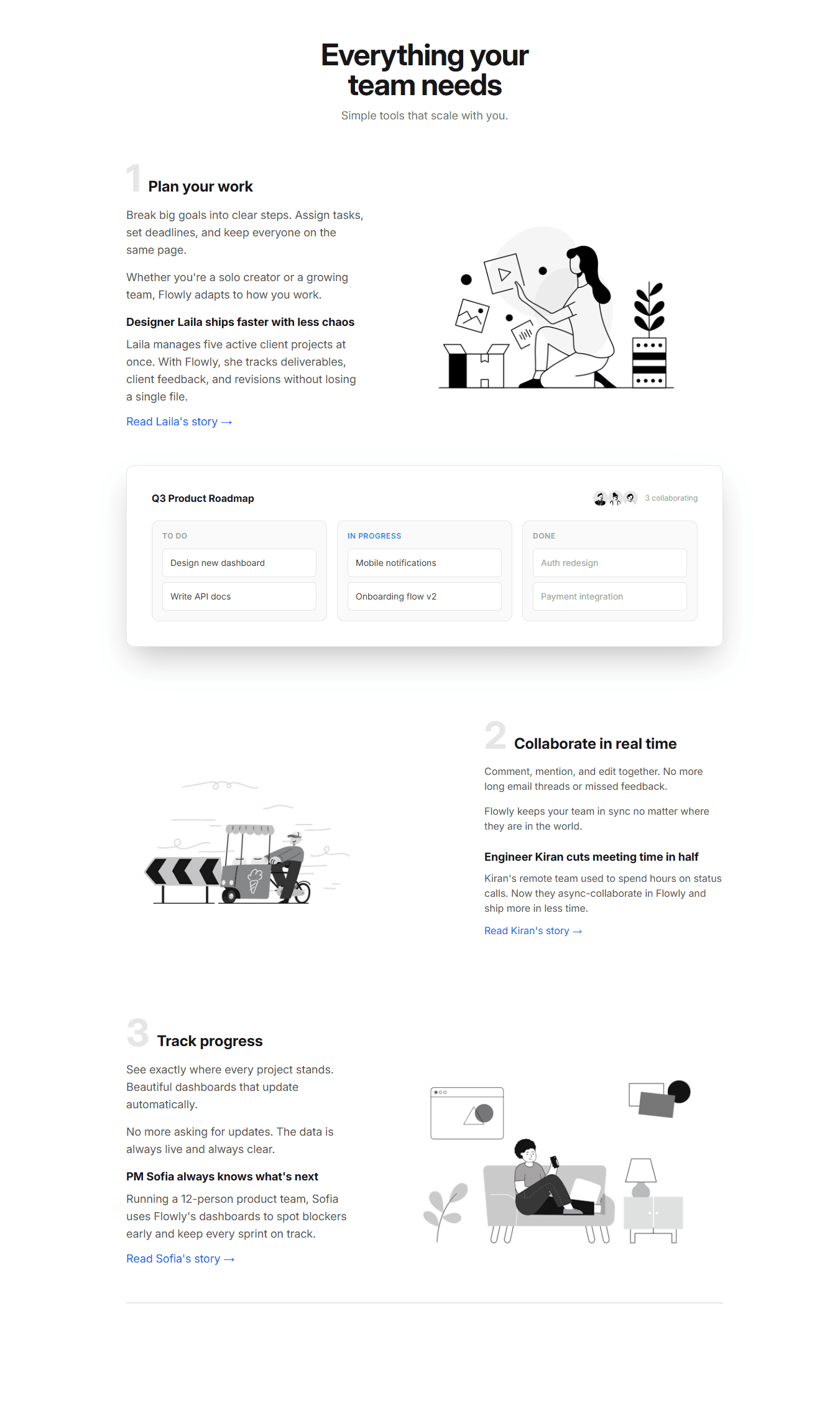
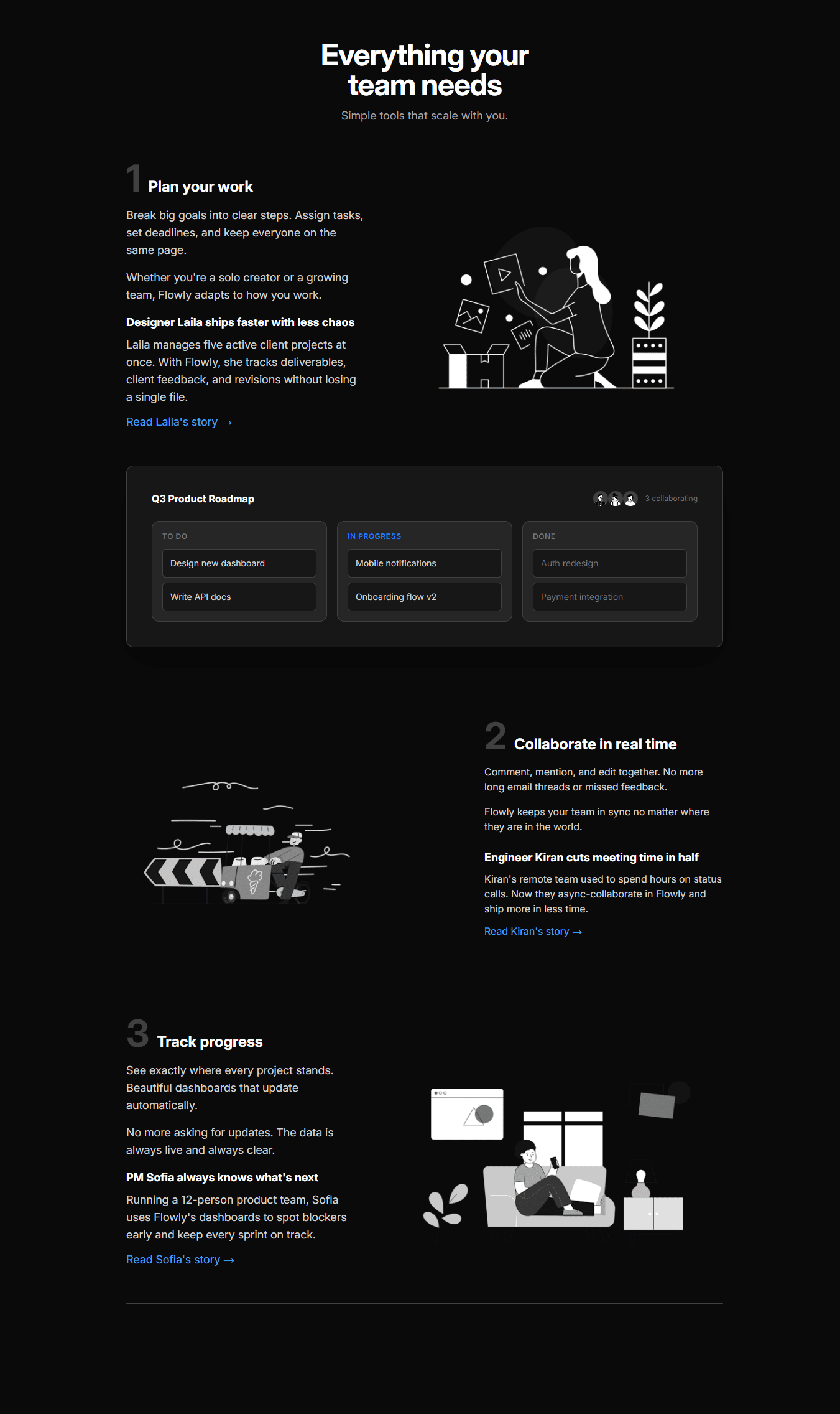
Content Section
Contents
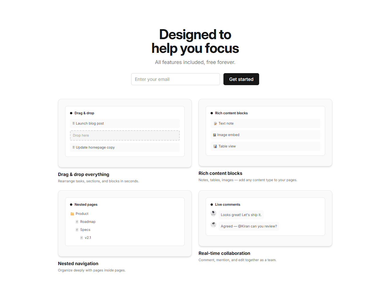
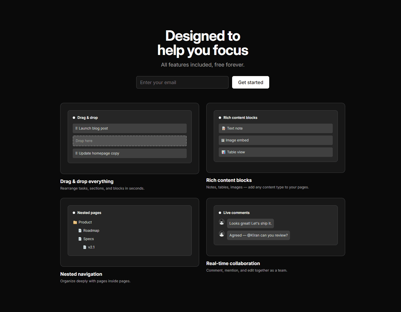
Features Section
Features


Email Subscription Form
Forms


Stats section
Stats


Content Section 2
Contents


Content Section 3
Contents


Pricing Section
Pricing


Blog Section
Blogs


CTA
CTA
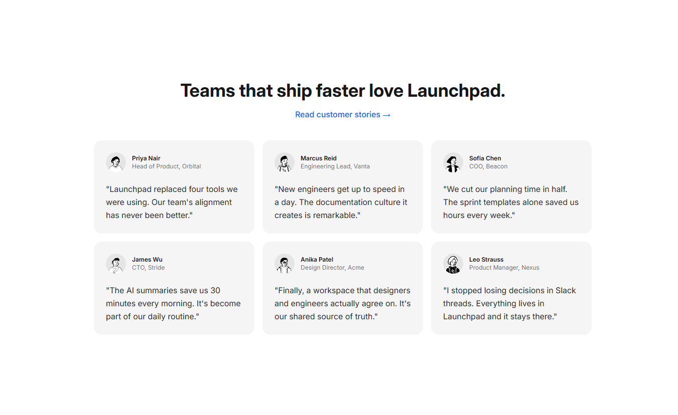
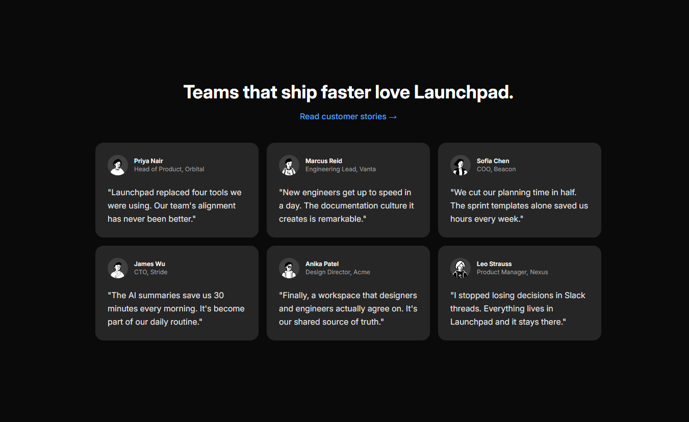
Testimonial Section
Testimonials
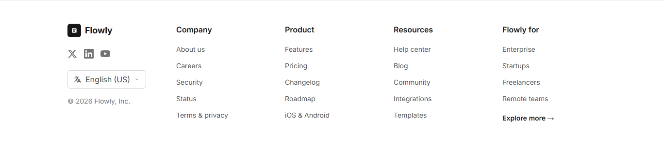
Footer
Footer
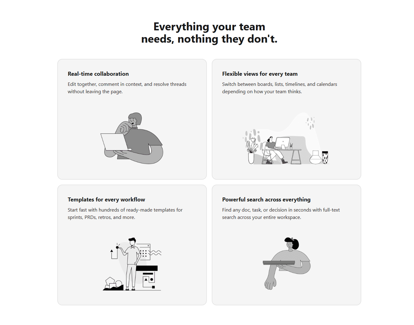
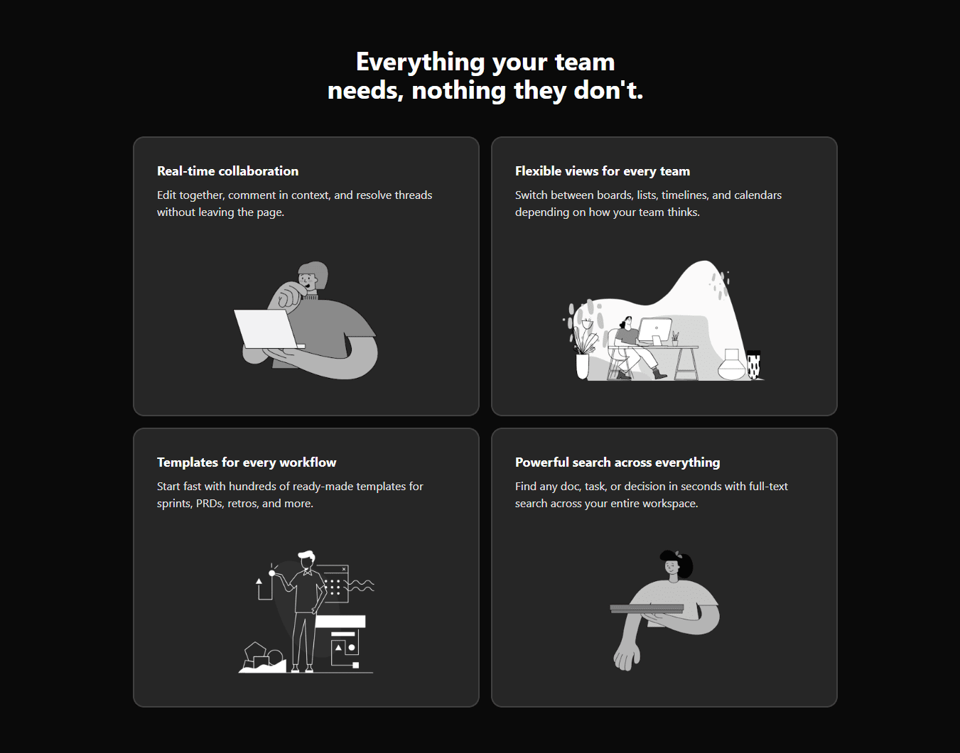
Features Section 2
Features
Workflow builder landing page
Full Page
Project Management page
Admin Pages
Hero Component 2
Hero
Features Section
Features
Stats section
Stats
Content Section 3
Contents
Blog Section
Blogs
Testimonial Section
Testimonials
Features Section 2
Features
Project Mgmt app landing page
Full Page
Hero Component
Hero
Content Section
Contents
Email Subscription Form
Forms
Content Section 2
Contents
Pricing Section
Pricing
CTA
CTA
Footer
Footer
Workflow builder landing page
Full Page
Hero Component
Hero
Features Section
Features
Content Section 2
Contents
Blog Section
Blogs
Footer
Footer
Project Mgmt app landing page
Full Page
Hero Component 2
Hero
Email Subscription Form
Forms
Content Section 3
Contents
CTA
CTA
Features Section 2
Features
Project Management page
Admin Pages
Content Section
Contents
Stats section
Stats
Pricing Section
Pricing
Testimonial Section
Testimonials
Explore Styles
Windframe gives you more than one beautiful style
Pick another style below to preview its design language and templates.
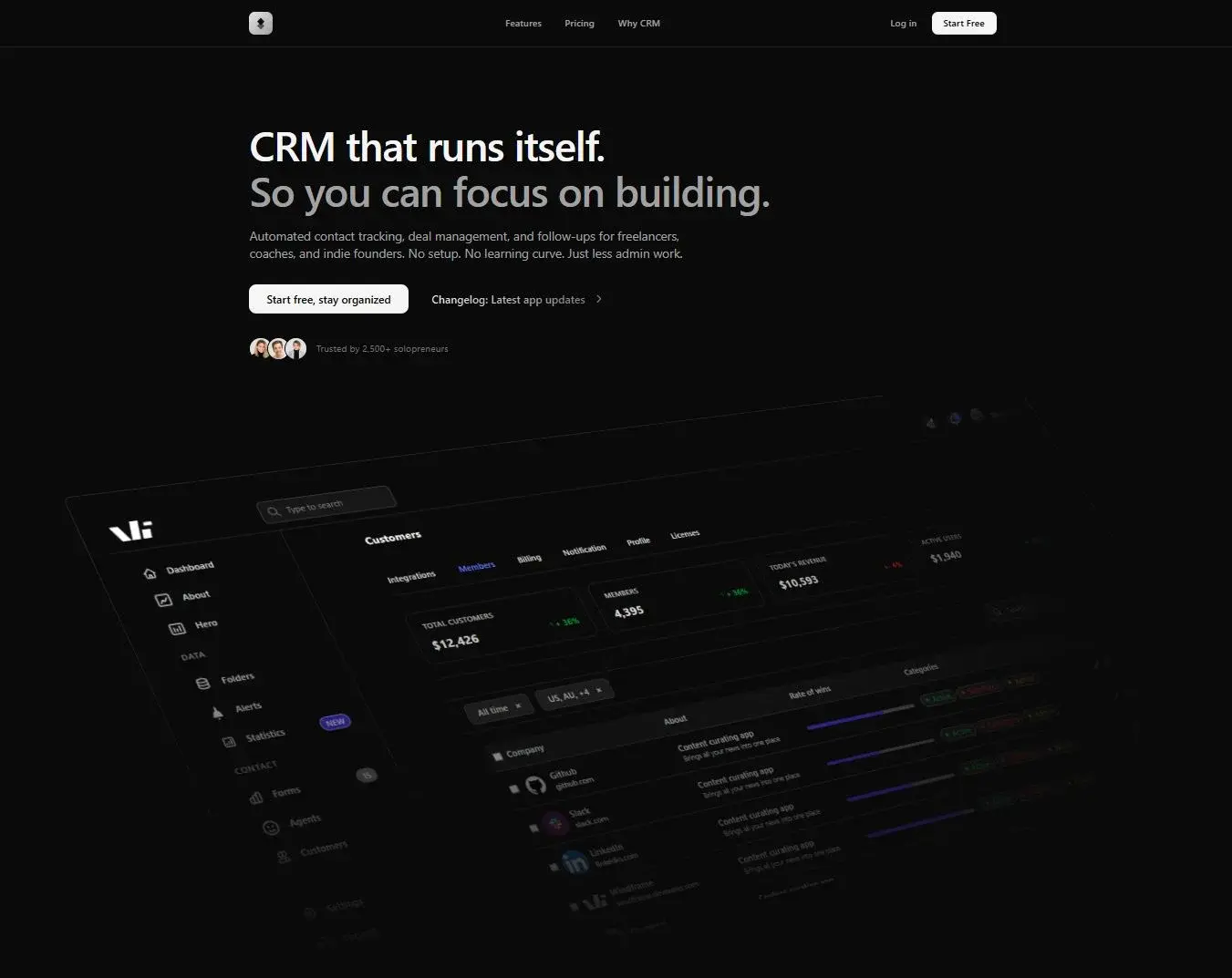
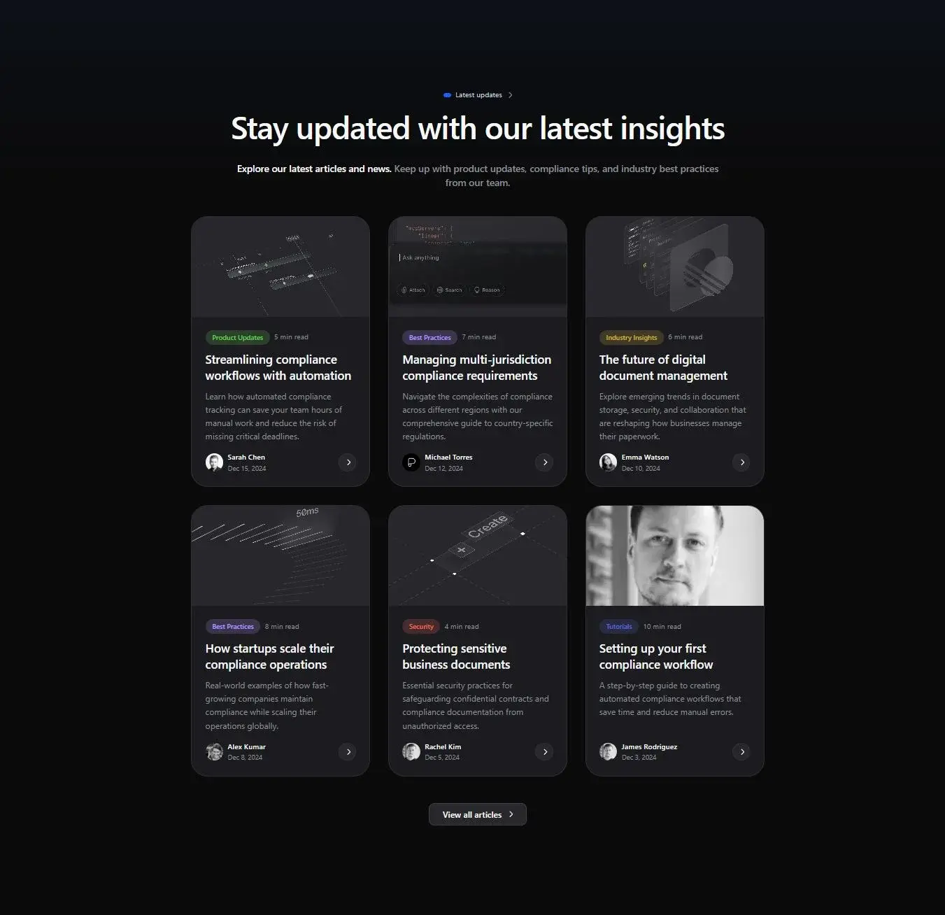
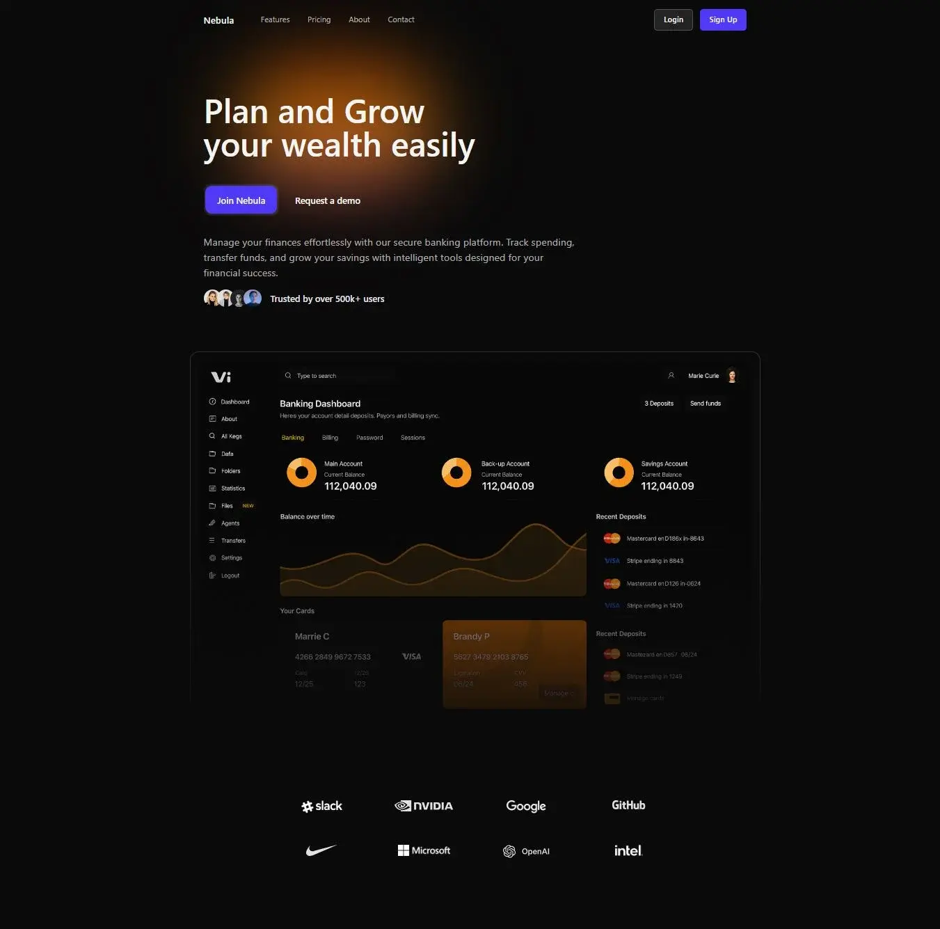
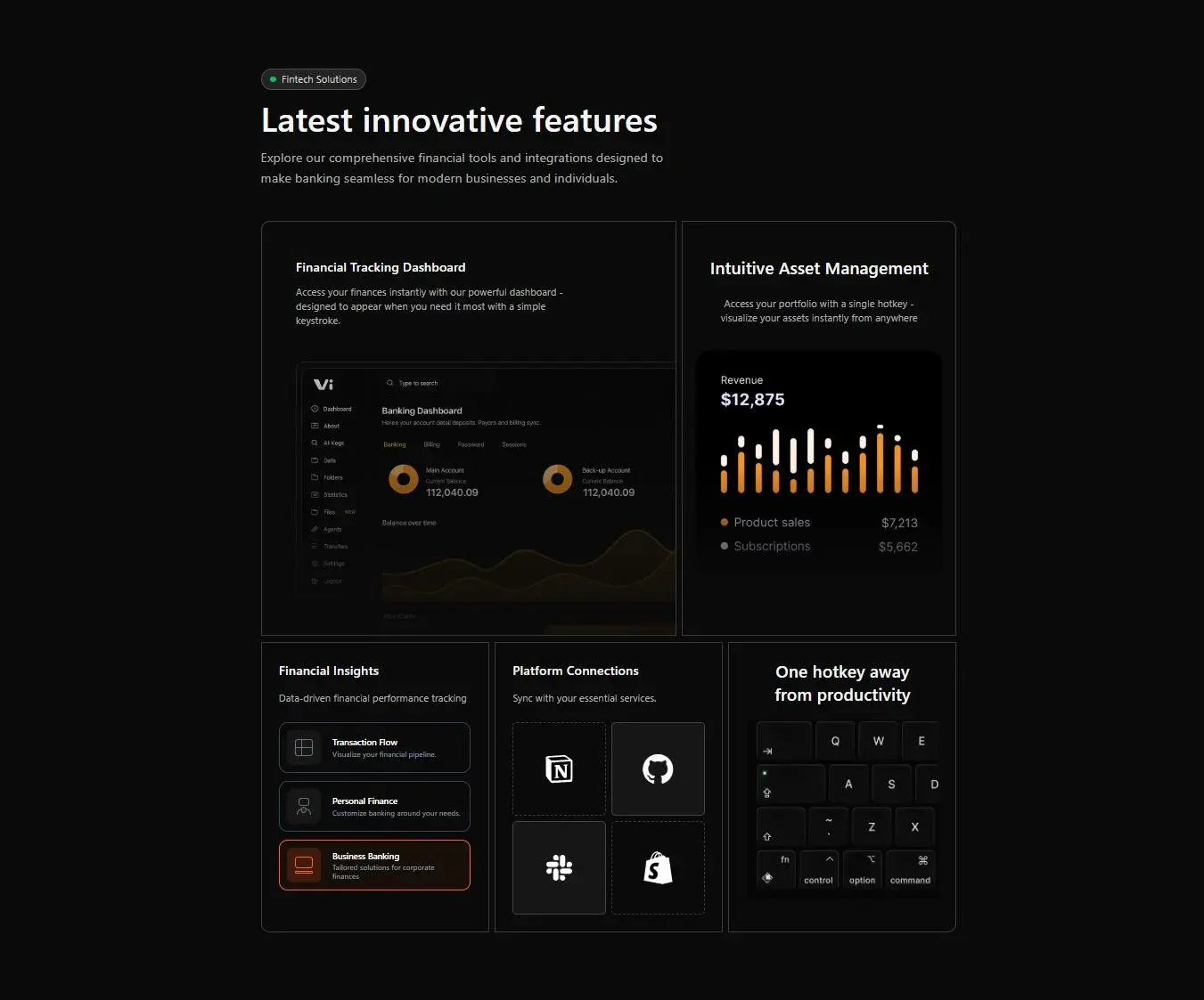
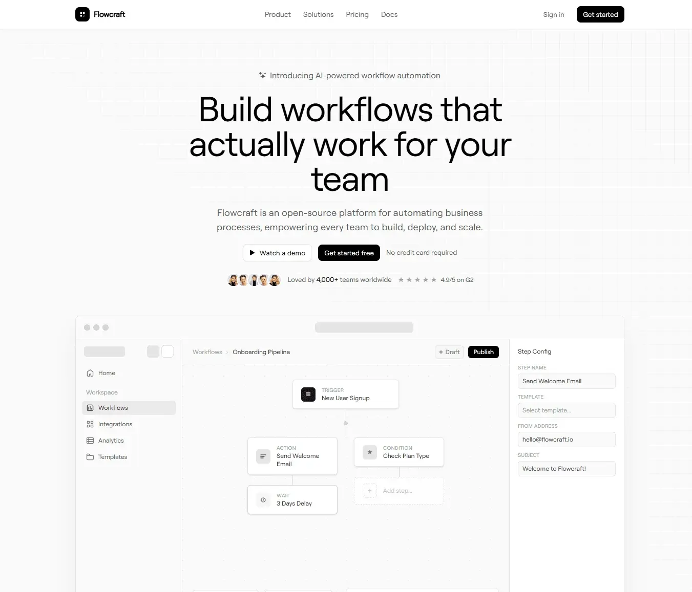
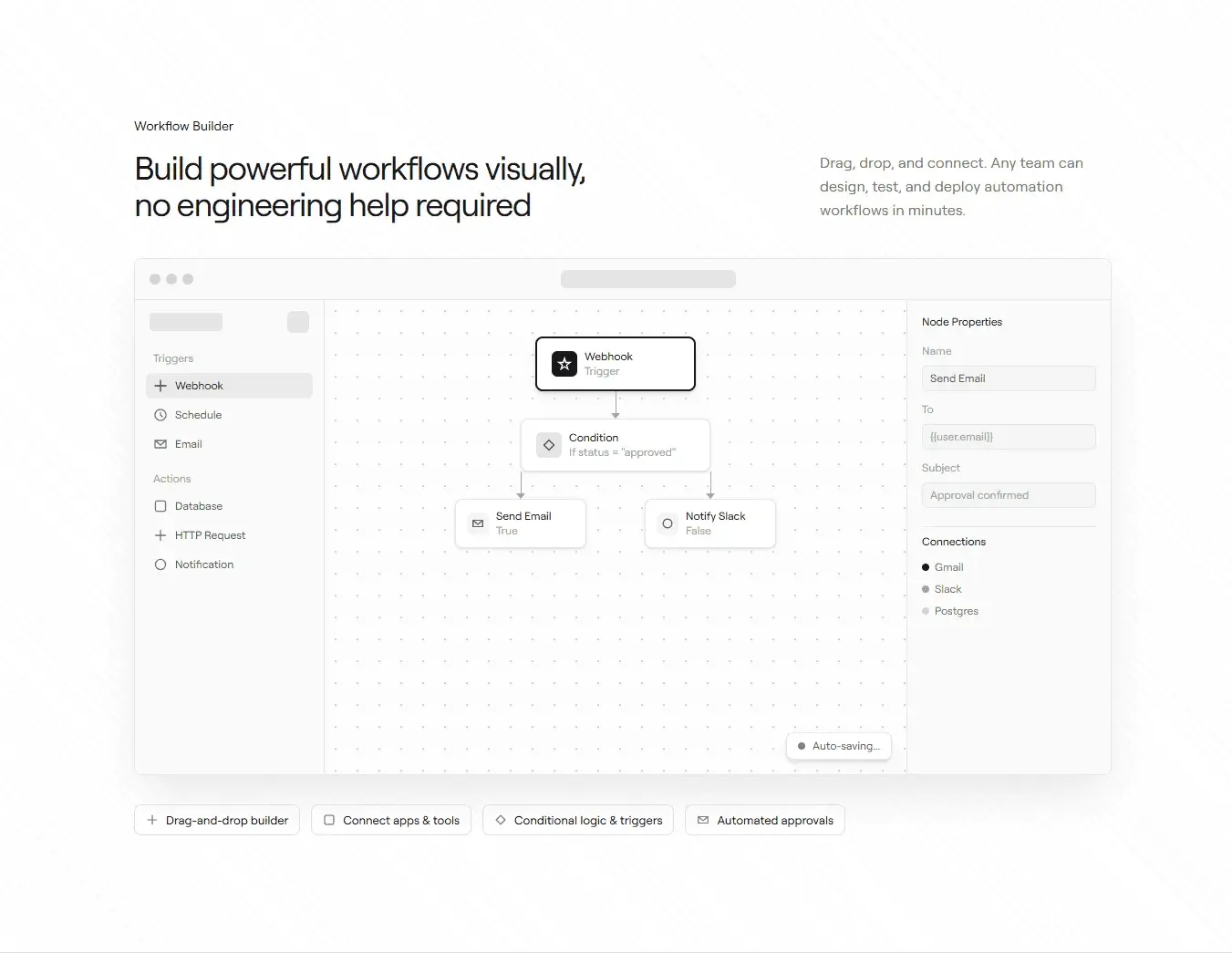
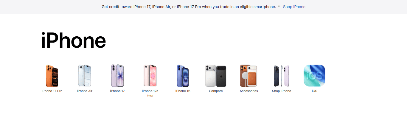
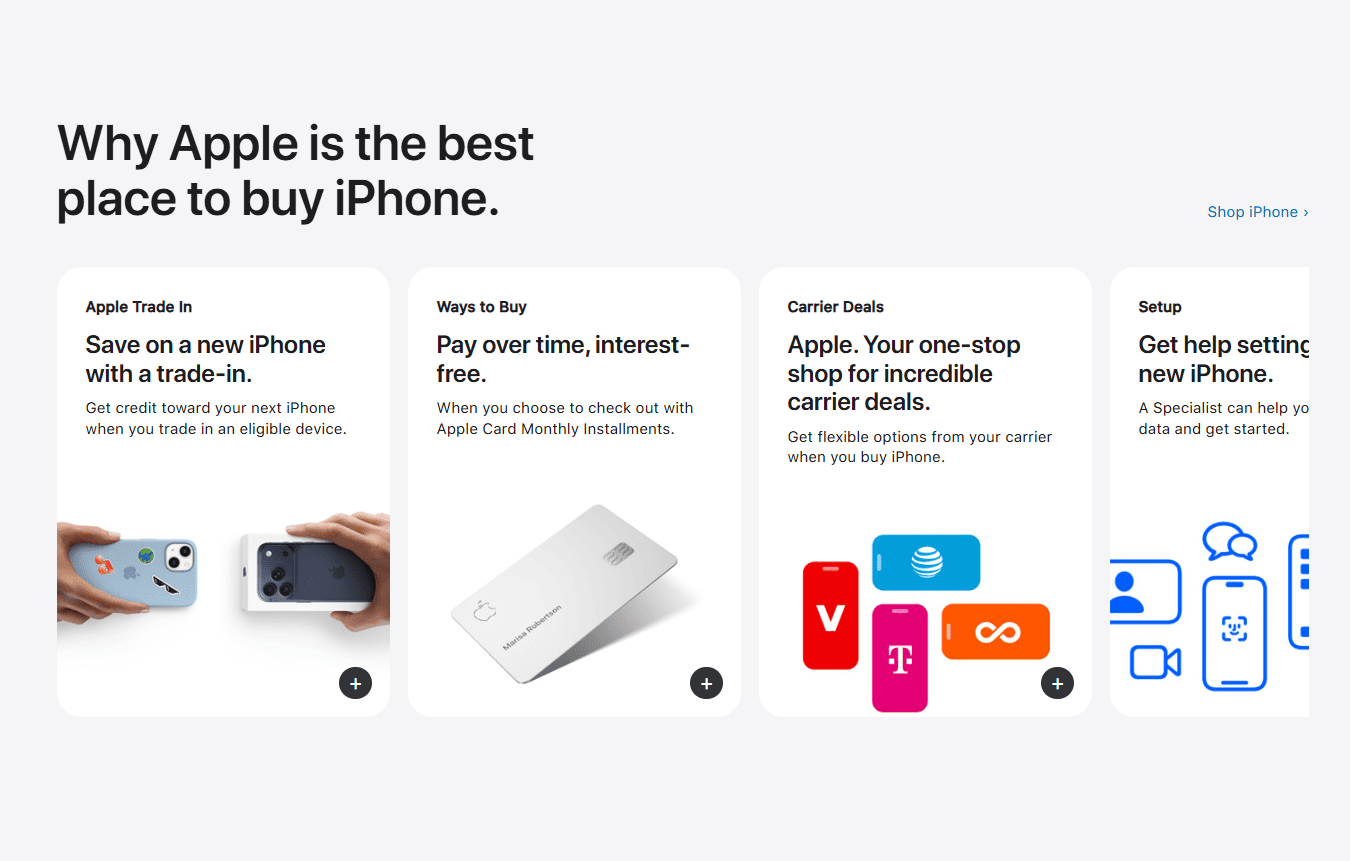
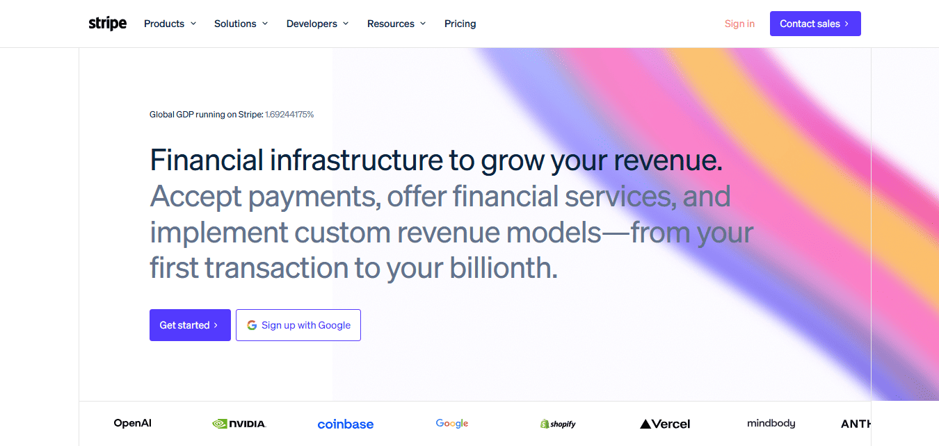
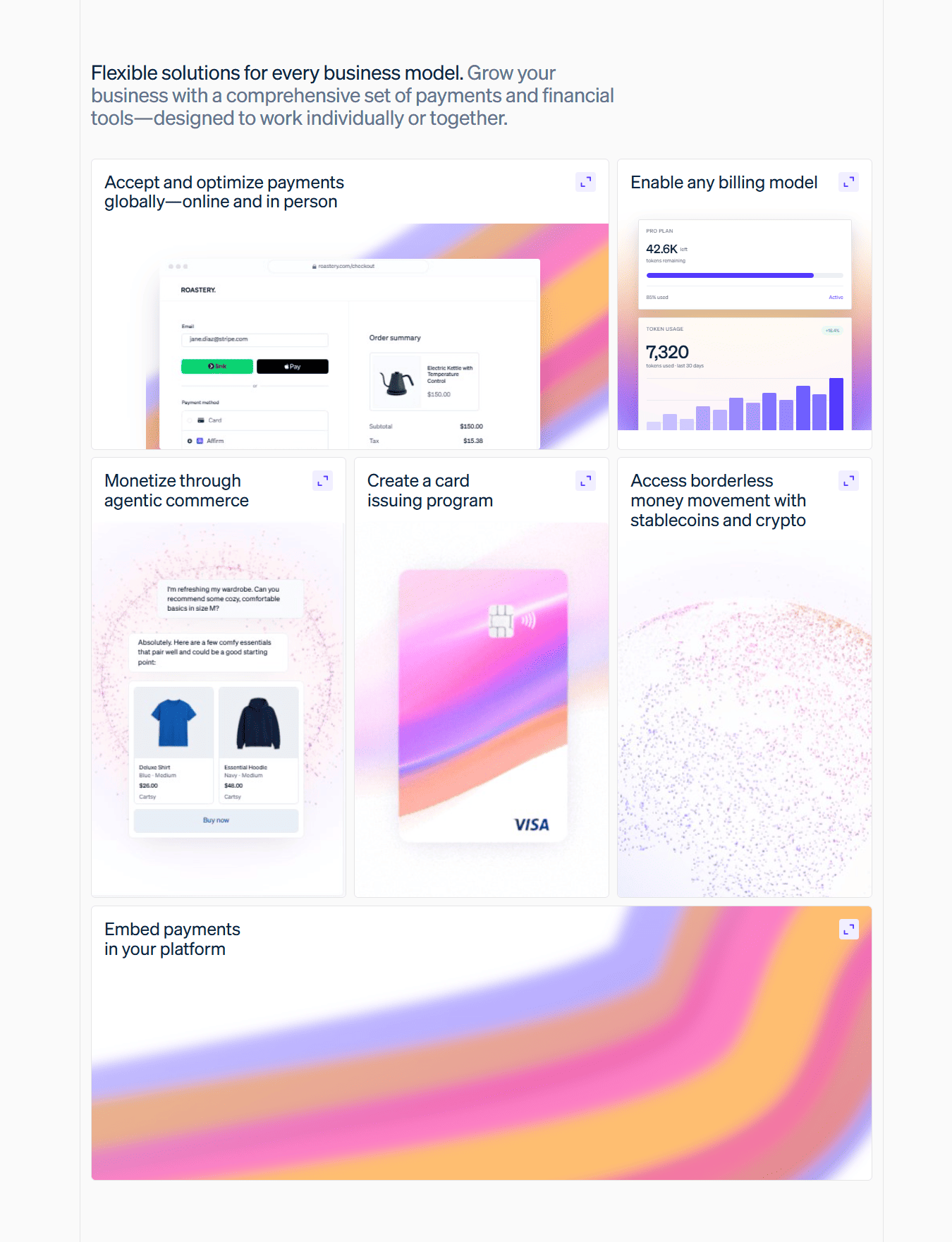
Windframe
You have seen what a design style in Windframe can do. Now see everything Windframe can do.
Windframe brings the full workflow into one platform: generate with AI, edit visually, test responsiveness, reuse templates, and export clean code to your framework. It is built to help teams ship polished UI faster, from first prompt to production.


 18,000+ developers
AI generation with real design systems
Describe any component and get polished, production-ready Tailwind CSS that follows actual design rules, not generic output.
Visual drag-and-drop editor
Fine-tune any component without touching code. Move elements, adjust spacing, swap colors, all visually in real time.
Live preview at every breakpoint
See exactly how your UI looks on mobile, tablet, and desktop before you ship a single line.
Export to 10+ frameworks
React, Next.js, Vue, Nuxt, Svelte, Angular, HTML and more. Clean Tailwind code ready to drop straight into your project.
1,000+ ready-made templates
Browse polished pages, sections, and components across multiple styles. Use them as-is or as a starting point.
Multiple beautiful styles
Linear precision, Notion clarity, Apple polish, Stripe structure and more. Each is a complete design system, not just a color swap.