Tailwind CSS Typography: How to Style Text Like a Pro
By Emmanuel Chinonso - Frontend Engineer and Technical Writer at Windframe
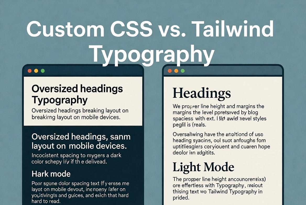
You sit down to build a clean blog layout or a dashboard with important instructions, and suddenly every heading looks too big on mobile, paragraphs feel cramped, and the whole thing collapses in dark mode. Hours disappear while you fight custom CSS files that never quite work across devices. That frustration is exactly why so many developers now reach for Tailwind CSS when it comes to text. With its utility classes and the official typography plugin, you can create readable, professional-looking text in minutes instead of days, and it scales beautifully no matter what project you throw at it.
This guide walks through everything step by step. If you have never touched Tailwind before, you will still walk away knowing how to handle fonts, spacing, readability, and rich content like a pro. We cover the basic utilities first, then the powerful prose plugin that handles blog posts and markdown in one class, and finally the advanced tricks that separate good text from great text. By the end you will have dozens of ready-to-copy patterns you can drop into any project.
Why Typography Matters More Than Most People Realize
Good typography does not just look nice. It affects how long people stay on your page, how easily they understand instructions, and even how trustworthy your brand feels. Poor line spacing makes readers tired. Wrong font sizes push mobile users away. Inconsistent weights make headings disappear into body text.
Tailwind solves these problems by giving you small, predictable tools instead of forcing you to write long CSS rules. Every change lives right in your HTML, so you see the result instantly. No more switching between files or guessing what “line-height: 1.6” actually looks like at different screen sizes.
The real power comes when you combine the core text utilities with the prose plugin. Together they handle everything from a simple paragraph to a full 5,000 word article without extra effort.
Starting with the Basics: Core Text Utilities
Tailwind gives you a complete set of classes that control every aspect of text. You apply them directly to any element, and they work responsively with prefixes like md: or lg:.
Font Size
The text- classes range from tiny to enormous:
text-xs(0.75rem) – perfect for captions and fine printtext-sm(0.875rem) – great for secondary texttext-base(1rem) – your default body sizetext-lg,text-xl,text-2xlup totext-9xlfor headings
You can make them responsive in one line:
1<h1 class="text-3xl md:text-5xl lg:text-6xl font-bold">2 This heading grows with the screen3</h1>
This single class replaces multiple media queries in traditional CSS.
Font Weight and Style
Weights go from font-thin (100) all the way to font-black (900). Common ones are font-normal, font-medium, font-semibold, and font-bold.
For italics use italic or not-italic to reset it. Combine them freely:
1<p class="font-medium italic text-lg">2 This paragraph stands out without shouting.3</p>
Line Height (Leading)
Line height controls breathing room between lines. Tailwind’s leading- classes are intuitive:
leading-none– tight for headingsleading-tightandleading-snug– compact paragraphsleading-normal– your safe defaultleading-relaxedandleading-loose– airy, readable body text
A common pattern for blog content:
1<article class="prose leading-relaxed">2 <!-- your content -->3</article>
Letter Spacing (Tracking)
tracking-tighter, tracking-tight, tracking-normal, tracking-wide, tracking-widest. Use sparingly, but tracking-wide on uppercase headings or tracking-tight on logos can make a big difference in polish.
Text Alignment and Decoration
- text-left, text-center, text-right, text-justify
- underline, line-through, no-underline
- uppercase, lowercase, capitalize
These work everywhere and pair perfectly with responsive prefixes.
Text Color and Opacity
text-slate-500, text-emerald-600, text-inherit, plus opacity modifiers like text-black/70. Dark mode is automatic with the dark: prefix:
1<p class="text-gray-600 dark:text-gray-400">2 This text adapts to light and dark modes automatically.3</p>
These utilities alone let you style 90% of everyday text without ever opening a CSS file.
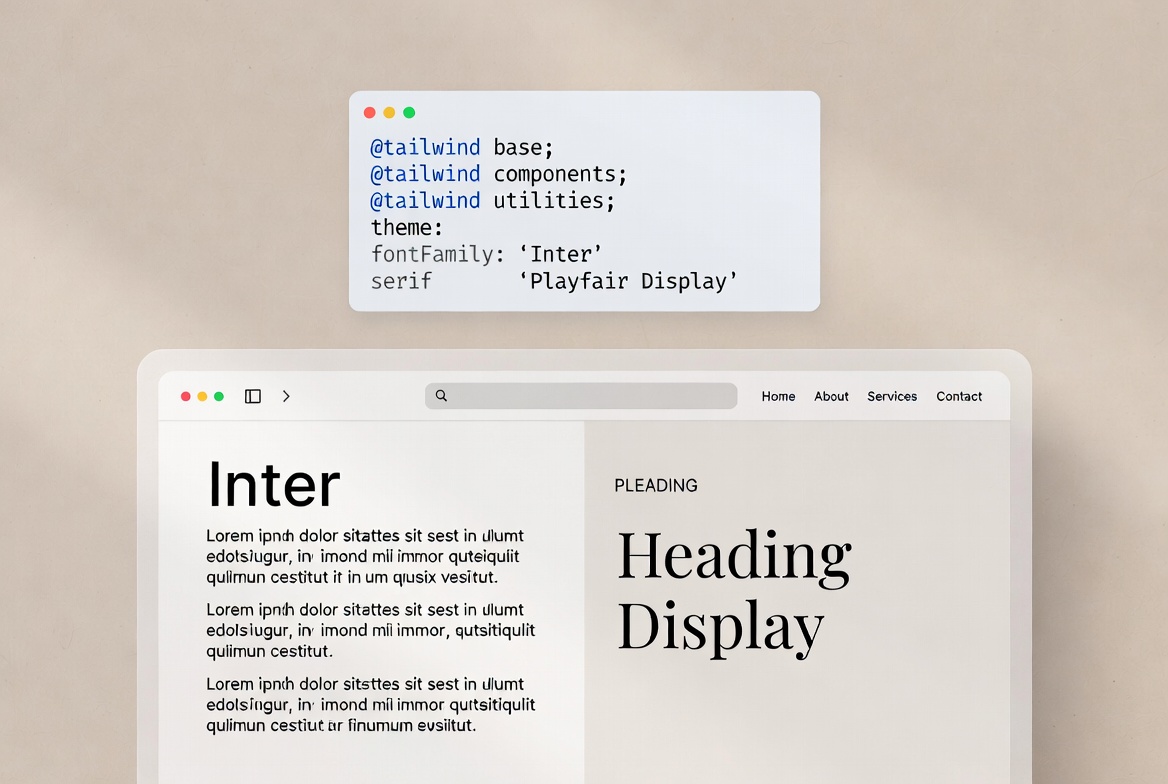
Custom Fonts: Bringing Your Brand In
Tailwind makes custom fonts painless. In Tailwind v4 you define them once in your CSS using the @theme directive or the older config approach if you are still on v3.
Example in your main CSS file
1@theme {2 --font-sans: "Inter", system-ui, sans-serif;3 --font-serif: "Playfair Display", serif;4}
Then use:
1<h1 class="font-serif text-5xl">Elegant heading</h1>2<p class="font-sans">Clean body text</p>
You can also add Google Fonts or local files in seconds. Many teams create a small set of three or four fonts and stick to them across the entire site. Consistency beats perfection every time.
The Prose Plugin: Your Secret Weapon for Rich Content
Here is where Tailwind typography really shines. The official @tailwindcss/typography plugin (still actively maintained in 2026) turns raw HTML from markdown, CMS, or user input into beautiful, readable content with one class: prose.
Installation in Tailwind v4 (CSS-first approach):
1@import "tailwindcss";2@plugin "@tailwindcss/typography";
That is literally it. No config file needed for the basics.
Now wrap any content:
1<article class="prose max-w-none mx-auto">2 <h1>Beautiful blog title</h1>3 <p>This paragraph gets automatic margins, proper line height, and readable font size.</p>4 <ul>5 <li>Lists look clean</li>6 <li>With proper spacing</li>7 </ul>8</article>
The prose class styles headings, paragraphs, lists, blockquotes, code blocks, tables, and more. It even handles nested elements intelligently.
Want bigger text on larger screens? Add prose-lg or prose-xl:
1<div class="bg-gray-100 flex items-center justify-center p-6">2 <article class="prose prose-lg max-w-xl bg-white p-6 rounded-xl shadow">3 <h1>Simple Dashboard Guide</h1>4 <p>5 This is how text looks when you use the <strong>prose</strong> class in Tailwind.6 You don’t need to style headings, paragraphs, or lists manually.7 </p>8 <h2>What happens automatically</h2>9 <ul>10 <li>Headings get proper spacing and size</li>11 <li>Paragraphs are easy to read</li>12 <li>Lists are neatly styled</li>13 </ul>14 <p>15 Everything here is just plain HTML, but it already looks clean and readable.16 That’s the benefit of using <strong>prose</strong>.17 </p>18 </article>19</div>
For dark mode:
1<article class="prose dark:prose-invert">2 <!-- content looks great in dark themes -->3</article>
Preview
Simple Dashboard Guide
This is how text looks when you use the prose class in Tailwind. You don’t need to style headings, paragraphs, or lists manually.
What happens automatically
- Headings get proper spacing and size
- Paragraphs are easy to read
- Lists are neatly styled
Everything here is just plain HTML, but it already looks clean and readable. That’s the benefit of using prose.
Customizing Prose to Match Your Brand
The plugin is not a black box. In Tailwind v4 you customize it directly in CSS using modifiers or by targeting the prose class.
Example overrides:
1.prose h1 {2 @apply text-4xl font-bold tracking-tight text-slate-900 dark:text-white;3}45.prose a {6 @apply text-emerald-600 hover:text-emerald-700 dark:text-emerald-400;7}
You can change colors, sizes, and even add your own styles for blockquotes or code blocks. Many developers create a prose-custom class that combines these tweaks so every article looks on-brand instantly.
There is also a growing community alternative called tw-prose for those who want a pure CSS version without the plugin overhead, but the official one remains the standard for most projects.
Responsive Typography That Actually Works
Tailwind’s responsive prefixes make fluid typography trivial. A common pattern used by pro teams:
1<h1 class="text-4xl md:text-5xl lg:text-6xl xl:text-7xl font-bold leading-tight">2 Headline that scales beautifully3</h1>
For body text you can combine size and leading:
1<p class="text-base md:text-lg leading-relaxed md:leading-loose max-w-prose">2 Readable on every device without extra media queries.3</p>
The max-w-prose utility is gold. It sets a comfortable reading width (around 65 characters) so lines never stretch too wide on big screens.
Dark Mode, Accessibility, and Performance Tips
Dark mode text is as simple as adding dark: variants everywhere. Always test contrast ratios. Tailwind’s default gray palette usually passes WCAG AA, but when you use custom colors double-check with tools like WebAIM Contrast Checker.
Accessibility best practices:
- Never rely on color alone for emphasis.
- Use proper heading hierarchy (h1 → h2 → h3).
- Keep line length between 45–75 characters.
- Add focus-visible styles for keyboard navigation.
Performance note: Tailwind purges unused classes automatically, so you can use every text utility without worrying about file size. The prose plugin adds only a few kilobytes when properly configured.
Common Mistakes Developers Still Make
- Overriding everything manually instead of starting with prose and tweaking.
- Forgetting responsive prefixes on headings.
- Using fixed pixel sizes instead of rem-based Tailwind scales.
- Ignoring the
max-w-proseutility and letting text stretch across full-width screens. - Applying prose to the entire page instead of just the content block.
Fix these and your text instantly feels more professional.
Real-World Examples You Can Copy Today
Blog Post Layout
1<div class="bg-gray-100 dark:bg-gray-950 p-6">2 <div class="max-w-6xl mx-auto space-y-10">3 <article class="prose prose-lg dark:prose-invert max-w-none bg-white dark:bg-gray-900 p-6 rounded-xl shadow border border-gray-200 dark:border-gray-800">4 <h1>Designing Better UI Without Overthinking It</h1>5 <p>6 This section is using <strong>prose</strong>, <strong>prose-lg</strong>, and7 <strong>dark:prose-invert</strong>. Notice how the typography already feels8 balanced without writing any custom CSS.9 </p>1011 <p>12 Headings, paragraphs, lists, and links are styled automatically. You just13 focus on writing content, not spacing or font sizes.14 </p>1516 <h2>Why this matters</h2>1718 <ul>19 <li>Cleaner content structure</li>20 <li>Better readability out of the box</li>21 <li>Less time spent tweaking styles</li>22 </ul>2324 <p>25 Switch your app to dark mode and the text will automatically adapt because26 of <strong>dark:prose-invert</strong>.27 </p>28 </article>2930 <!-- Blog Cards -->31 <div class="grid gap-6 md:grid-cols-2 lg:grid-cols-3">3233 <!-- Card 1 -->34 <article class="prose dark:prose-invert bg-white dark:bg-gray-900 p-5 rounded-xl shadow border border-gray-200 dark:border-gray-800">35 <h2>Understanding Layout Spacing</h2>36 <p>37 Learn how spacing affects readability and how Tailwind handles it38 automatically with prose utilities.39 </p>40 <a href="#">Read more →</a>41 </article>4243 <!-- Card 2 -->44 <article class="prose dark:prose-invert bg-white dark:bg-gray-900 p-5 rounded-xl shadow border border-gray-200 dark:border-gray-800">45 <h2>Writing Cleaner UI Code</h2>46 <p>47 Focus on structure instead of styling every element manually. Let48 Tailwind typography do the work.49 </p>50 <a href="#">Read more →</a>51 </article>5253 <!-- Card 3 -->54 <article class="prose dark:prose-invert bg-white dark:bg-gray-900 p-5 rounded-xl shadow border border-gray-200 dark:border-gray-800">55 <h2>Dark Mode Made Easy</h2>56 <p>57 With dark:prose-invert, your text automatically adjusts for dark themes58 without extra effort.59 </p>60 <a href="#">Read more →</a>61 </article>6263 </div>6465 </div>66</div>
Preview
Designing Better UI Without Overthinking It
This section is using prose, prose-lg, and dark:prose-invert. Notice how the typography already feels balanced without writing any custom CSS.
Headings, paragraphs, lists, and links are styled automatically. You just focus on writing content, not spacing or font sizes.
Why this matters
- Cleaner content structure
- Better readability out of the box
- Less time spent tweaking styles
Switch your app to dark mode and the text will automatically adapt because of dark:prose-invert.
Understanding Layout Spacing
Learn how spacing affects readability and how Tailwind handles it automatically with prose utilities.
Read more →Writing Cleaner UI Code
Focus on structure instead of styling every element manually. Let Tailwind typography do the work.
Read more →Dark Mode Made Easy
With dark:prose-invert, your text automatically adjusts for dark themes without extra effort.
Read more →Dashboard Instruction Text
1<div class="bg-gray-200 flex items-center justify-center p-6 rounded-t-xl">2 <div class="w-full rounded-2xl bg-gray-900 border border-gray-800 shadow-xl p-8 space-y-6">3 <div>4 <h1 class="text-2xl font-semibold text-white leading-relaxed">5 Getting started with your6 <span class="text-indigo-400 font-bold">dashboard</span>7 </h1>8 <p class="text-gray-400 text-sm mt-2 leading-loose">9 Follow these simple steps to set things up and start seeing value immediately.10 </p>11 </div>12 <div class="space-y-4">13 <div class="flex items-start gap-4">14 <div class="shrink-0 w-8 h-8 rounded-lg bg-indigo-500/10 text-indigo-400 flex items-center justify-center text-sm font-semibold">15 116 </div>17 <p class="text-gray-300 text-sm leading-loose">18 Connect your data source to begin syncing real-time information into your dashboard.19 </p>20 </div>21 <div class="flex items-start gap-4">22 <div class="shrink-0 w-8 h-8 rounded-lg bg-indigo-500/10 text-indigo-400 flex items-center justify-center text-sm font-semibold">23 224 </div>25 <p class="text-gray-300 text-sm leading-loose">26 Customize your widgets to focus on the metrics that matter most to you.27 </p>28 </div>29 <div class="flex items-start gap-4">30 <div class="shrink-0 w-8 h-8 rounded-lg bg-indigo-500/10 text-indigo-400 flex items-center justify-center text-sm font-semibold">31 332 </div>33 <p class="text-gray-300 text-sm leading-loose">34 Set up alerts so you’re notified instantly when something important changes.35 </p>36 </div>37 </div>38 <div class="pt-4 border-t border-gray-800 flex items-center justify-between">39 <p class="text-xs text-gray-500 leading-loose">40 You can update these settings anytime from your dashboard.41 </p>42 <button class="px-4 py-2 rounded-lg bg-indigo-500 text-white text-sm font-medium hover:bg-indigo-400 transition">43 Continue44 </button>45 </div>46 </div>47</div>
Preview
Getting started with your dashboard
Follow these simple steps to set things up and start seeing value immediately.
1
Connect your data source to begin syncing real-time information into your dashboard.
2
Customize your widgets to focus on the metrics that matter most to you.
3
Set up alerts so you’re notified instantly when something important changes.
You can update these settings anytime from your dashboard.
Card with Highlighted Text
1<div class="flex items-center justify-center bg-gray-200 p-6 rounded-t-xl">2 <div class="max-w-md w-full rounded-2xl bg-linear-to-br from-gray-900 to-gray-800 border border-gray-700/50 shadow-2xl p-6 relative overflow-hidden">3 <div class="absolute -top-10 -right-10 w-40 h-40 bg-indigo-500/20 blur-3xl rounded-full"></div>4 <div class="absolute -bottom-10 -left-10 w-40 h-40 bg-pink-500/20 blur-3xl rounded-full"></div>56 <div class="relative z-10 space-y-5">7 <h2 class="text-xl font-semibold text-white leading-relaxed">8 Build better interfaces with9 <span class="relative inline-block mx-1">10 <span class="absolute inset-0 bg-linear-to-r from-indigo-500 to-pink-500 blur-sm opacity-60 rounded"></span>11 <span class="relative text-transparent bg-clip-text bg-linear-to-r from-indigo-400 to-pink-400 font-bold">12 highlighted text13 </span>14 </span>15 that feels natural and easy to read16 </h2>17 <p class="text-gray-400 text-sm leading-loose">18 This card uses a more relaxed line height to make the content feel open and19 approachable. The extra spacing between lines gives your text room to breathe,20 making it easier to scan and more comfortable to read over longer sections.21 </p>22 <button class="mt-2 inline-flex items-center gap-2 px-4 py-2 rounded-lg bg-linear-to-r from-indigo-500 to-pink-500 text-white text-sm font-medium shadow-lg shadow-indigo-500/20 hover:scale-[1.02] active:scale-[0.98] transition">23 Get Started24 </button>25 </div>26 </div>27</div>
Preview
Build better interfaces with
highlighted text
that feels natural and easy to read
This card uses a more relaxed line height to make the content feel open and approachable. The extra spacing between lines gives your text room to breathe, making it easier to scan and more comfortable to read over longer sections.
These patterns appear in production apps built by teams at Shopify, Vercel, and countless indie projects.
Taking It Further: Fluid Typography and Advanced Techniques
For truly modern designs you can combine Tailwind with CSS clamp for fluid scaling:
1@theme {2 --font-size-fluid: clamp(1.5rem, 4vw, 3rem);3}
Then apply it with a custom utility if needed. Many developers also layer the @layer base directive to set global heading defaults once and never touch them again.
Wrapping Up: Start Small, Ship Fast
The beauty of Tailwind typography is how quickly it lets you move from zero to polished. Start with the basic text utilities for UI elements. Add the prose plugin the moment you need to display longer content. Tweak colors and sizes to match your brand. Test on real devices early.
You no longer need to be a CSS expert to create text that feels intentional and readable. Thousands of developers have already made the switch and never looked back. Start applying these techniques on your next project today. Your users will notice the difference, and you will wonder how you ever lived without it.
Windframe is an AI visual editor for rapidly building stunning web UIs & websites
Start building stunning web UIs & websites!
