Tailwind CSS Card Component
By Emmanuel Chinonso - Frontend Engineer and Technical Writer at Windframe

Tailwind CSS has revolutionized styling for web developers, providing a utility-first system that accelerates UI creation. Cards, those compact, boxed elements displaying products, profiles, or blog teasers, are staples in modern interfaces.
They appear in countless real-world sites, from e-commerce platforms to dashboards, and customizing them with Tailwind's classes can give your project a polished edge.
You need a card component for your project. Product cards, profile cards, blog post previews, they’re everywhere in modern web design and show up in almost every real-world interface, including many production projects built with Tailwind CSS. But building them from scratch feels repetitive, and you're not sure which Tailwind classes to use.
In this blog, we'll dive into what makes effective cards, showcase 15 ready-to-use Tailwind card examples with full HTML code, previews, and breakdowns of key utilities. Plus, we'll introduce AI visual builders that streamline the process, generating Tailwind code from prompts or designs. Whether you're starting from scratch or refining designs, these tools and templates will help you build responsive, attractive cards without endless trial and error. We've expanded this post with new AI integration tips, drawing from recent advancements in tools like v0 and Windframe, to make card creation even more efficient. By the end, you'll understand how to build any card design you can imagine.
Table of Content
- What Makes a Good Card Component
- Diving into Tailwind CSS Basics
- The Role of Cards in Web Design
- Basic Cards (Start Here)
- Cards with Images
- Profile & User Cards
- Interactive Cards
- Advanced Cards
- Exploring AI Visual Builders for Tailwind Cards
- Comparing AI Visual Builders
- Step-by-Step: Building a Card with v0.dev
- Using Windframe for Visual Building
- From Design to Code with Builder.io Fusion
- Building a Card Grid Layout
- Advanced Customizations and Variations
- Card Best Practices I've Learned
- Accessibility Considerations
- Common Card Mistakes to Avoid
- Customizing Card Styles
- Frameworks and Libraries
What Makes a Good Card Component
Before jumping into code, let me explain what separates a great card from a mediocre one.
-
Clear visual hierarchy - Users should know where to look first. Use font sizes, weights, and spacing to guide their eyes.
-
Consistent spacing - Don't randomly throw p-4 and p-6 around. Pick a spacing system and stick to it.
-
Responsive by default - Cards should look good on phones, tablets, and desktops without extra code.
-
Scannable content - Keep text short and actionable. Nobody reads long paragraphs in cards.
-
Purposeful interactions - If a card is clickable, make it obvious with hover states and cursor changes.
Tailwind makes all of this easy because you're building with utilities instead of fighting against pre-made components. Let's build some cards.
Diving into Tailwind CSS Basics
Tailwind CSS is a framework that lets you style elements by applying predefined classes directly in your HTML. Unlike traditional CSS where you define custom rules in separate files, Tailwind provides utilities for padding, colors, borders, and more, allowing quick compositions. For instance, a button might use "bg-blue-500 text-white px-4 py-2 rounded" instead of a lengthy stylesheet.
Developed by Adam Wathan and team in 2017, Tailwind emphasizes rapid development and consistency. It includes a configuration file where you can extend defaults, like adding custom colors or fonts. Installation is simple: via npm with npm install -D tailwindcss, then initialize with npx tailwindcss init. This creates tailwind.config.js for customizations and postcss.config.js if using PostCSS.
In your CSS file, add directives:
1@tailwind base;2@tailwind components;3@tailwind utilities;
Tailwind scans your files for used classes and purges unused ones in production, keeping bundles small. For cards, utilities like "shadow-lg", "rounded-xl", and "p-6" handle shadows, curves, and spacing effortlessly.
Newcomers often find the class-heavy markup overwhelming at first, but it grows on you. Tools like the Tailwind extension for VS Code offer autocompletion, making it smoother. The official documentation walks through setup in detail here. For a tutorial video, check here. For a deeper look at why it's popular, see my post on Tailwind vs traditional CSS.
The Role of Cards in Web Design
Cards organize content into digestible chunks, improving readability on sites. They're versatile: vertical for blog teasers with image, title, excerpt; horizontal for team members with photo and bio. E-commerce uses them for products with price and add-to-cart buttons.
A standard card structure includes a container div, optional image, heading, body text, and actions. Tailwind makes this easy without custom CSS. Here's a basic example:
1<div class="max-w-sm bg-white border border-gray-200 rounded-lg shadow-md">2 <img class="rounded-t-lg" src="image.jpg" alt="" />3 <div class="p-5">4 <h5 class="mb-2 text-2xl font-bold tracking-tight text-gray-900">5 Card Title6 </h5>7 <p class="mb-3 font-normal text-gray-700">Description text goes here.</p>8 <a9 href="#"10 class="inline-flex items-center px-3 py-2 text-sm font-medium text-center text-white bg-blue-700 rounded-lg hover:bg-blue-800"11 >Read more</a12 >13 </div>14</div>
This draws from common patterns, like those in Flowbite's library here. Cards respond well to Tailwind's breakpoints, shifting layouts with "md:flex" for larger screens.
Why customize? Stock designs work, but tailoring to your brand, unique colors, animations, or layouts, elevates the site. Manual coding takes time, though, which is where AI visual builders step in.
Basic Cards (Start Here)
These foundational designs build simple structures you can expand.
1. Simple Card with Title and Description
Let's start with the basics. This card has a title, description, and a link, perfect for blog posts or news articles.
1<div class="max-w-sm bg-white rounded-lg shadow-md overflow-hidden">2 <div class="p-6">3 <h3 class="text-2xl font-bold text-gray-900 mb-3">4 Getting Started with Tailwind CSS5 </h3>6 <p class="text-gray-600 text-base mb-4">7 Learn how to set up Tailwind CSS in your project and start building8 beautiful interfaces with utility-first classes.9 </p>10 <a11 href="#"12 class="text-blue-600 font-semibold hover:text-blue-800 transition-colors"13 >14 Read more →15 </a>16 </div>17</div>
Preview
Getting Started with Tailwind CSS
Learn how to set up Tailwind CSS in your project and start building beautiful interfaces with utility-first classes.
Read more →
Key utilities explained:
max-w-sm- Caps width at 384px (perfect for card grids)rounded-lg- Gives rounded corners (8px radius)shadow-md- Adds medium box shadow for depthoverflow-hidden- Prevents content from breaking rounded cornershover:text-blue-800- Changes link color on hover
This is your foundation. Everything else builds on this pattern.
2. Card with Header and Footer
Add a header and footer for more structured content. Great for dashboards or admin panels.
1<div class="max-w-sm bg-white rounded-lg shadow-lg overflow-hidden">2 <div class="bg-linear-to-r from-blue-500 to-blue-600 px-6 py-4">3 <h3 class="text-xl font-bold text-white">Monthly Report</h3>4 </div>5 <div class="p-6">6 <p class="text-gray-700 mb-4">7 Your website received 12,450 visitors this month, up 23% from last month.8 </p>9 <div class="flex items-center justify-between text-sm">10 <span class="text-gray-500">Progress</span>11 <span class="font-semibold text-green-600">+23%</span>12 </div>13 </div>14 <div class="bg-gray-50 px-6 py-4 border-t border-gray-200">15 <button16 class="text-blue-600 font-semibold hover:text-blue-800 transition-colors"17 >18 View Details19 </button>20 </div>21</div>
Preview
Monthly Report
Your website received 12,450 visitors this month, up 23% from last month.
Pro tip: The gradient header (bg-gradient-to-r from-blue-500 to-blue-600) adds visual interest without extra images. The footer uses bg-gray-50 to create subtle separation from the body.
3. Horizontal Card Layout
Sometimes you need cards that run horizontally. Perfect for list views or mobile layouts.
1<div2 class="max-w-2xl bg-white rounded-lg shadow-md overflow-hidden flex flex-col sm:flex-row"3>4 <div class="sm:w-1/3">5 <img6 src="https://images.unsplash.com/photo-1496128858413-b36217c2ce36?w=300"7 alt="Workspace"8 class="w-full h-48 sm:h-full object-cover"9 />10 </div>11 <div class="p-6 sm:w-2/3">12 <div class="flex items-center mb-2">13 <span14 class="bg-blue-100 text-blue-800 text-xs font-semibold px-2.5 py-0.5 rounded"15 >16 Featured17 </span>18 </div>19 <h3 class="text-xl font-bold text-gray-900 mb-2">20 Modern Workspace Design21 </h3>22 <p class="text-gray-600 mb-4">23 Create a productive environment with these workspace design tips and24 modern furniture recommendations.25 </p>26 <div class="flex items-center justify-between">27 <span class="text-sm text-gray-500">5 min read</span>28 <a href="#" class="text-blue-600 font-semibold hover:text-blue-800">29 Read article →30 </a>31 </div>32 </div>33</div>
Preview

Featured
Modern Workspace Design
Create a productive environment with these workspace design tips and modern furniture recommendations.
Read article →
Notice the responsive pattern: flex-col sm:flex-row stacks vertically on mobile, then switches to horizontal on tablets and up. The image uses object-cover to maintain aspect ratio without distortion.
Cards with Images
Incorporating images makes cards more engaging, especially for products or content previews.
4. Product Card with Image
E-commerce cards need images, pricing, and clear call-to-action buttons. Here's a pattern I use constantly.
1<div class="max-w-sm bg-white rounded-lg shadow-lg overflow-hidden group">2 <div class="relative overflow-hidden">3 <img4 src="https://images.unsplash.com/photo-1505740420928-5e560c06d30e?w=400"5 alt="Product"6 class="w-full h-64 object-cover group-hover:scale-110 transition-transform duration-300"7 />8 <div class="absolute top-4 right-4">9 <span10 class="bg-red-500 text-white text-xs font-bold px-3 py-1 rounded-full"11 >12 Sale13 </span>14 </div>15 </div>16 <div class="p-6">17 <h3 class="text-xl font-bold text-gray-900 mb-2">Wireless Headphones</h3>18 <p class="text-gray-600 text-sm mb-4">19 Premium noise-cancelling headphones with 30-hour battery life.20 </p>21 <div class="flex items-center justify-between mb-4">22 <div>23 <span class="text-2xl font-bold text-gray-900">$199</span>24 <span class="text-sm text-gray-500 line-through ml-2">$299</span>25 </div>26 <div class="flex items-center">27 <svg class="w-5 h-5 text-yellow-400 fill-current" viewBox="0 0 20 20">28 <path29 d="M10 15l-5.878 3.09 1.123-6.545L.489 6.91l6.572-.955L10 0l2.939 5.955 6.572.955-4.756 4.635 1.123 6.545z"30 />31 </svg>32 <span class="ml-1 text-sm text-gray-600">4.8</span>33 </div>34 </div>35 <button36 class="w-full bg-blue-600 text-white py-3 rounded-lg font-semibold hover:bg-blue-700 transition-colors"37 >38 Add to Cart39 </button>40 </div>41</div>
Preview

Sale
Wireless Headphones
Premium noise-cancelling headphones with 30-hour battery life.
The zoom effect on hover (group-hover:scale-110) gives the card life. The group class on the parent enables this. The sale badge uses absolute positioning to float over the image.
5. Blog Post Card
Blog cards need images, categories, reading time, and author info.
1<div class="max-w-sm bg-white rounded-xl shadow-lg overflow-hidden">2 <div class="relative h-48 overflow-hidden">3 <img4 src="https://images.unsplash.com/photo-1499750310107-5fef28a66643?w=400"5 alt="Blog post"6 class="w-full h-full object-cover"7 />8 <div class="absolute top-4 left-4">9 <span10 class="bg-purple-600 text-white text-xs font-bold px-3 py-1 rounded-full"11 >12 Tutorial13 </span>14 </div>15 </div>16 <div class="p-6">17 <h318 class="text-xl font-bold text-gray-900 mb-2 hover:text-blue-600 cursor-pointer transition-colors"19 >20 Build a Modern Dashboard with Tailwind CSS21 </h3>22 <p class="text-gray-600 text-sm mb-4 line-clamp-3">23 Learn how to create a responsive dashboard interface using Tailwind CSS24 utility classes. This tutorial covers layouts, charts, and interactive25 components.26 </p>27 <div class="flex items-center justify-between text-sm">28 <div class="flex items-center">29 <img30 src="https://i.pravatar.cc/150?img=33"31 alt="Author"32 class="w-8 h-8 rounded-full mr-2"33 />34 <span class="text-gray-700 font-medium">Mike Chen</span>35 </div>36 <div class="flex items-center text-gray-500">37 <svg38 class="w-4 h-4 mr-1"39 fill="none"40 stroke="currentColor"41 viewBox="0 0 24 24"42 >43 <path44 stroke-linecap="round"45 stroke-linejoin="round"46 stroke-width="2"47 d="M12 8v4l3 3m6-3a9 9 0 11-18 0 9 9 0 0118 0z"48 />49 </svg>50 <span>8 min read</span>51 </div>52 </div>53 </div>54</div>
Preview

Tutorial
Build a Modern Dashboard with Tailwind CSS
Learn how to create a responsive dashboard interface using Tailwind CSS utility classes. This tutorial covers layouts, charts, and interactive components.
The line-clamp-3 utility truncates text after 3 lines with an ellipsis. Super useful for maintaining consistent card heights in grids. Note: You'll need to add the @tailwindcss/line-clamp plugin for this to work (or use the built-in version in Tailwind v3.3+).
6. Video Card with Play Button
Media cards need thumbnails and clear playback indicators.
1<div class="max-w-sm bg-white rounded-lg shadow-lg overflow-hidden">2 <div class="relative group cursor-pointer">3 <img4 src="https://images.unsplash.com/photo-1611162617474-5b21e879e113?w=400"5 alt="Video thumbnail"6 class="w-full h-56 object-cover"7 />8 <div9 class="absolute inset-0 bg-black bg-opacity-30 group-hover:bg-opacity-40 transition-all flex items-center justify-center"10 >11 <div12 class="w-16 h-16 bg-white rounded-full flex items-center justify-center group-hover:scale-110 transition-transform"13 >14 <svg15 class="w-8 h-8 text-gray-900 ml-1"16 fill="currentColor"17 viewBox="0 0 20 20"18 >19 <path20 d="M6.3 2.841A1.5 1.5 0 004 4.11V15.89a1.5 1.5 0 002.3 1.269l9.344-5.89a1.5 1.5 0 000-2.538L6.3 2.84z"21 />22 </svg>23 </div>24 </div>25 <div26 class="absolute bottom-4 right-4 bg-black bg-opacity-75 text-white text-xs font-semibold px-2 py-1 rounded"27 >28 12:3429 </div>30 </div>31 <div class="p-6">32 <h3 class="text-lg font-bold text-gray-900 mb-2">33 Tailwind CSS Tutorial: Building Cards34 </h3>35 <p class="text-sm text-gray-600 mb-4">36 Learn how to create beautiful, responsive card components using Tailwind's37 utility classes.38 </p>39 <div class="flex items-center justify-between text-sm text-gray-500">40 <span>24K views</span>41 <span>•</span>42 <span>2 days ago</span>43 <span>•</span>44 <span class="flex items-center">45 <svg class="w-4 h-4 mr-1" fill="currentColor" viewBox="0 0 20 20">46 <path47 d="M2 10.5a1.5 1.5 0 113 0v6a1.5 1.5 0 01-3 0v-6zM6 10.333v5.43a2 2 0 001.106 1.79l.05.025A4 4 0 008.943 18h5.416a2 2 0 001.962-1.608l1.2-6A2 2 0 0015.56 8H12V4a2 2 0 00-2-2 1 1 0 00-1 1v.667a4 4 0 01-.8 2.4L6.8 7.933a4 4 0 00-.8 2.4z"48 />49 </svg>50 1.2K51 </span>52 </div>53 </div>54</div>
Preview

12:34
Tailwind CSS Tutorial: Building Cards
Learn how to create beautiful, responsive card components using Tailwind's utility classes.
1.2K
The play button overlay uses absolute positioning with inset-0 to cover the entire thumbnail. The group and group-hover classes create coordinated hover effects.
7. Card with Image Overlay Text
Perfect for featured content or hero sections.
1<div class="max-w-sm rounded-xl shadow-xl overflow-hidden cursor-pointer group">2 <div class="relative h-96">3 <img4 src="https://images.unsplash.com/photo-1618005182384-a83a8bd57fbe?w=400"5 alt="Featured"6 class="w-full h-full object-cover group-hover:scale-110 transition-transform duration-500"7 />8 <div9 class="absolute inset-0 bg-linear-to-t from-black via-black/50 to-transparent"10 ></div>11 <div class="absolute bottom-0 left-0 right-0 p-6 text-white">12 <span13 class="bg-red-600 text-xs font-bold px-3 py-1 rounded-full mb-3 inline-block"14 >15 Featured16 </span>17 <h3 class="text-2xl font-bold mb-2">The Future of Web Development</h3>18 <p class="text-gray-200 text-sm mb-4">19 Exploring modern frameworks and tools that are shaping how we build for20 the web.21 </p>22 <div class="flex items-center justify-between">23 <div class="flex items-center">24 <img25 src="https://i.pravatar.cc/150?img=18"26 alt="Author"27 class="w-10 h-10 rounded-full border-2 border-white mr-3"28 />29 <div>30 <p class="font-semibold text-sm">Jessica Taylor</p>31 <p class="text-gray-300 text-xs">March 15, 2025</p>32 </div>33 </div>34 <button35 class="bg-white text-gray-900 px-4 py-2 rounded-lg text-sm font-semibold hover:bg-gray-100 transition-colors"36 >37 Read More38 </button>39 </div>40 </div>41 </div>42</div>
Preview

Featured
The Future of Web Development
Exploring modern frameworks and tools that are shaping how we build for the web.
Jessica Taylor
March 15, 2025
The gradient overlay (bg-linear-to-t from-black) ensures text remains readable over any image. This technique works for any hero or feature card.
Profile & User Cards
These focus on personal info, stats, and social elements.
8. Card with Avatar and Metadata
Perfect for user content, comments, or social media posts.
1<div class="max-w-md bg-white rounded-lg shadow-md p-6">2 <div class="flex items-center mb-4">3 <img4 src="https://i.pravatar.cc/150?img=12"5 alt="Author"6 class="w-12 h-12 rounded-full"7 />8 <div class="ml-3">9 <h4 class="text-sm font-bold text-gray-900">Sarah Johnson</h4>10 <p class="text-xs text-gray-500">2 hours ago</p>11 </div>12 </div>13 <p class="text-gray-700 mb-4">14 Just finished implementing the new dashboard design. The Tailwind utilities15 made it so much faster than writing custom CSS. Highly recommend!16 </p>17 <div class="flex flex-wrap gap-2 mb-4">18 <span19 class="bg-blue-100 text-blue-800 text-xs font-semibold px-2.5 py-1 rounded"20 >21 #tailwindcss22 </span>23 <span24 class="bg-green-100 text-green-800 text-xs font-semibold px-2.5 py-1 rounded"25 >26 #webdev27 </span>28 <span29 class="bg-purple-100 text-purple-800 text-xs font-semibold px-2.5 py-1 rounded"30 >31 #frontend32 </span>33 </div>34 <div35 class="flex items-center justify-between text-sm text-gray-500 border-t pt-4"36 >37 <button class="flex items-center hover:text-blue-600 transition-colors">38 <svg39 class="w-5 h-5 mr-1"40 fill="none"41 stroke="currentColor"42 viewBox="0 0 24 24"43 >44 <path45 stroke-linecap="round"46 stroke-linejoin="round"47 stroke-width="2"48 d="M4.318 6.318a4.5 4.5 0 000 6.364L12 20.364l7.682-7.682a4.5 4.5 0 00-6.364-6.364L12 7.636l-1.318-1.318a4.5 4.5 0 00-6.364 0z"49 />50 </svg>51 <span>24</span>52 </button>53 <button class="flex items-center hover:text-blue-600 transition-colors">54 <svg55 class="w-5 h-5 mr-1"56 fill="none"57 stroke="currentColor"58 viewBox="0 0 24 24"59 >60 <path61 stroke-linecap="round"62 stroke-linejoin="round"63 stroke-width="2"64 d="M8 12h.01M12 12h.01M16 12h.01M21 12c0 4.418-4.03 8-9 8a9.863 9.863 0 01-4.255-.949L3 20l1.395-3.72C3.512 15.042 3 13.574 3 12c0-4.418 4.03-8 9-8s9 3.582 9 8z"65 />66 </svg>67 <span>12</span>68 </button>69 <button class="flex items-center hover:text-blue-600 transition-colors">70 <svg71 class="w-5 h-5 mr-1"72 fill="none"73 stroke="currentColor"74 viewBox="0 0 24 24"75 >76 <path77 stroke-linecap="round"78 stroke-linejoin="round"79 stroke-width="2"80 d="M8.684 13.342C8.886 12.938 9 12.482 9 12c0-.482-.114-.938-.316-1.342m0 2.684a3 3 0 110-2.684m0 2.684l6.632 3.316m-6.632-6l6.632-3.316m0 0a3 3 0 105.367-2.684 3 3 0 00-5.367 2.684zm0 9.316a3 3 0 105.368 2.684 3 3 0 00-5.368-2.684z"81 />82 </svg>83 <span>Share</span>84 </button>85 </div>86</div>
Preview
Sarah Johnson
2 hours ago
Just finished implementing the new dashboard design. The Tailwind utilities made it so much faster than writing custom CSS. Highly recommend!
#tailwindcss
#webdev
#frontend
Social proof elements like likes and comments make cards more engaging. The flex-wrap gap-2 on tags prevents them from overflowing on narrow screens.
9. Profile Card with Stats
Great for user profiles, team pages, or social platforms.
1<div class="max-w-sm bg-white rounded-2xl shadow-xl overflow-hidden">2 <div3 class="h-32 bg-linear-to-r from-purple-500 via-pink-500 to-red-500"4 ></div>5 <div class="relative px-6 pb-6">6 <div class="flex justify-center -mt-16 mb-4">7 <img8 src="https://i.pravatar.cc/150?img=25"9 alt="Profile"10 class="w-32 h-32 rounded-full border-4 border-white shadow-xl"11 />12 </div>13 <div class="text-center mb-6">14 <h3 class="text-2xl font-bold text-gray-900 mb-1">Emma Wilson</h3>15 <p class="text-gray-600">Senior Product Designer</p>16 <p class="text-sm text-gray-500 mt-1">San Francisco, CA</p>17 </div>18 <div class="grid grid-cols-3 gap-4 mb-6 text-center">19 <div>20 <p class="text-2xl font-bold text-gray-900">2.5K</p>21 <p class="text-xs text-gray-500">Followers</p>22 </div>23 <div>24 <p class="text-2xl font-bold text-gray-900">842</p>25 <p class="text-xs text-gray-500">Following</p>26 </div>27 <div>28 <p class="text-2xl font-bold text-gray-900">127</p>29 <p class="text-xs text-gray-500">Posts</p>30 </div>31 </div>32 <div class="flex gap-3">33 <button34 class="flex-1 bg-blue-600 text-white py-2.5 rounded-lg font-semibold hover:bg-blue-700 transition-colors"35 >36 Follow37 </button>38 <button39 class="flex-1 border-2 border-blue-600 text-blue-600 py-2.5 rounded-lg font-semibold hover:bg-blue-50 transition-colors"40 >41 Message42 </button>43 </div>44 </div>45</div>
Preview
Emma Wilson
Senior Product Designer
San Francisco, CA
2.5K
Followers
842
Following
127
Posts
The avatar overlaps the cover using negative margin (-mt-16). The stats grid (grid-cols-3) divides space evenly. This pattern works great for any profile or contact card.
Interactive Cards
Add engagement with hovers and transitions.
10. Hover Card with Scale Effect
Add subtle animations to make cards feel more interactive.
1<div2 class="max-w-sm bg-white rounded-xl shadow-md overflow-hidden hover:shadow-2xl hover:scale-105 transition-all duration-300 cursor-pointer"3>4 <div5 class="h-48 bg-linear-to-br from-indigo-500 to-purple-600 flex items-center justify-center"6 >7 <svg8 class="w-20 h-20 text-white"9 fill="none"10 stroke="currentColor"11 viewBox="0 0 24 24"12 >13 <path14 stroke-linecap="round"15 stroke-linejoin="round"16 stroke-width="2"17 d="M9.663 17h4.673M12 3v1m6.364 1.636l-.707.707M21 12h-1M4 12H3m3.343-5.657l-.707-.707m2.828 9.9a5 5 0 117.072 0l-.548.547A3.374 3.374 0 0014 18.469V19a2 2 0 11-4 0v-.531c0-.895-.356-1.754-.988-2.386l-.548-.547z"18 />19 </svg>20 </div>21 <div class="p-6">22 <h3 class="text-xl font-bold text-gray-900 mb-2">Feature Highlight</h3>23 <p class="text-gray-600 mb-4">24 This card scales up and adds shadow on hover, creating an engaging25 interactive experience for your users.26 </p>27 <div class="flex items-center justify-between">28 <span class="text-sm text-indigo-600 font-semibold">Learn More →</span>29 <span30 class="bg-indigo-100 text-indigo-800 text-xs font-semibold px-3 py-1 rounded-full"31 >32 New33 </span>34 </div>35 </div>36</div>
Preview
Feature Highlight
This card scales up and adds shadow on hover, creating an engaging interactive experience for your users.
Learn More →
New
hover:shadow-2xl hover:scale-105 transition-all duration-300 creates the effect; cursor-pointer signals clickability.
Advanced Cards
These incorporate more features like badges, progress, icons.
11. Pricing Card
Pricing tables are just cards arranged in a grid. Here's a single pricing card.
1<div2 class="max-w-sm bg-white rounded-2xl shadow-xl overflow-hidden border-2 border-transparent hover:border-blue-500 transition-all"3>4 <div5 class="bg-linear-to-br from-blue-500 to-blue-600 text-white text-center py-8 px-6"6 >7 <h3 class="text-2xl font-bold mb-2">Professional</h3>8 <p class="text-blue-100">For growing teams</p>9 <div class="mt-6">10 <span class="text-5xl font-bold">$49</span>11 <span class="text-blue-100">/month</span>12 </div>13 </div>1415 <div class="p-8">16 <ul class="space-y-4 mb-8">17 <li class="flex items-center">18 <svg19 class="w-5 h-5 text-green-500 mr-3 shrink-0"20 fill="currentColor"21 viewBox="0 0 20 20"22 >23 <path24 fill-rule="evenodd"25 d="M16.707 5.293a1 1 0 010 1.414l-8 8a1 1 0 01-1.414 0l-4-4a1 1 0 011.414-1.414L8 12.586l7.293-7.293a1 1 0 011.414 0z"26 clip-rule="evenodd"27 />28 </svg>29 <span class="text-gray-700">Unlimited projects</span>30 </li>31 <li class="flex items-center">32 <svg33 class="w-5 h-5 text-green-500 mr-3 shrink-0"34 fill="currentColor"35 viewBox="0 0 20 20"36 >37 <path38 fill-rule="evenodd"39 d="M16.707 5.293a1 1 0 010 1.414l-8 8a1 1 0 01-1.414 0l-4-4a1 1 0 011.414-1.414L8 12.586l7.293-7.293a1 1 0 011.414 0z"40 clip-rule="evenodd"41 />42 </svg>43 <span class="text-gray-700">Up to 10 team members</span>44 </li>45 <li class="flex items-center">46 <svg47 class="w-5 h-5 text-green-500 mr-3 shrink-0"48 fill="currentColor"49 viewBox="0 0 20 20"50 >51 <path52 fill-rule="evenodd"53 d="M16.707 5.293a1 1 0 010 1.414l-8 8a1 1 0 01-1.414 0l-4-4a1 1 0 011.414-1.414L8 12.586l7.293-7.293a1 1 0 011.414 0z"54 clip-rule="evenodd"55 />56 </svg>57 <span class="text-gray-700">Priority support</span>58 </li>59 <li class="flex items-center">60 <svg61 class="w-5 h-5 text-green-500 mr-3 shrink-0"62 fill="currentColor"63 viewBox="0 0 20 20"64 >65 <path66 fill-rule="evenodd"67 d="M16.707 5.293a1 1 0 010 1.414l-8 8a1 1 0 01-1.414 0l-4-4a1 1 0 011.414-1.414L8 12.586l7.293-7.293a1 1 0 011.414 0z"68 clip-rule="evenodd"69 />70 </svg>71 <span class="text-gray-700">Advanced analytics</span>72 </li>73 </ul>7475 <button76 class="w-full bg-blue-600 text-white py-3 rounded-lg font-semibold hover:bg-blue-700 transition-colors"77 >78 Get Started79 </button>80 </div>81</div>
Preview
Professional
For growing teams
- Unlimited projects
- Up to 10 team members
- Priority support
- Advanced analytics
The hover border effect (hover:border-blue-500) highlights the selected plan. Use space-y-4 on the list for consistent vertical spacing between features.
12. Notification Card
Perfect for alerts, updates, or activity feeds.
1<div2 class="max-w-md bg-white rounded-lg shadow-md p-4 border-l-4 border-blue-500"3>4 <div class="flex items-start">5 <div class="shrink-0">6 <div7 class="w-10 h-10 bg-blue-100 rounded-full flex items-center justify-center"8 >9 <svg10 class="w-6 h-6 text-blue-600"11 fill="none"12 stroke="currentColor"13 viewBox="0 0 24 24"14 >15 <path16 stroke-linecap="round"17 stroke-linejoin="round"18 stroke-width="2"19 d="M13 16h-1v-4h-1m1-4h.01M21 12a9 9 0 11-18 0 9 9 0 0118 0z"20 />21 </svg>22 </div>23 </div>24 <div class="ml-4 flex-1">25 <div class="flex items-center justify-between mb-1">26 <h4 class="text-sm font-bold text-gray-900">New Update Available</h4>27 <span class="text-xs text-gray-500">2m ago</span>28 </div>29 <p class="text-sm text-gray-600 mb-3">30 Version 2.0 includes new features and performance improvements. Update31 now to get the latest changes.32 </p>33 <div class="flex gap-3">34 <button class="text-sm text-blue-600 font-semibold hover:text-blue-800">35 Update Now36 </button>37 <button class="text-sm text-gray-500 hover:text-gray-700">38 Dismiss39 </button>40 </div>41 </div>42 </div>43</div>
Preview
New Update Available
2m agoVersion 2.0 includes new features and performance improvements. Update now to get the latest changes.
The colored left border (border-l-4 border-blue-500) makes the notification type instantly recognizable. Change the color for different notification types: blue for info, green for success, yellow for warning, red for errors.
13. Testimonial Card
Customer reviews and testimonials need quotes, ratings, and author info.
1<div class="max-w-md bg-white rounded-xl shadow-lg p-8">2 <div class="mb-4">3 <svg4 class="w-10 h-10 text-gray-300"5 fill="currentColor"6 viewBox="0 0 24 24"7 >8 <path9 d="M14.017 21v-7.391c0-5.704 3.731-9.57 8.983-10.609l.995 2.151c-2.432.917-3.995 3.638-3.995 5.849h4v10h-9.983zm-14.017 0v-7.391c0-5.704 3.748-9.57 9-10.609l.996 2.151c-2.433.917-3.996 3.638-3.996 5.849h3.983v10h-9.983z"10 />11 </svg>12 </div>13 <p class="text-gray-700 text-lg mb-6">14 "Tailwind CSS transformed how our team builds interfaces. We ship features15 3x faster now, and our codebase is cleaner than ever."16 </p>17 <div class="flex mb-4">18 <svg class="w-5 h-5 text-yellow-400 fill-current" viewBox="0 0 20 20">19 <path20 d="M10 15l-5.878 3.09 1.123-6.545L.489 6.91l6.572-.955L10 0l2.939 5.955 6.572.955-4.756 4.635 1.123 6.545z"21 />22 </svg>23 <svg class="w-5 h-5 text-yellow-400 fill-current" viewBox="0 0 20 20">24 <path25 d="M10 15l-5.878 3.09 1.123-6.545L.489 6.91l6.572-.955L10 0l2.939 5.955 6.572.955-4.756 4.635 1.123 6.545z"26 />27 </svg>28 <svg class="w-5 h-5 text-yellow-400 fill-current" viewBox="0 0 20 20">29 <path30 d="M10 15l-5.878 3.09 1.123-6.545L.489 6.91l6.572-.955L10 0l2.939 5.955 6.572.955-4.756 4.635 1.123 6.545z"31 />32 </svg>33 <svg class="w-5 h-5 text-yellow-400 fill-current" viewBox="0 0 20 20">34 <path35 d="M10 15l-5.878 3.09 1.123-6.545L.489 6.91l6.572-.955L10 0l2.939 5.955 6.572.955-4.756 4.635 1.123 6.545z"36 />37 </svg>38 <svg class="w-5 h-5 text-yellow-400 fill-current" viewBox="0 0 20 20">39 <path40 d="M10 15l-5.878 3.09 1.123-6.545L.489 6.91l6.572-.955L10 0l2.939 5.955 6.572.955-4.756 4.635 1.123 6.545z"41 />42 </svg>43 </div>44 <div class="flex items-center">45 <img46 src="https://i.pravatar.cc/150?img=45"47 alt="Customer"48 class="w-12 h-12 rounded-full mr-4"49 />50 <div>51 <h4 class="text-sm font-bold text-gray-900">Jane Park</h4>52 <p class="text-xs text-gray-500">CTO at TechCorp</p>53 </div>54 </div>55</div>
Preview
"Tailwind CSS transformed how our team builds interfaces. We ship features 3x faster now, and our codebase is cleaner than ever."
Jane Park
CTO at TechCorp
Testimonials work best when they include specific results or numbers ("3x faster"). The quote icon adds visual interest without images.
14. Card with Badge and Status
Show item status, availability, or progress with badges.
1<div class="max-w-sm bg-white rounded-lg shadow-md overflow-hidden">2 <div class="p-6">3 <div class="flex items-start justify-between mb-4">4 <div>5 <h3 class="text-xl font-bold text-gray-900 mb-1">Development Sprint</h3>6 <p class="text-sm text-gray-500">Due in 3 days</p>7 </div>8 <span9 class="bg-green-100 text-green-800 text-xs font-bold px-3 py-1 rounded-full"10 >11 Active12 </span>13 </div>14 <p class="text-gray-600 mb-4">15 Complete the user authentication flow and implement password reset16 functionality.17 </p>18 <div class="mb-4">19 <div class="flex justify-between text-sm mb-2">20 <span class="text-gray-600">Progress</span>21 <span class="font-semibold text-gray-900">75%</span>22 </div>23 <div class="w-full bg-gray-200 rounded-full h-2">24 <div class="bg-blue-600 h-2 rounded-full w-3/4"></div>25 </div>26 </div>27 <div class="flex items-center justify-between">28 <div class="flex -space-x-2">29 <img30 class="w-8 h-8 rounded-full border-2 border-white"31 src="https://i.pravatar.cc/150?img=1"32 alt="Member 1"33 />34 <img35 class="w-8 h-8 rounded-full border-2 border-white"36 src="https://i.pravatar.cc/150?img=2"37 alt="Member 2"38 />39 <img40 class="w-8 h-8 rounded-full border-2 border-white"41 src="https://i.pravatar.cc/150?img=3"42 alt="Member 3"43 />44 <div45 class="w-8 h-8 rounded-full border-2 border-white bg-gray-200 flex items-center justify-center"46 >47 <span class="text-xs font-semibold text-gray-600">+5</span>48 </div>49 </div>50 <button class="text-sm text-blue-600 font-semibold hover:text-blue-800">51 View Details →52 </button>53 </div>54 </div>55</div>
Preview
Development Sprint
Due in 3 days
Active
Complete the user authentication flow and implement password reset functionality.
The overlapping avatars use -space-x-2 to create negative horizontal spacing. This stacks them nicely without manual positioning.
15. Stats Card with Icon
Dashboard cards that display metrics and key performance indicators often work best when combined with Tailwind CSS tables for detailed data views.
1<div2 class="max-w-sm bg-white rounded-lg shadow-md p-6 border-l-4 border-blue-500"3>4 <div class="flex items-center justify-between">5 <div>6 <p class="text-sm font-medium text-gray-500 mb-1">Total Revenue</p>7 <p class="text-3xl font-bold text-gray-900 mb-2">$45,231</p>8 <div class="flex items-center text-sm">9 <span class="text-green-600 font-semibold flex items-center">10 <svg class="w-4 h-4 mr-1" fill="currentColor" viewBox="0 0 20 20">11 <path12 fill-rule="evenodd"13 d="M12 7a1 1 0 110-2h5a1 1 0 011 1v5a1 1 0 11-2 0V8.414l-4.293 4.293a1 1 0 01-1.414 0L8 10.414l-4.293 4.293a1 1 0 01-1.414-1.414l5-5a1 1 0 011.414 0L11 10.586 14.586 7H12z"14 clip-rule="evenodd"15 />16 </svg>17 12.5%18 </span>19 <span class="text-gray-500 ml-2">vs last month</span>20 </div>21 </div>22 <div23 class="w-12 h-12 bg-blue-100 rounded-lg flex items-center justify-center"24 >25 <svg26 class="w-6 h-6 text-blue-600"27 fill="none"28 stroke="currentColor"29 viewBox="0 0 24 24"30 >31 <path32 stroke-linecap="round"33 stroke-linejoin="round"34 stroke-width="2"35 d="M12 8c-1.657 0-3 .895-3 2s1.343 2 3 2 3 .895 3 2-1.343 2-3 2m0-8c1.11 0 2.08.402 2.599 1M12 8V7m0 1v8m0 0v1m0-1c-1.11 0-2.08-.402-2.599-1M21 12a9 9 0 11-18 0 9 9 0 0118 0z"36 />37 </svg>38 </div>39 </div>40</div>
Preview
Total Revenue
$45,231
12.5%
vs last monthStats cards should show trends, the arrow and percentage change give context. Use green for positive trends, red for negative.
Exploring AI Visual Builders for Tailwind Cards
AI visual builders use machine learning to generate code from descriptions or designs, reducing manual effort. For Tailwind, they output utility classes based on prompts, often with previews and exports. Several stand out:
-
v0 by Vercel: Generates React components with Tailwind and shadcn/ui from text prompts. Describe a card, and it produces code. Features include real-time previews, editing, and exports. Great for quick iterations. More on its capabilities here.
-
Windframe: An AI-enhanced editor for Tailwind UIs. Start with prompts like "product card," drag elements, adjust properties. It supports templates, responsive views, and exports to frameworks like React or HTML. Pricing includes a free tier and pro for advanced features here.
-
Builder.io Fusion AI: Converts Figma designs to Tailwind code. Upload a card design, and it maps to utilities, handling responsiveness and variants. Ideal if you design visually first here.
-
Workik AI Code Generator: Free tool for generating Tailwind code from context. Define your project, and it suggests components like cards with optimizations here.
-
CodeRocket (formerly Tailwind AI): Generates from text or images, deploying quickly here.
-
FlyonUI MCP: IDE-integrated for generating components here.
These tools save hours by handling class combinations. For comparisons, see lists of top AI UI generators here.
Choosing one depends on workflow: Prompt-based like v0 for speed, visual like Windframe for control, design-to-code like Fusion for Figma users.
Comparing AI Visual Builders
v0 excels in prompt-to-code, producing React/Tailwind snippets fast. Windframe offers drag-and-drop with AI suggestions, ideal for visual tweaks. Fusion bridges design and code, converting Figma layers to utilities. Workik focuses on optimization, integrating PurgeCSS.
Pricing: v0 is free in beta, Windframe has pro tiers, Fusion ties to Builder.io plans, Workik free.
Output quality varies: All generate clean code, but check for semantics and accessibility.
For cards, Windframe's templates and AI prompts make it versatile. A guide on using such tools for components is in Windframe's docs here.
Step-by-Step: Building a Card with v0.dev
Let's use v0 for its simplicity. No install needed, web-based.
- Visit the V0 page.
- Prompt: "A custom Tailwind card for a product: image top, title, price, description, add button. Blue theme, responsive."
- It generates the component, you can check the preview.
- Refine: Add "hover shadow, round corners."
- Edit in interface: Change colors, add elements.
- Copy code: Example output:
1<div className="max-w-sm bg-white border border-gray-200 rounded-lg shadow-md overflow-hidden">2 <img className="w-full h-48 object-cover" src="/product.jpg" alt="Product" />3 <div className="p-5">4 <h5 className="mb-2 text-xl font-bold tracking-tight text-gray-900">5 Product Name6 </h5>7 <p className="mb-3 font-normal text-gray-700">$49.99</p>8 <p className="mb-3 font-normal text-gray-700">Short description.</p>9 <button className="inline-flex items-center px-3 py-2 text-sm font-medium text-white bg-blue-700 rounded-lg hover:bg-blue-800">10 Add to Cart11 </button>12 </div>13</div>
- Integrate into project: Paste in component.
- Test: Resize for responsiveness.
This takes minutes. For variations, prompt differently.
Similar steps in Workik: Sign up, define context, generate here.
Using Windframe for Visual Building
Windframe's canvas lets you drag for precision.
- Go to windframe landing page and sign up.
- Start new project or template.
- Prompt AI: "Create a team profile card."
- Drag image, text, buttons; set classes in panel.
- Switch views: Desktop to mobile.
- Export: Choose framework, get code.
Example for a testimonial card:
1<div2 class="flex flex-col items-center bg-white border rounded-lg shadow-md md:flex-row md:max-w-xl hover:bg-gray-100"3>4 <img5 class="object-cover w-full rounded-t-lg h-96 md:h-auto md:w-48 md:rounded-none md:rounded-l-lg"6 src="/person.jpg"7 alt=""8 />9 <div class="flex flex-col justify-between p-4 leading-normal">10 <h5 class="mb-2 text-2xl font-bold tracking-tight text-gray-900">Name</h5>11 <p class="mb-3 font-normal text-gray-700">Quote here.</p>12 </div>13</div>
Windframe supports imports, collaborations.
From Design to Code with Builder.io Fusion
If starting in Figma:
- Design card in Figma.
- Use plugin to export.
- In Fusion, attach as prompt context.
- Generate Tailwind code.
It handles auto-layouts to flex/grid, variants for states.
Example: Figma card becomes "flex flex-col space-y-4 p-6 bg-white rounded-lg shadow". Benefits: Consistent tokens, editable code here.
Building a Card Grid Layout
Now that you've got individual cards, let's arrange them in a grid. This responsive layout works for any card type.
1<div class="container mx-auto px-4 py-12">2 <h2 class="text-3xl font-bold text-gray-900 mb-8">Featured Products</h2>3 <div4 class="grid grid-cols-1 sm:grid-cols-2 lg:grid-cols-3 xl:grid-cols-4 gap-6"5 >6 <div class="bg-white rounded-lg shadow-md p-6">7 <h3 class="text-xl font-bold mb-2">Card 1</h3>8 <p class="text-gray-600">Content goes here</p>9 </div>1011 <div class="bg-white rounded-lg shadow-md p-6">12 <h3 class="text-xl font-bold mb-2">Card 2</h3>13 <p class="text-gray-600">Content goes here</p>14 </div>1516 <!-- Add more cards... -->17 </div>18</div>
The breakpoint system:
- Mobile: 1 column (
grid-cols-1) - Small tablets: 2 columns (
sm:grid-cols-2) - Large tablets/laptops: 3 columns (
lg:grid-cols-3) - Desktop: 4 columns (
xl:grid-cols-4)
The gap-6 adds consistent spacing between cards. Adjust based on your design needs.
Card Best Practices I've Learned
After building hundreds of cards, here's what actually matters:
- Keep content scannable - Users skim cards. Put the most important info first (title, price, status).
- Use consistent spacing - Pick values like
p-4,p-6,p-8and stick to them. Don't mixp-5andp-7randomly. - Mind your shadows -
shadow-mdis usually enough.shadow-2xllooks overdone unless it's a featured card. - Make clickable cards obvious - Add
cursor-pointer,hover states, andtransitions. Users should know they can interact. - Don't overcrowd - White space is your friend. Better to have less content that's readable than cramming everything in.
- Test on real devices - Cards that look perfect on your monitor might be too small on phones or too large on tablets.
- Optimize images - Use proper image sizes and formats. A card with a 5MB image defeats the purpose of Tailwind's small CSS.
Accessibility Considerations
Cards need to work for everyone. Here's what to check:
Add semantic HTML - Use <article> or <section> tags for card containers, not just <div>.
1<article class="bg-white rounded-lg shadow-md p-6"></article>
Include alt text - Every image needs descriptive alt text. Screen readers announce this to users who can't see images.
Make interactive cards keyboard-accessible - If a card is clickable, use a <button> or <a> tag, not a <div> with an onclick handler.
Maintain color contrast - Text should have a 4.5:1 contrast ratio against its background. Use tools like WebAIM's contrast checker to verify.
Don't rely solely on color - Use icons or text labels alongside color-coded badges. Some users can't distinguish colors.
Learn more about accessible card patterns in the W3C Web Accessibility Initiative guidelines.
Common Card Mistakes to Avoid
I've made all these mistakes. Learn from my pain:
Mistake 1: Inconsistent card heights in grids
When cards have different amounts of content, they look messy in a grid. Fix this with min-height or flexbox.
1<div class="grid grid-cols-3 gap-6">2 <div class="bg-white p-6">Short content</div>3 <div class="bg-white p-6">This card has much longer content...</div>4</div>5<div class="grid grid-cols-3 gap-6">6 <div class="bg-white p-6 min-h-[300px] flex flex-col">7 <h3 class="text-xl font-bold mb-2">Title</h3>8 <p class="grow">Content</p>9 <button class="mt-4">Action</button>10 </div>11</div>
Mistake 2: Forgetting mobile users
Cards that look great on desktop often break on mobile. Always test responsive breakpoints.
Mistake 3: Too many hover effects
One or two effects are elegant. Five effects are distracting. Pick scale OR shadow OR background change, not all three.
Mistake 4: Ignoring loading states
Cards that load content dynamically need skeleton loaders or spinners. Don't leave users staring at empty boxes.
1<div class="bg-white rounded-lg shadow-md p-6 animate-pulse">2 <div class="h-4 bg-gray-300 rounded w-3/4 mb-3"></div>3 <div class="h-3 bg-gray-200 rounded w-full mb-2"></div>4 <div class="h-3 bg-gray-200 rounded w-5/6"></div>5</div>
Customizing Card Styles
Want to create reusable card styles? Add them to your tailwind.config.js or CSS file.
Option 1: Config File (Recommended)
1module.exports = {2 theme: {3 extend: {4 boxShadow: {5 card: "0 4px 6px -1px rgba(0, 0, 0, 0.1), 0 2px 4px -1px rgba(0, 0, 0, 0.06)",6 "card-hover":7 "0 20px 25px -5px rgba(0, 0, 0, 0.1), 0 10px 10px -5px rgba(0, 0, 0, 0.04)",8 },9 borderRadius: {10 card: "12px",11 },12 },13 },14};
Now use shadow-card, shadow-card-hover, and rounded-card in your HTML.
Option 2: Component Classes
1/* In your main CSS file */2@layer components {3 .card {4 @apply bg-white rounded-xl shadow-md overflow-hidden;5 }67 .card-hover {8 @apply hover:shadow-2xl hover:scale-105 transition-all duration-300 cursor-pointer;9 }1011 .card-header {12 @apply px-6 py-4 border-b border-gray-200;13 }1415 .card-body {16 @apply p-6;17 }1819 .card-footer {20 @apply px-6 py-4 bg-gray-50 border-t border-gray-200;21 }22}
Then use semantic class names:
1<div class="card card-hover">2 <div class="card-header">3 <h3 class="text-xl font-bold">Title</h3>4 </div>5 <div class="card-body">6 <p>Content</p>7 </div>8 <div class="card-footer">9 <button>Action</button>10 </div>11</div>
This approach works great for design systems or when you're building many similar cards.
Frameworks and Libraries
Don't want to build every card from scratch? These libraries offer pre-built Tailwind card components:
- Flowbite - 20+ card variations ready to copy and paste
- Headless UI - Unstyled components you add Tailwind classes to
- DaisyUI - Semantic component classes like
<div class="card"> - Tailwind UI - Official component library (paid) from Tailwind's creators
- Meraki UI - Free beautiful components
These aren't framework dependencies that bloat your bundle. They're just well-designed examples you copy into your project.
Wrapping Up
You now have 15 production-ready card components you can copy, customize, and use in any project. Every example uses pure Tailwind utilities, no custom CSS required. The beauty of Tailwind cards is their flexibility. Start with these examples, then mix and match elements to create exactly what your design needs.
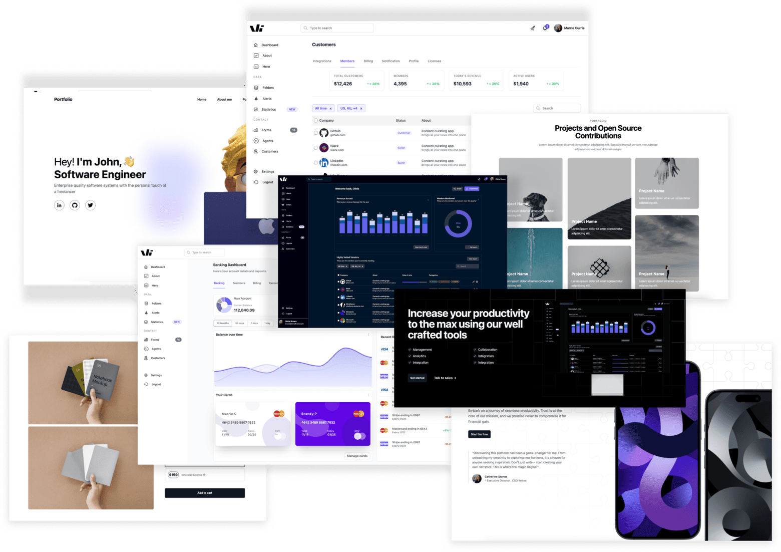
Windframe is an AI visual editor for rapidly building stunning web UIs & websites
Start building stunning web UIs & websites!