How to build tailwind css dashboard with React
By Emmanuel Chinonso - Frontend Engineer and Technical Writer at Windframe

You open a fresh project folder, excited to build a clean admin dashboard for your SaaS tool or internal team app. Ten minutes later you are drowning in custom CSS files, fighting sidebar collapse on mobile, and wondering why your cards look uneven across screen sizes. The worst part? Every tutorial you find either uses heavy frameworks that bloat your bundle or forces you to reinvent the wheel for basic things like tables and charts.
That cycle ends today. With React, Tailwind CSS v4, and the copy-paste magic of shadcn/ui, you can create a fully responsive, dark-mode-ready, professional dashboard in hours instead of weeks. No more guessing at breakpoints. No more wrestling global styles. Everything lives in your components, stays consistent, and scales beautifully from day one.
This guide takes you from zero to a working dashboard you can actually ship. Even if you have never combined React and Tailwind before, every step includes the exact code, why it works, and the small decisions that separate amateur layouts from pro ones. By the end you will have a complete structure you can extend into your own product.
If you are new to Tailwind setup, our internal primer on getting Tailwind running in a modern React app covers the absolute basics.
Why React + Tailwind CSS Is the Perfect Dashboard Stack in 2026
Before writing code, let's understand why this combination became the industry standard for admin panels.
The Problem with Traditional Approaches
CSS Frameworks (Bootstrap, Material-UI):
You get complete components, but customization means fighting the framework. Want your primary button 2px taller? Write CSS overrides. Need custom spacing? More overrides. Eventually you're shipping the entire framework plus custom CSS that contradicts it.
Custom CSS: Total control, but at a cost. You name components (.dashboard-sidebar? .sidebar-nav? .side-navigation?). You organize files. You manage specificity. Simple layout changes ripple through multiple files. Refactoring becomes archaeology.
Inline Styles: Fast to write, but no pseudo-classes, no media queries, no hover states. You hit the wall quickly.
What Tailwind + React Solves
No Context Switching
1// Everything in one file2function Button({ children, variant }) {3 const baseClasses = "px-4 py-2 rounded-lg font-medium transition-colors";4 const variants = {5 primary: "bg-blue-600 text-white hover:bg-blue-700",6 secondary: "bg-gray-200 text-gray-800 hover:bg-gray-300"7 };89 return (10 <button className={` ${baseClasses} ${variants[variant]} `}>11 {children}12 </button>13 );14}
You see the component. You see its styling. You see its logic. No jumping to separate CSS files.
Component-Native
Tailwind utilities map to component props:
1<Button size="lg" variant="primary" rounded="full">2 Click Me3</Button>
Becomes:
1className="px-6 py-3 bg-blue-600 text-white rounded-full"
The mental model is identical.
Consistency by Design
Tailwind's design tokens enforce consistency. text-xl is always the same size. space-y-4 is always 1rem vertical spacing. No more "was that 16px or 18px?"
Production Performance
Tailwind removes unused styles in production builds through its content purge system. Your 3MB development bundle becomes 8KB in production. Only classes you actually use ship to users.
Step 1: Project Setup That Actually Saves Time
Let's build the foundation properly.
Start with Vite. It is faster than Create React App and comes with excellent Tailwind support out of the box.
Run these commands:
1npm create vite@latest my-dashboard -- --template react2cd my-dashboard3npm install
Now install Tailwind CSS v4 (the current version in 2026):
1npm install tailwindcss @tailwindcss/vite
configure the vite.config.ts file with the plugin for Tailwind:
1import { defineConfig } from 'vite'2import react from '@vitejs/plugin-react'3import tailwindcss from "@tailwindcss/vite";45// https://vite.dev/config/6export default defineConfig({7 plugins: [react(), tailwindcss()],8})
Add the Tailwind directives to your src/index.css:
1@import "tailwindcss";
That is it. Run npm run dev and you already have Tailwind working.
Next, add shadcn/ui. This is the part most beginners skip and later regret. Before you do this make sure you have either a jsconfig.json file or tsconfig.json file. Then run
1npx shadcn@latest init
The CLI asks a few questions (choose TypeScript if you want it, default style, etc.). It creates a components/ui folder and a few config files. From this point forward you can add any component with one command:
1npx shadcn@latest add button card table sidebar
Each addition copies clean, customizable code straight into your project. No black-box dependencies.
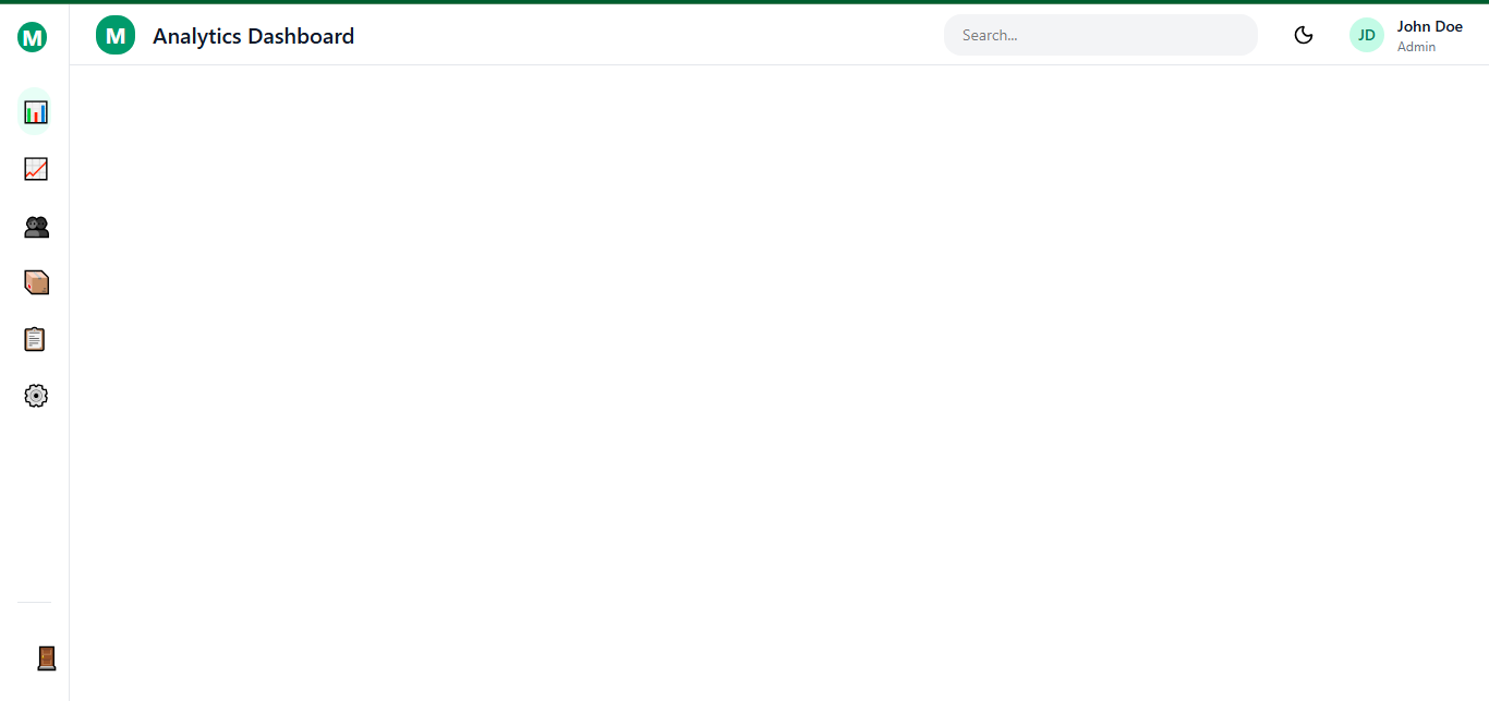
Step 2: Building the Main Layout Structure
Dashboards live and die by their layout. We want a collapsible sidebar, top navbar, and flexible main content area that works on phones, tablets, and large monitors.
Create src/components/layout/DashboardLayout.jsx:
1import { useState } from 'react';2import Sidebar from './Sidebar';3import Navbar from './Navbar';45export default function DashboardLayout({ children }) {6 const [sidebarOpen, setSidebarOpen] = useState(false);78 return (9 <div className="flex h-screen bg-gray-50 dark:bg-slate-950">10 {/* Sidebar */}11 <Sidebar isOpen={sidebarOpen} onClose={() => setSidebarOpen(false)} />1213 {/* Main Content Area */}14 <div className="flex-1 flex flex-col overflow-hidden">15 <Navbar onMenuClick={() => setSidebarOpen(!sidebarOpen)} />1617 <main className="flex-1 overflow-auto p-6 bg-white dark:bg-slate-900">18 {children}19 </main>20 </div>21 </div>22 );23}
The flex h-screen and flex-1 utilities do the heavy lifting. On mobile we toggle the sidebar with a simple state variable.
For the Sidebar component (added via shadcn or built manually), use Tailwind flex and hover states to make navigation feel alive:
1<nav className="w-64 bg-white dark:bg-slate-900 border-r border-gray-200 dark:border-slate-800 h-full p-4">2 <div className="flex items-center gap-3 mb-8">3 <div className="w-8 h-8 bg-emerald-600 rounded-xl"></div>4 <span className="font-semibold text-xl">MyApp</span>5 </div>67 {/* Navigation links with active states */}8 <a href="#" className="flex items-center gap-3 px-4 py-3 rounded-xl bg-emerald-50 dark:bg-emerald-950 text-emerald-600 font-medium">9 Dashboard10 </a>11 {/* more links */}12</nav>
Add responsive collapse by hiding the sidebar on small screens and showing it as an overlay when toggled.
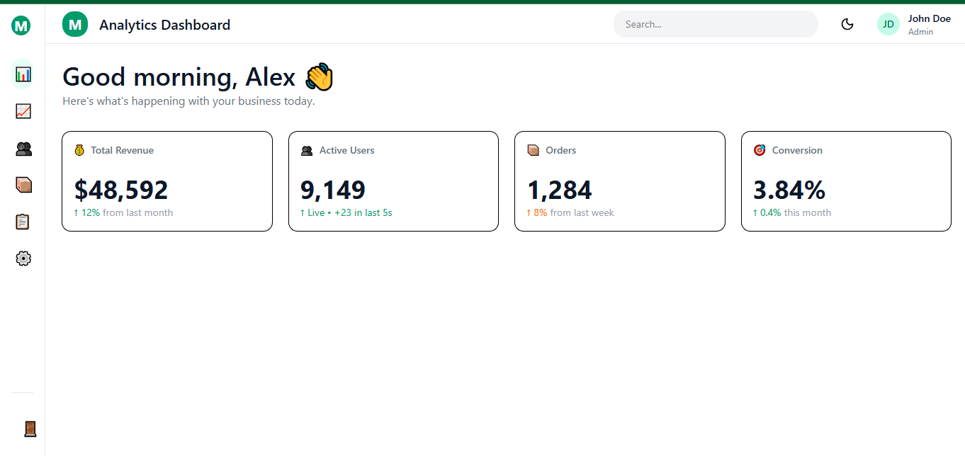
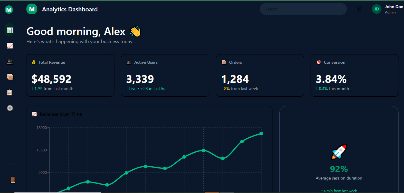
Step 3: Building Beautiful Cards and Metrics
Every dashboard needs KPI cards. shadcn’s Card component plus Tailwind makes them trivial.
1import { Card, CardContent, CardHeader, CardTitle } from '@/components/ui/card';23export default function Metrics() {4 return (5 <div className="grid grid-cols-1 md:grid-cols-2 lg:grid-cols-4 gap-6">6 <Card className="border-0 shadow-sm">7 <CardHeader className="pb-2">8 <CardTitle className="text-sm font-medium text-gray-500 dark:text-gray-400">9 Total Revenue10 </CardTitle>11 </CardHeader>12 <CardContent>13 <p className="text-3xl font-bold">$48,592</p>14 <p className="text-emerald-600 text-sm mt-1">+12% from last month</p>15 </CardContent>16 </Card>1718 {/* repeat for users, orders, etc. */}19 </div>20 );21}
The grid utilities handle responsiveness automatically. On phones the cards stack; on larger screens they sit side by side. Dark mode classes keep everything readable without extra work.
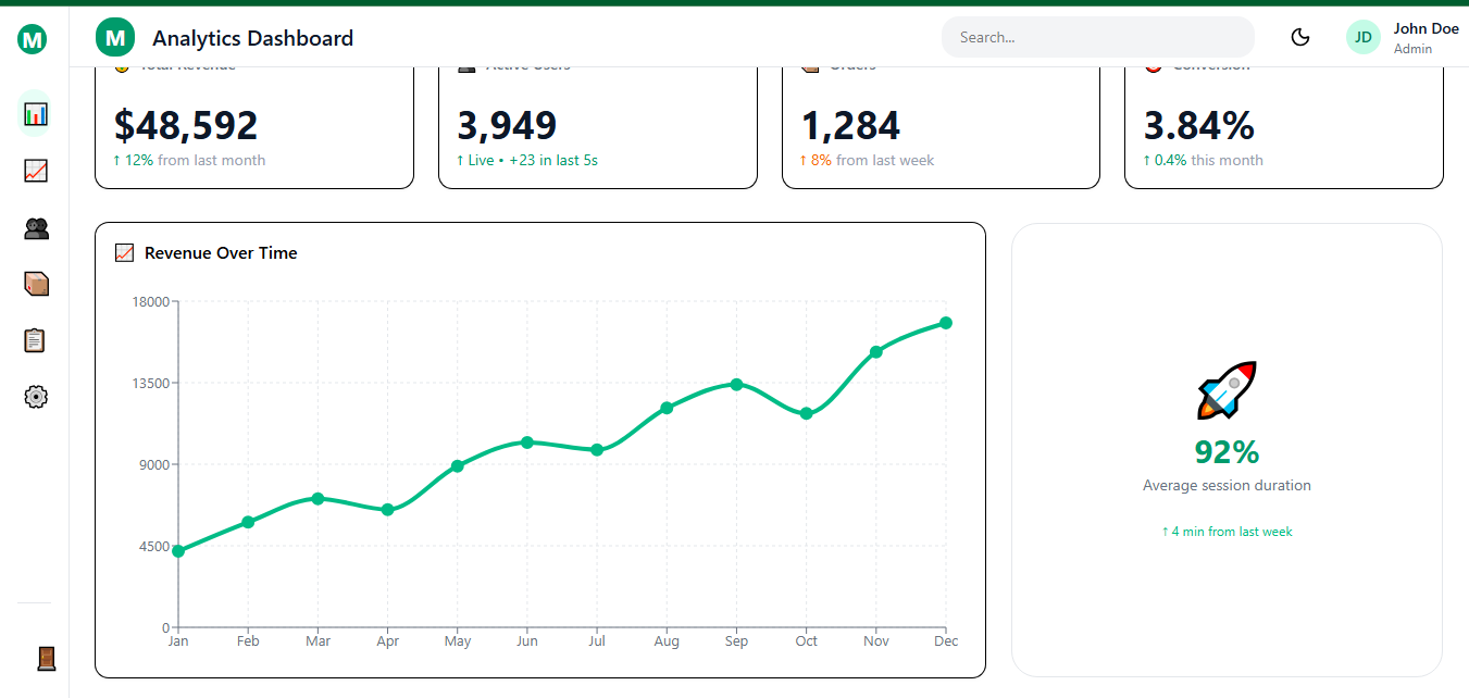
Step 4: Adding Charts Without the Headache
For data visualization, pair Tailwind with Recharts (lightweight) or Tremor (dashboard-specific and beautiful).
Install Recharts:
1npm install recharts
Simple line chart component:
1import { LineChart, Line, XAxis, YAxis, Tooltip, ResponsiveContainer } from 'recharts';23const data = [4 { month: 'Jan', revenue: 4200 },5 { month: 'Feb', revenue: 5800 },6 // more data7];89export default function RevenueChart() {10 return (11 <Card className="col-span-2">12 <CardHeader>13 <CardTitle>Revenue Over Time</CardTitle>14 </CardHeader>15 <CardContent>16 <ResponsiveContainer width="100%" height={300}>17 <LineChart data={data}>18 <XAxis dataKey="month" />19 <YAxis />20 <Tooltip />21 <Line type="monotone" dataKey="revenue" stroke="#10b981" strokeWidth={3} />22 </LineChart>23 </ResponsiveContainer>24 </CardContent>25 </Card>26 );27}
ResponsiveContainer makes the chart adapt to any screen size. Tremor offers pre-styled versions if you want even less work.
Step 5: Tables That Feel Modern
Use shadcn’s Table component for clean, sortable data displays:
1import {2 Table,3 TableBody,4 TableCell,5 TableHead,6 TableHeader,7 TableRow,8} from '@/components/ui/table';910const users = [11 { id: 1, name: 'Sarah Chen', email: 'sarah@example.com', status: 'Active' },12 // more rows13];1415export default function UsersTable() {16 return (17 <Table>18 <TableHeader>19 <TableRow>20 <TableHead>Name</TableHead>21 <TableHead>Email</TableHead>22 <TableHead>Status</TableHead>23 </TableRow>24 </TableHeader>25 <TableBody>26 {users.map(user => (27 <TableRow key={user.id}>28 <TableCell>{user.name}</TableCell>29 <TableCell>{user.email}</TableCell>30 <TableCell>31 <span className="px-3 py-1 bg-emerald-100 dark:bg-emerald-900 text-emerald-700 dark:text-emerald-300 rounded-full text-xs">32 {user.status}33 </span>34 </TableCell>35 </TableRow>36 ))}37 </TableBody>38 </Table>39 );40}
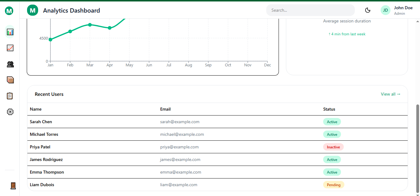
Add pagination or filters later with the same simple patterns.
Step 6: Dark Mode That Just Works
Tailwind’s dark: prefix is all you need once you set darkMode: 'class' in config.
Create a simple theme toggle in the Navbar:
1const [isDark, setIsDark] = useState(false);23useEffect(() => {4 if (isDark) {5 document.documentElement.classList.add('dark');6 localStorage.theme = 'dark';7 } else {8 document.documentElement.classList.remove('dark');9 localStorage.theme = 'light';10 }11}, [isDark]);
One button with sun/moon icons and your entire dashboard flips perfectly. All the components we built earlier already respect the dark variants.
Step 7: Making It Responsive and Mobile-Friendly
Tailwind’s responsive prefixes (sm:, md:, lg:, xl:) handle almost everything:
- Sidebar hides on mobile and becomes a slide-over menu.
- Grid columns change from 1 on phones to 4 on desktops.
- Charts shrink gracefully thanks to ResponsiveContainer.
Test on real devices early. The combination of flex, grid, and Tailwind breakpoints usually gets 95% of the way there with almost no extra code.
Step 8: Adding State Management and Real Data
For a small dashboard, React’s built-in useState and useEffect are enough. For anything larger, add Zustand or TanStack Query.
Example with simple state for a live counter card:
1const [count, setCount] = useState(1248);23useEffect(() => {4 const interval = setInterval(() => setCount(c => c + 23), 5000);5 return () => clearInterval(interval);6}, []);
For real API data, fetch inside useEffect or use a data-fetching library. The dashboard structure stays clean either way.
Step 9: Polish, Accessibility, and Common Pitfalls
Add subtle hover effects with hover:bg-slate-100 dark:hover:bg-slate-800 and transitions with transition-all duration-200.
Accessibility tips that matter:
- Always use semantic headings.
- Add aria-label on icons.
- Ensure focus states are visible (focus-visible:ring-2).
Common mistakes to avoid:
- Mixing layout classes with content classes in the same component.
- Forgetting to wrap charts in ResponsiveContainer.
- Hard-coding pixel widths instead of using Tailwind’s responsive grid.
- Ignoring the max-w-prose or content width utilities for long text sections.
Fix these early and your dashboard will feel production-ready from day one.
Step 10: Deploying and Next Steps
Deploy to Vercel in one click (it handles React + Tailwind perfectly). Connect your GitHub repo and you have previews on every push.
From here you can:
- Add authentication with NextAuth or Clerk.
- Integrate real analytics with Tremor blocks.
- Create multiple dashboard pages with React Router.
- Turn the whole thing into a template you sell or open-source.
Conclusion
You now have everything needed to build production-ready dashboards. The Tailwind + React combination eliminates the friction between design and development. No CSS files. No naming conventions. No fighting specificity. Just components with styling that makes sense. Start with this foundation. Customize colors in tailwind.config.js. Add pages as routes. Build components for your specific needs. The patterns scale from side projects to enterprise dashboards.
Windframe is an AI visual editor for rapidly building stunning web UIs & websites
Start building stunning web UIs & websites!
