DaisyUI vs Shadcn/UI: The Ultimate 2026 Guide to Picking Your Tailwind CSS Component Library
By Emmanuel Chinonso - Frontend Engineer and Technical Writer at Windframe

If you're knee-deep in building web apps and wrestling with UI decisions, you've probably stumbled upon Tailwind CSS. It's a powerhouse for styling, but let's face it, writing every single utility class from scratch can feel like reinventing the wheel. That's where component libraries like DaisyUI and Shadcn/UI come in. Both are built on Tailwind, both promise to speed up your workflow, but they're not twins. One's more like a ready-to-wear outfit, while the other's a customizable sewing kit.
In this deep-dive blog post, we'll unpack everything you need to know about DaisyUI vs Shadcn/UI. I'll break down their features, show you real-world examples, weigh the pros and cons, and help you decide which one fits your project like a glove. Whether you're a solo dev prototyping a side hustle or part of a team scaling a SaaS app, this guide's got you covered. We'll even touch on installation steps, use cases, and tips to avoid common pitfalls. By the end, you'll have a clear path forward—and hey, if you're new to this stuff, I'll explain it all in plain English.
Why this comparison matters in 2026? Well, with Tailwind CSS hitting new heights in adoption, these libraries are evolving fast. DaisyUI just rolled out version 5 betas with better theming, while Shadcn/UI's ecosystem is exploding with community blocks and AI-friendly designs. Let's jump in.
Understanding What These Libraries Actually Are
Before we compare them, let's get crystal clear on what we're talking about. The confusion starts here because DaisyUI and Shadcn/UI aren't even the same type of thing.
What is DaisyUI
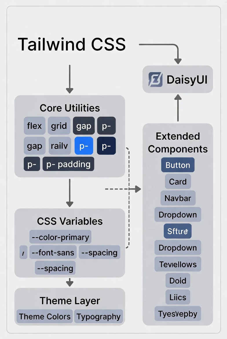
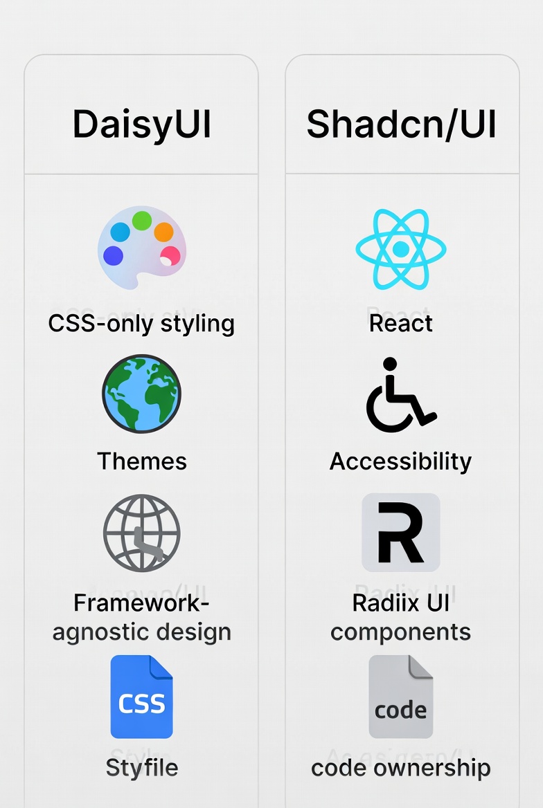
DaisyUI is a plugin for Tailwind CSS. You install it as an npm package, add it to your Tailwind configuration, and suddenly you have access to semantic component classes like btn, card, modal, and alert.
Here's what makes DaisyUI different: it's purely CSS. There's zero JavaScript involved (unless you need interactive components, but that's on you to add). It works with any framework, React, Vue, Svelte, plain HTML, even server-rendered templates. Install it once, and it just works everywhere.
Think of DaisyUI like this: Tailwind gives you individual Lego bricks (utility classes). DaisyUI gives you pre-assembled Lego sets (component classes). You can still use the individual bricks if you want, but now you also have quick shortcuts for common patterns.
Key Features of DaisyUI
-
Semantic Classes: Instead of
<button class="px-4 py-2 bg-blue-500 text-white rounded">, you write<button class="btn btn-primary">. It's shorter, easier to read, and keeps your HTML clean. -
Themes Galore: Out of the box, you get 35+ themes (like "cupcake" for a fun, pastel vibe or "corporate" for sleek business looks). Switching themes? Just add a data attribute like
data-theme="dark". Customization uses CSS variables, so tweaking colors is a breeze. -
Component Library: Over 65 components, from accordions and alerts to carousels and stats. They're all responsive and accessible by default.
-
Framework-Agnostic: Works with React, Vue, Svelte, Angular, or even plain HTML. No lock-in here.
-
Lightweight: The minified CSS is around 20-30KB, depending on your config. It purges unused styles with Tailwind's JIT mode for tiny bundles.
-
Utilities and Variables: Extra helpers like semantic colors (primary, secondary) and utilities for layouts, typography, and more.
How DaisyUI Works Under the Hood
DaisyUI plugs right into your Tailwind config. It extends Tailwind's classes without overriding them, so you can mix and match. For themes, it uses CSS variables like --color-primary: oklch(55% 0.3 240); for modern color spaces that handle light/dark modes seamlessly.1
This means no flashing on theme switches, perfect for user preferences.
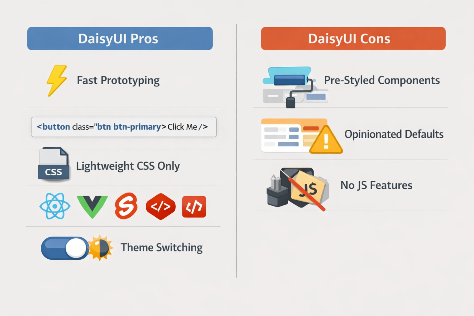
Pros of DaisyUI
-
Speed Demon for Prototyping: If you're building MVPs or simple sites, DaisyUI lets you ship fast. No need to design from zero.
-
Beginner-Friendly: The semantic names make it approachable if you're new to Tailwind. Less cognitive load.
-
Performance Wins: Pure CSS means no JS overhead. Great for static sites or apps where bundle size matters.
-
Community and Adoption: Over 41,000 GitHub stars and 611,000 weekly NPM downloads.2 It's battle-tested in big projects.
-
Easy Customization: Override styles with Tailwind utilities or CSS vars. No fighting the library.
Cons of DaisyUI
-
Opinionated Styling: Components come pre-styled, so if you want something wildly different, you'll spend time undoing defaults.
-
Limited to CSS-Only: No built-in state management or accessibility primitives like ARIA roles in JS-heavy components. Fine for simple UIs, but complex interactions might need extra work.
-
Theme Overload: With so many themes, picking one can feel overwhelming, and custom ones require some CSS know-how.
-
Not Ideal for Heavy JS Apps: If your app relies on React-specific behaviors, you might miss out on headless options.
Real-World Use Cases for DaisyUI
DaisyUI shines in scenarios where speed and simplicity rule. For example:
-
Ecommerce Sites: Use cards for products, buttons for CTAs, and carousels for images. Themes like "business" give a professional polish without custom design work.3
-
Blogs and Portfolios: Quick layouts with typography utilities and responsive grids. Pair it with Nextjs for static generation.
-
Admin Dashboards: Stats components for metrics, tables for data, and modals for forms. It's used in tools like Scalo Startup Template.4
-
SaaS Landing Pages: Breadcrumbs, alerts, and avatars make onboarding flows a snap.
-
Prototyping Tools: Teams at places like Adobe and Google Cloud use similar setups for rapid iterations.5
If you're curious about anti-patterns, avoid over-customizing components early, stick to themes first to keep things maintainable.6
Getting Started with DaisyUI in a Nextjs App
Let's walk through installation. It's straightforward.
-
Create a new Next.js project:
npx create-next-app@latest my-app --ts. -
Install dependencies:
npm i -D tailwindcss @tailwindcss/postcss daisyui@latest. -
Update
tailwind.config.ts:
1import type { Config } from "tailwindcss";2import daisyui from "daisyui";34const config: Config = {5 content: ["./app/**/*.{ts,tsx}"],6 plugins: [daisyui],7};8export default config;
- In
app/globals.css:@import "tailwindcss"; @plugin "daisyui";. - Use it! In a component:
<button className="btn btn-primary">Click Me</button>.
For dark mode, add data-theme="dark" to your root element. Easy peasy.
What is Shadcn/UI? Breaking It Down Simply
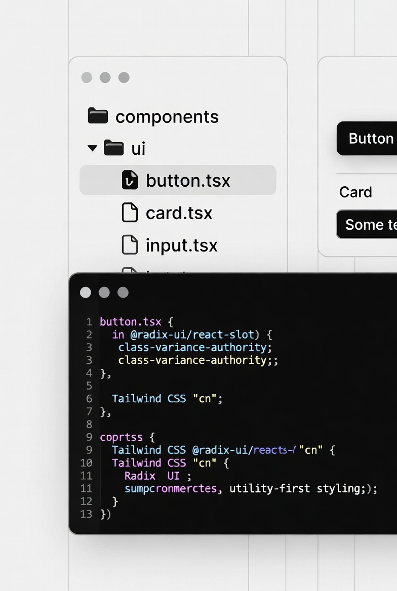
Shadcn/UI is not a library you install in the traditional sense. It's a collection of React components built on top of Radix UI primitives and styled with Tailwind CSS that you copy directly into your codebase.
Read that again: you don't install Shadcn/UI as a dependency. You use its CLI tool to copy component source code into your project. After that, the components are yours. You own them, you maintain them, you modify them however you want.
Shadcn/UI takes a radical approach that turns traditional component libraries on their head. Instead of abstracting components away in node_modules where you can't see or touch them, it puts the actual source code right in your project where you have complete control.
Example of a Shadcn/UI button:
1import { Button } from "@/components/ui/button";23export default function Demo() {4 return <Button>Click Me</Button>;5}
Looks similar to any other component library, right? But the key difference is that @/components/ui/button is a file in YOUR project. Open components/ui/button.tsx, and you'll see the actual TypeScript code that creates the button. Want to change how buttons work? Just edit the file. No fighting with library APIs or waiting for maintainers to accept your feature request.
Key Features of Shadcn/UI
-
Copy-Paste Components: Run npx shadcn@latest add button and boom—code lands in your /components/ui folder. No dependencies beyond Radix and Tailwind.
-
Accessibility First: Radix handles ARIA, keyboard nav, and focus management. Components like dialogs and accordions are WCAG-compliant out of the box.
-
Customization Heaven: Since the code is yours, tweak styles, add props, or compose new ones. Themes via Tailwind config or CSS vars.
-
React-Focused: Best with React/Next.js, but adaptable. Includes hooks for state.
-
Growing Ecosystem: Community blocks, templates, and add-ons like Plate for rich text or Vaul for drawers.7
-
Components List: Around 50+ core ones, buttons, cards, data tables, date pickers, and more. Extendable with third-party registries.
Head to the Shadcn/UI docs for the full lineup.8 Favorites include the command palette and resizable panels.
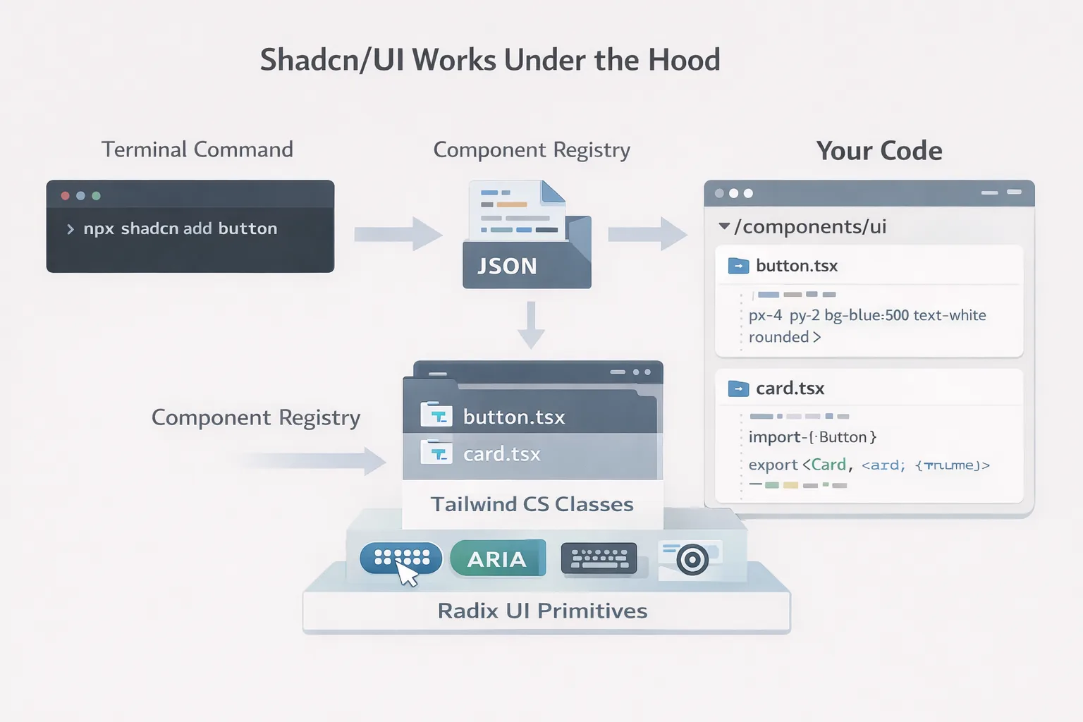
How Shadcn/UI Works Behind the Scenes
It's a CLI tool that fetches components from a registry (JSON-based). Each one is a React component with Tailwind classes and Radix primitives. Radix primitives are production-ready, battle-tested components used by companies like Adobe, Atlassian, and Stripe. They solve the hard problems of building accessible interactive components. No black-box magic, you own the files, so version control is seamless. For themes, update your Tailwind config with custom colors.9 It's AI-friendly too, simple structures make it easy for tools like Copilot to generate UIs.
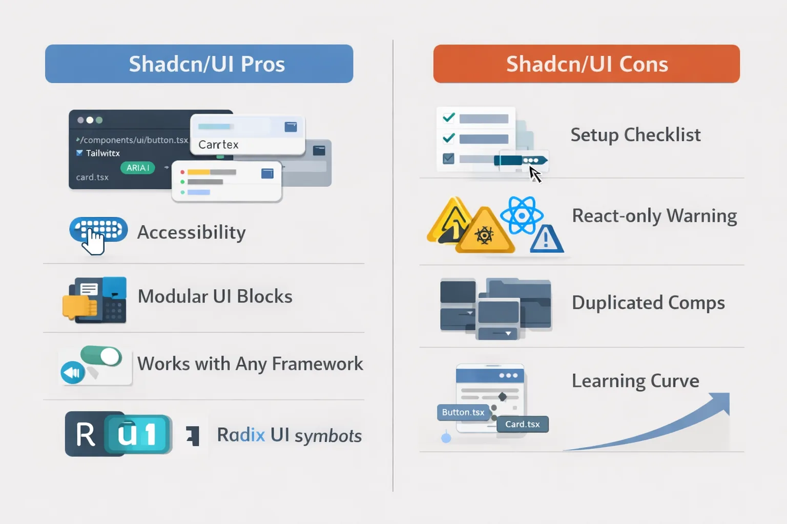
Pros of Shadcn/UI
-
Full Control: Code in your repo means no breaking updates from external deps. Customize endlessly.
-
Accessibility and State Management: Radix provides robust primitives, saving you from rolling your own.
-
Modern Design: Clean, minimalist aesthetics that scale with your brand. Great for dashboards and apps.
-
Community-Driven: Over 107k GitHub stars, with extensions for calendars, chats, and more.10
-
Performance: Lightweight, with lazy loading options. Integrates with Next.js SSR.
Cons of Shadcn/UI
-
React-Only (Mostly): Not framework-agnostic like DaisyUI. Porting to Vue or others takes work.
-
Setup Overhead: CLI adds steps, and managing copied code can lead to duplication if not organized.
-
Less Opinionated: You might spend more time styling from scratch compared to pre-themed options.
-
Learning Curve for Radix: If you're new, understanding headless components adds complexity.
Real-World Use Cases for Shadcn/UI
Shadcn/UI excels in dynamic, interactive apps where control matters.
-
SaaS Dashboards: Data tables, charts, and resizables for analytics. Used in tools like NamasteDev.
-
AI-Powered Interfaces: Chat UIs, forms, and modals integrate well with LLMs.11
-
Ecommerce and Forms: Auto-forms from Zod schemas speed up validation-heavy flows.12
-
Design Systems: Teams at Vercel use it as a base for internal kits.13
-
Prototyping with AI: Its structure plays nice with code gen tools.
Getting Started with Shadcn/UI in a React App
Quick setup:
-
Create a Vite app:
npm create vite@latest my-app -- --template react-ts. -
Install Tailwind: Follow Tailwind docs.
-
Init Shadcn:
npx shadcn@latest init. -
Add a component:
npx shadcn@latest add button. -
Use it:
import { Button } from './components/ui/button'; <Button variant="primary">Click</Button>.
For JS-only (no TS): Edit components.json to set "tsx": false.
Head-to-Head: DaisyUI vs Shadcn/UI Comparison
Now, the meaty part, let's compare them side by side. I'll use data from various sources to keep it factual.
| Feature | DaisyUI | Shadcn/UI |
|---|---|---|
| Core Approach | CSS plugin with semantic classes | CLI-copied React components with Radix primitives |
| Framework Support | Any (HTML, React, Vue, etc.) | Primarily React/Next.js |
| Components Count | 65+ (CSS-based) | 50+ core, plus community (JS-based) |
| Themes | 35+ built-in, CSS var customization | Custom via Tailwind, no pre-built themes |
| Accessibility | Basic (relies on you) | Advanced via Radix (ARIA, keyboard) |
| Size/Efficiency | ~20KB minified CSS | Varies, but code in your app (no extra deps) |
| Customization | Utility overrides, themes | Full code ownership, compose freely |
| Performance | Excellent (no JS) | Good, with optimization potential |
From comparisons, DaisyUI is faster for quick starts, while Shadcn/UI wins for long-term maintainability14
Size and Efficiency
DaisyUI's CSS-only nature keeps bundles tiny, 895 bytes gzipped for basics vs Shadcn's per-component approach. But Shadcn avoids library lock-in, making it efficient for large apps.
Customization and Themes
DaisyUI's themes are plug-and-play: <html data-theme="cupcake">. Shadcn is more manual, extend Tailwind's theme object. DaisyUI feels easier for beginners, Shadcn for pros.
When to Choose DaisyUI
- Small teams or solo devs needing quick wins.
- Multi-framework projects.
- Sites where CSS performance is key.
When to Choose Shadcn/UI
- React-heavy apps with complex interactions.
- Projects requiring deep customization.
- Teams building reusable design systems.
Code Examples: Seeing Them in Action
Let's build a simple card component with both.
DaisyUI Card
1<div class="card w-96 bg-base-100 shadow-xl">2 <figure><img src="image.jpg" alt="Shoes" /></figure>3 <div class="card-body">4 <h2 class="card-title">Shoes!</h2>5 <p>If a dog chews shoes whose shoes does he choose?</p>6 <div class="card-actions justify-end">7 <button class="btn btn-primary">Buy Now</button>8 </div>9 </div>10</div>
Super simple, classes do the heavy lifting.
Shadcn/UI Card
First, add via CLI: npx shadcn@latest add card.tsx
1import {2 Card,3 CardContent,4 CardDescription,5 CardFooter,6 CardHeader,7 CardTitle,8} from "./components/ui/card";910export function MyCard() {11 return (12 <Card className="w-[350px]">13 <CardHeader>14 <CardTitle>Shoes</CardTitle>15 <CardDescription>If a dog chews shoes...</CardDescription>16 </CardHeader>17 <CardContent>18 <img src="image.jpg" alt="Shoes" />19 </CardContent>20 <CardFooter>21 <Button>Buy Now</Button>22 </CardFooter>23 </Card>24 );25}
More composable, with props for variants. Both look great, but Shadcn's is easier to extend with state.
Common Pitfalls and How to Avoid Them
- For DaisyUI: Don't ignore responsive classes, test on mobile early.
- For Shadcn: Organize your /ui folder to avoid mess. Use registries for community components.
Frequently Asked Questions
-
Can I use DaisyUI and Shadcn/UI together? Technically yes, DaisyUI is CSS and Shadcn/UI is React components, so they don't conflict. However, maintaining visual consistency is challenging. Most projects should commit to one approach.
-
Which has better performance? DaisyUI has zero JavaScript overhead, making it lighter for content sites. Shadcn/UI adds JavaScript for interactivity but the overhead is minimal in React applications. Performance difference is negligible for most real-world use cases.
-
Do I need React for Shadcn/UI? Yes, absolutely. Shadcn/UI is built exclusively for React. If you're not using React, DaisyUI is your better option. There are community ports for Vue and Svelte, but they're not officially maintained.
-
Can I customize DaisyUI components extensively? You can customize styling through CSS variables and utility classes, but you can't fundamentally change component architecture. If you need deep structural changes, you'll hit limitations.
-
What happens when Shadcn/UI releases updates? Updates don't automatically apply since you own the code. Check changelogs manually and update components you care about. This is intentional, you control when and what to update.
-
Which has better accessibility? Shadcn/UI has significantly better accessibility for complex components through Radix UI primitives. DaisyUI provides good baseline accessibility but requires manual work for advanced patterns.
-
Can I use these with mobile apps? DaisyUI works with React Native Web if you're using Tailwind with React Native. Shadcn/UI is web-only but works in hybrid apps using web views.
-
Is DaisyUI dying because Shadcn/UI is more popular? No, they serve different audiences. DaisyUI is actively maintained and popular in Vue, Svelte, and full-stack communities. Shadcn/UI's popularity is concentrated in the React ecosystem.
-
Do I need TypeScript for Shadcn/UI? TypeScript is strongly recommended because Shadcn/UI components include TypeScript definitions. You can use JavaScript, but you'll miss autocomplete, type checking, and the full development experience.
-
Which is better for beginners? DaisyUI is more beginner-friendly—it works with HTML and CSS. Shadcn/UI requires React and TypeScript knowledge, which has a steeper learning curve. However, if you already know React, Shadcn/UI isn't difficult.
-
Can I build a design system with either? Yes to both, but Shadcn/UI is better suited for design systems. Since you own the code, you can fork components and build your own system on top. DaisyUI works but you're more constrained by its structure.
-
What about server-side rendering? Both work with SSR. DaisyUI is perfect (zero JS) for SSR. Shadcn/UI works well with Next.js SSR and other React SSR frameworks.
-
How do costs compare? Both are free and MIT licensed. DaisyUI offers paid templates ($19-149) but the library itself is free. Shadcn/UI is entirely free with no paid tiers.
-
Can I migrate between them later? Migrating is possible but expensive. DaisyUI to Shadcn/UI means rewriting HTML to React components. Shadcn/UI to DaisyUI means simplifying components and potentially losing features. Choose carefully upfront.
-
Which should I learn first if I'm new to web development? Learn DaisyUI first. It teaches component thinking without React complexity. Once comfortable, explore Shadcn/UI if you move into React development.
Conclusion
Both DaisyUI and Shadcn/UI are excellent tools created by talented developers who care about their craft. You can build amazing things with either one. The most important thing isn't choosing the "perfect" library, it's starting to build. Analysis paralysis helps no one. Pick one, learn it, and create something great.
Windframe is an AI visual editor for rapidly building stunning web UIs & websites
Start building stunning web UIs & websites!
