How to integrate Tailwind CSS with Svelte
By Emmanuel Chinonso - Frontend Engineer and Technical Writer at Windframe

If you've been tinkering with web development, you might have come across Svelte and Tailwind CSS. They're both fantastic tools on their own, but when you put them together, they make building sleek, responsive websites a whole lot easier and more fun. I remember when I first tried combining them, it felt like unlocking a superpower for quick prototyping without the usual CSS headaches.
In this post, I'm going to break it all down for you, especially if you're just starting out. We'll cover what each one is, why they work so well as a pair, and walk through setups for both plain Svelte and SvelteKit projects. I'll include plenty of code examples, tips from my own experiments, and links to dig deeper. By the end, you'll be ready to create your own custom components that look professional right out of the gate. Let's jump in!
What Makes Svelte So Special?
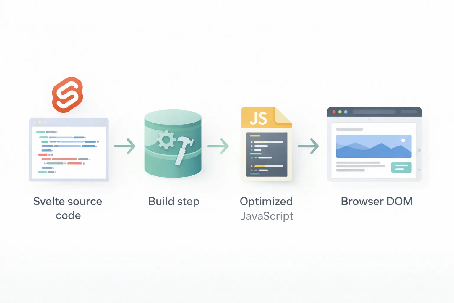
Picture this: You're building a web app, and you want something that's lightweight, fast, and doesn't bog down your users with huge bundles of JavaScript. That's where Svelte shines. It's a component framework that compiles your code into vanilla JavaScript at build time, meaning no runtime overhead like you get with React or Vue.
Svelte was created by Rich Harris back in 2016, and it's gained a ton of fans for its simplicity. Each component is a single file with HTML, JavaScript, and CSS all in one place. For example, a basic counter might look like this:
1<script>2 let count = 0;3 function increment() {4 count += 1;5 }6</script>78<button on:click={increment}>9 Clicks: {count}10</button>1112<style>13 button {14 background: blue;15 color: white;16 padding: 10px;17 }18</style>
See how everything's together? No separate files to juggle. Svelte handles reactivity automatically , when 'count' changes, the DOM updates without you lifting a finger.
But it's not just for small stuff. With SvelteKit, which is like Next.js for Svelte, you can build full sites with routing, server-side rendering, and API routes. It's perfect for blogs, e-commerce, or dashboards.
If you're brand new, head over to the official Svelte tutorial. And for more on why developers love it, check out this comparison I wrote in Svelte vs React: Which to Choose?
One thing to note: Svelte's styling is scoped by default, meaning your CSS only affects that component. That's great for avoiding conflicts, but when we add Tailwind, we'll tweak how styles apply globally or per-component.
Unpacking Tailwind CSS: Utility-First Styling
Now, shift gears to Tailwind CSS. If traditional CSS feels like painting a masterpiece from scratch every time, Tailwind is like having a palette of ready-mixed colors. It's a utility-first framework, which means you style elements by adding classes directly in your HTML, rather than writing custom selectors.
Created by Adam Wathan and friends in 2017, Tailwind gives you classes for everything: margins (like m-4), colors (bg-red-500), flexbox (flex items-center), and more. It encourages composing styles on the fly, leading to faster development and consistent designs.
Here's a quick button example
1<button2 class="bg-blue-500 hover:bg-blue-700 text-white font-bold py-2 px-4 rounded"3>4 Click Me5</button>
No need for a separate stylesheet, it's all inline. But don't worry about bloat; Tailwind purges unused classes during builds, keeping your final CSS tiny.
Tailwind's real power comes from its configurability. You can extend themes with custom colors, fonts, or even plugins for forms and typography. It's responsive out of the box too, with prefixes like md: for medium screens.
Some folks balk at the long class lists, but tools like VS Code extensions make it a breeze with autocompletion. If you want to learn the basics, the Tailwind docs are excellent place.
Why does this matter for Svelte? Tailwind fits perfectly because Svelte components are modular, and utility classes keep things clean without overriding scoped styles.
Why Pair Tailwind CSS with Svelte? The Perfect Match

Combining these two is like peanut butter and jelly, they complement each other beautifully. Svelte handles the logic and structure, while Tailwind takes care of the looks without you writing much CSS.
First off, speed: Both are optimized for performance. Svelte compiles to minimal JS, and Tailwind trims CSS to what's used. Your apps load fast, which is crucial for user experience.
Second, developer happiness: No more context-switching between files. You style right in your markup, and Svelte's reactivity pairs well with Tailwind's hover/focus states.
Third, scalability: For larger projects, Tailwind's consistency prevents style drift, and Svelte's components make reuse easy.
From what I've seen in community forums, many devs use this combo for personal sites or startups. It's also great for prototyping, you can mock up a UI in minutes.
Drawbacks? If you're used to semantic CSS, the utility approach might feel verbose at first. But stick with it, and it'll click.
For real-world inspo, look at sites built with this stack on Showcase Svelte. Or read about benefits in this LogRocket piece here.
Getting Started: Setting Up a Plain Svelte Project with Tailwind
Step 1 — Scaffold a New Svelte + Vite Project
Open your terminal and run:
1npm create vite@latest my-svelte-app
Vite will prompt you to pick a framework and variant. Select Svelte, then choose JavaScript or TypeScript (either works for this guide):
- ✔ Select a framework: › Svelte
- ✔ Select a variant: › JavaScript
Then move into your project and install the default dependencies:
1cd my-svelte-app2npm install
Your project structure will look like this:
1my-svelte-app/2├── public/3├── src/4│ ├── lib/5│ ├── assets/6│ ├── App.svelte ← root component7│ ├── app.css ← global stylesheet8│ └── main.js ← app entry point9├── index.html10├── vite.config.js11└── package.json
Step 2 — Install Tailwind CSS and the Vite Plugin
1npm install tailwindcss @tailwindcss/vite
This installs two things:
tailwindcss— the core framework@tailwindcss/vite— the official Vite plugin that handles the entire integration (no PostCSS setup needed)
Step 3 — Register the Plugin in Vite
Open vite.config.js and add the Tailwind plugin:
1import { defineConfig } from 'vite'2import { svelte } from '@sveltejs/vite-plugin-svelte'3import tailwindcss from '@tailwindcss/vite'45export default defineConfig({6 plugins: [7 tailwindcss(),8 svelte(),9 ],10})
Plugin order matters. Always put tailwindcss() before svelte() so Tailwind processes styles first.
Step 4 — Add Tailwind to Your Global CSS
Open src/app.css and replace everything in it with this one line:
1@import "tailwindcss";
That single line pulls in every layer of Tailwind, base resets, component styles, and all utility classes. No three separate directives like in v3.
Step 5 — Import the CSS in Your Entry Point
Open src/main.js and confirm the CSS import is at the top:
1import './app.css'2import App from './App.svelte'34const app = new App({5 target: document.getElementById('app'),6})78export default app
This tells Vite to load your global stylesheet (and therefore Tailwind) every time the app starts.
Step 6 — Run the Dev Server
1npm run dev
Open http://localhost:5173 in your browser.
Step 7 — Confirm Tailwind Is Working
Open src/App.svelte, clear it out, and add:
1<main class="min-h-screen bg-gray-50 flex items-center justify-center">2 <h1 class="text-4xl font-bold text-blue-600">3 Tailwind CSS is working in Svelte!4 </h1>5</main>
Save the file. If you see large, bold, blue text centered on a light gray background, you're all set.
The One-Command Shortcut
If you'd rather skip the manual wiring, the Svelte CLI can add Tailwind automatically:
1npx sv add tailwindcss
According to the official Svelte CLI docs, this command updates app.css and App.svelte for non-SvelteKit Vite apps, adds the Vite plugin, and integrates with Prettier if you have it. You can also pass plugin flags:
1# Add the Typography plugin2npx sv add tailwindcss="plugins:typography"34# Add the Forms plugin5npx sv add tailwindcss="plugins:forms"
Understanding the manual steps first is valuable, but this shortcut is great for quickly spinning up new projects.
Leveling Up: Integrating Tailwind with SvelteKit
For full apps, SvelteKit is the way to go. It's Svelte's official meta-framework for routing and more.
Step 1: Init the project
1npm create svelte@latest my-kit-app2cd my-kit-app3npm install
The sv CLI walks you through a wizard for TypeScript, ESLint, Prettier, and other options. The defaults are fine.
Step 2: Add Tailwind.
1npm install tailwindcss @tailwindcss/vite
Same packages as the plain Svelte setup.
Step 3: Update vite.config.ts
Open vite.config.ts and add the Tailwind plugin:
1import { sveltekit } from '@sveltejs/kit/vite';2import { defineConfig } from 'vite';3import tailwindcss from '@tailwindcss/vite';45export default defineConfig({6 plugins: [7 tailwindcss(),8 sveltekit(),9 ],10});
Again, tailwindcss() goes before sveltekit().
Step 4: Create src/app.css
1@import "tailwindcss";
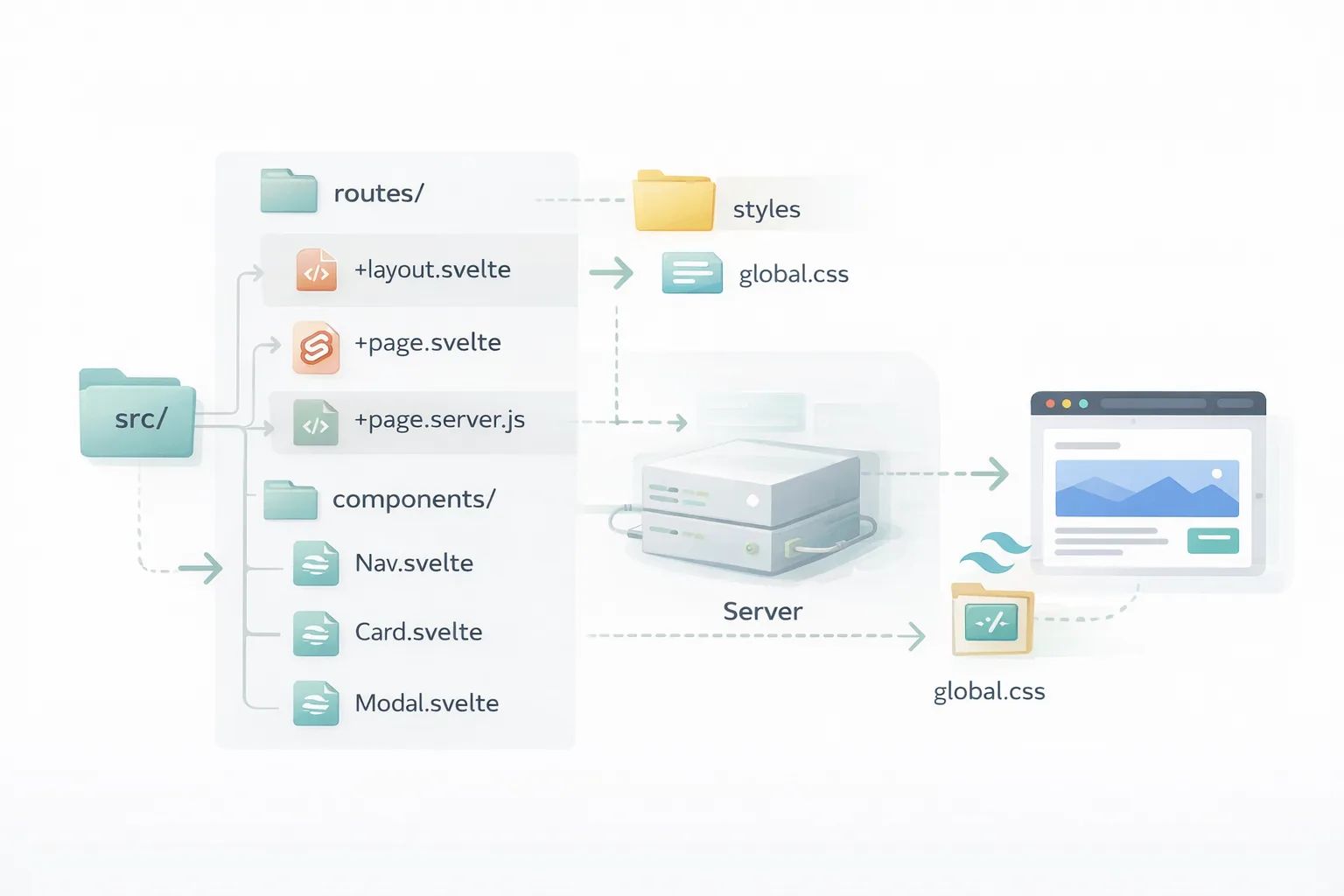
Step 5: Import CSS in the Root Layout
Create or open src/routes/+layout.svelte if not there
1<script>2 let { children } = $props();3 import "../app.css";4</script>56{@render children()}
This layout file wraps every page in the app, so importing the CSS here makes Tailwind available everywhere. This is the key difference from plain Svelte, the entry point is the root layout, not main.js.
Step 6: Start the Dev Server Run
1npm run dev
Open src/routes/+page.svelte and test it:
1<h1 class="text-4xl font-extrabold text-blue-600">SvelteKit + Tailwind Works!</h1>
SvelteKit has a handy adder: npx svelte-add@latest tailwindcss. It automates much of this. For details, visit Tailwind's SvelteKit guide Or this post on Sveltekit project.
Building Your First Custom Component
With setup done, let's make something useful, a card component.
Create src/lib/Card.svelte:
1<script>2 export let title = 'Default Title';3 export let content = 'Some content here.';4</script>56<div class="max-w-sm rounded overflow-hidden shadow-lg bg-white m-4">7 <div class="px-6 py-4">8 <div class="font-bold text-xl mb-2">{title}</div>9 <p class="text-gray-700 text-base">{content}</p>10 </div>11 <div class="px-6 pt-4 pb-2">12 <button class="bg-blue-500 hover:bg-blue-700 text-white font-bold py-2 px-4 rounded">13 Action14 </button>15 </div>16</div>
Import in a page:
1<script>2 import Card from '$lib/Card.svelte';3</script>45<Card title="My First Card" content="This is styled with Tailwind!" />
Boom, a reusable card.
Tailwind classes make it easy to adjust: Add 'hover:scale-105 transition' for effects.
For a gallery like in tutorials, use flex or grid:
1<div class="grid grid-cols-1 md:grid-cols-3 gap-4">2 <img src="image1.jpg" alt="1" class="w-full h-48 object-cover rounded" />3 <!-- more -->4</div>
This is responsive, on medium screens, three columns.1
Mastering Responsive Design
Tailwind excels at responsiveness. Prefix classes with breakpoints: sm, md, lg, xl.
For a navbar:
1<nav class="flex flex-col md:flex-row justify-between items-center p-4 bg-gray-800 text-white">2 <div>Logo</div>3 <ul class="flex flex-col md:flex-row space-y-2 md:space-y-0 md:space-x-4">4 <li>Home</li>5 <li>About</li>6 </ul>7</nav>
On small screens, it's stacked; on medium, side-by-side.
Svelte adds transitions: Wrap in {#if} blocks with transition:fade. Test with browser dev tools, resize and see.
More on this in Tailwind's responsive docs here.
Customizing Themes and Extending Tailwind
Out of the box is fine, but customize! In tailwind.config.js
1theme: {2 extend: {3 colors: {4 primary: '#ff3e00',5 secondary: {6 100: '#fff6f2',7 200: '#ffcfc2',8 }9 },10 fontFamily: {11 sans: ['Inter', 'sans-serif'],12 }13 }14}
Use like 'bg-primary' or 'font-sans'.
For plugins, add @tailwindcss/forms for better inputs.
In Svelte, if using <style lang="postcss">, you can use @apply classes
1<style lang="postcss">2 .btn {3 @apply bg-blue-500 text-white py-2 px-4 rounded hover:bg-blue-700;4 }5</style>
But stick to utilities mostly, it's Tailwind's philosophy. Check Flowbite for pre-built components with Tailwind and Svelte here.
Adding Dark Mode Support
Dark mode is a must these days. Tailwind has 'dark:' variants.
In config:
1darkMode: 'class',
Add 'dark' class to html tag via Svelte store or button toggle.
Example
1<script>2 import { onMount } from 'svelte';3 let darkMode = false;4 onMount(() => {5 if (localStorage.theme === 'dark') darkMode = true;6 });7 $: document.documentElement.classList.toggle('dark', darkMode);8</script>910<div class="bg-white dark:bg-gray-900 text-black dark:text-white">11 Content12</div>
Styles switch automatically.
Best Practices for Clean Code
- Keep components small.
- Use aliases like $lib for imports in SvelteKit.
- Purge properly to minimize CSS size.
- Lint with Prettier and Tailwind plugin.
- Accessibility: Use semantic HTML, add aria labels.
Avoid over-nesting classes; group with 'group' for hovers. For optimization, see Tailwind's production guide here.
Troubleshooting Common Hitches
-
Classes not applying? Check purge paths include your files.
-
No styles? Ensure import in layout.
-
SvelteKit errors? Update dependencies.
-
Community help on Reddit's r/sveltejs here.
Project Ideas to Practice
- Build a todo app with styled lists.
- A portfolio site using cards and grids.
- An e-commerce mockup with responsive products.
- Watch this YouTube tutorial for a portfolio build here.
Wrapping It Up
Whew, we've covered a lot! From basics to advanced tweaks, integrating Tailwind with Svelte opens up endless possibilities for beautiful apps. Give it a try on your next project, you'll love the workflow.
Windframe is an AI visual editor for rapidly building stunning web UIs & websites
Start building stunning web UIs & websites!
