How to Create Responsive Web Designs 10x Faster with AI Generators
By Emmanuel Chinonso - Frontend Engineer and Technical Writer at Windframe
Your website needs to look good whether someone opens it on a big desktop monitor, a tablet on the couch, or a phone while waiting in line. That’s what responsive web design is all about—layouts that automatically adjust to any screen size, fonts that stay readable, images that resize nicely, and buttons that are easy to tap.Doing all that manually used to take hours or even days. You’d write CSS media queries, test on different devices, tweak padding, rearrange columns, and hope nothing breaks.
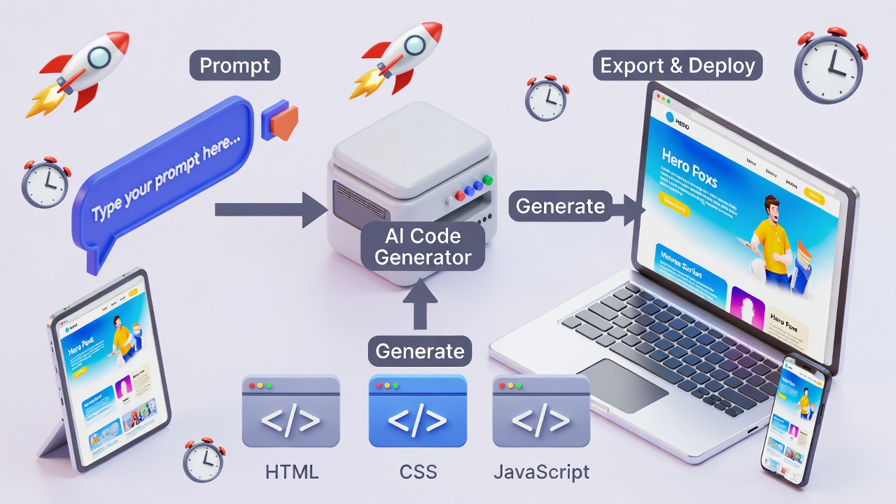
Today, AI generators can handle most of that heavy lifting from a simple text description. This shift is part of a much broader trend of using AI in modern web development to speed up design, coding, and deployment. You describe what you want (“a clean landing page for a coffee shop with mobile-friendly navigation”), and the AI produces responsive HTML, Tailwind CSS, or React code in seconds.
This guide is written for complete beginners, no design or coding experience required. We’ll start with the basics of responsive design, explore the best AI tools available in 2026, walk through exact steps to use them, share prompt tips that actually work, and cover how to turn AI output into a polished, production-ready website.
Why Responsive Design Matters More Than Ever
People browse websites on all kinds of devices. Google prioritizes mobile-friendly sites in search results. If your site looks broken on a phone, visitors leave quickly, and your rankings suffer.Traditional responsive design involves:
- Flexible grids (using CSS Grid or Flexbox)
- Media queries (@media screen and (max-width: 768px))
- Responsive images (srcset, sizes)
- Viewport meta tag
- Testing on real devices
AI tools skip most of this manual work. They generate code that already includes proper breakpoints, flexible layouts, and mobile-first styling.
Top AI Generators for Responsive Web Design in 2026
Many of these platforms also appear in broader roundups of the best AI-powered tools for building projects faster across design and development.
Here are the tools that consistently deliver fast, responsive results:
-
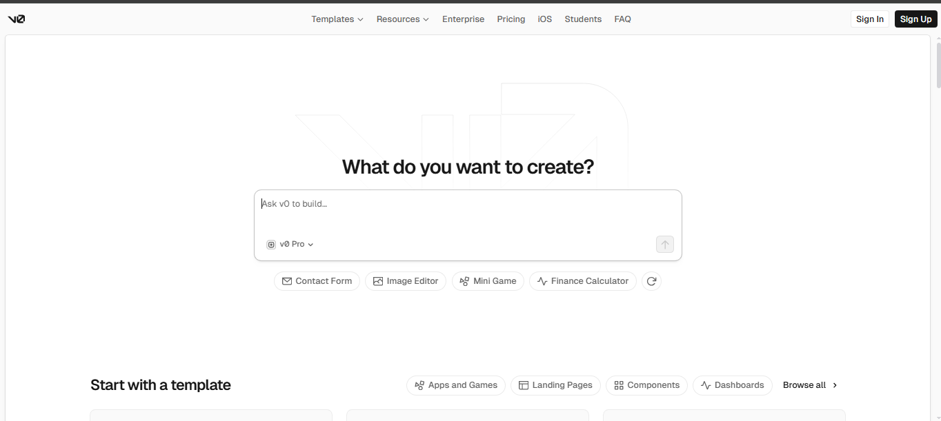
v0 by Vercel – Best for developers and clean code output. Start by visiting the Vo website. It generates high-quality React + Tailwind code that’s responsive by default.
-
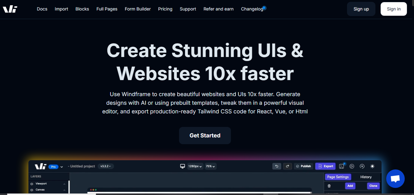
Windframe AI – Excellent for Tailwind CSS users wanting quick prototypes Visit Windframe AI when you need an AI-powered visual builder to generate and edit responsive Tailwind CSS templates or full pages.
-
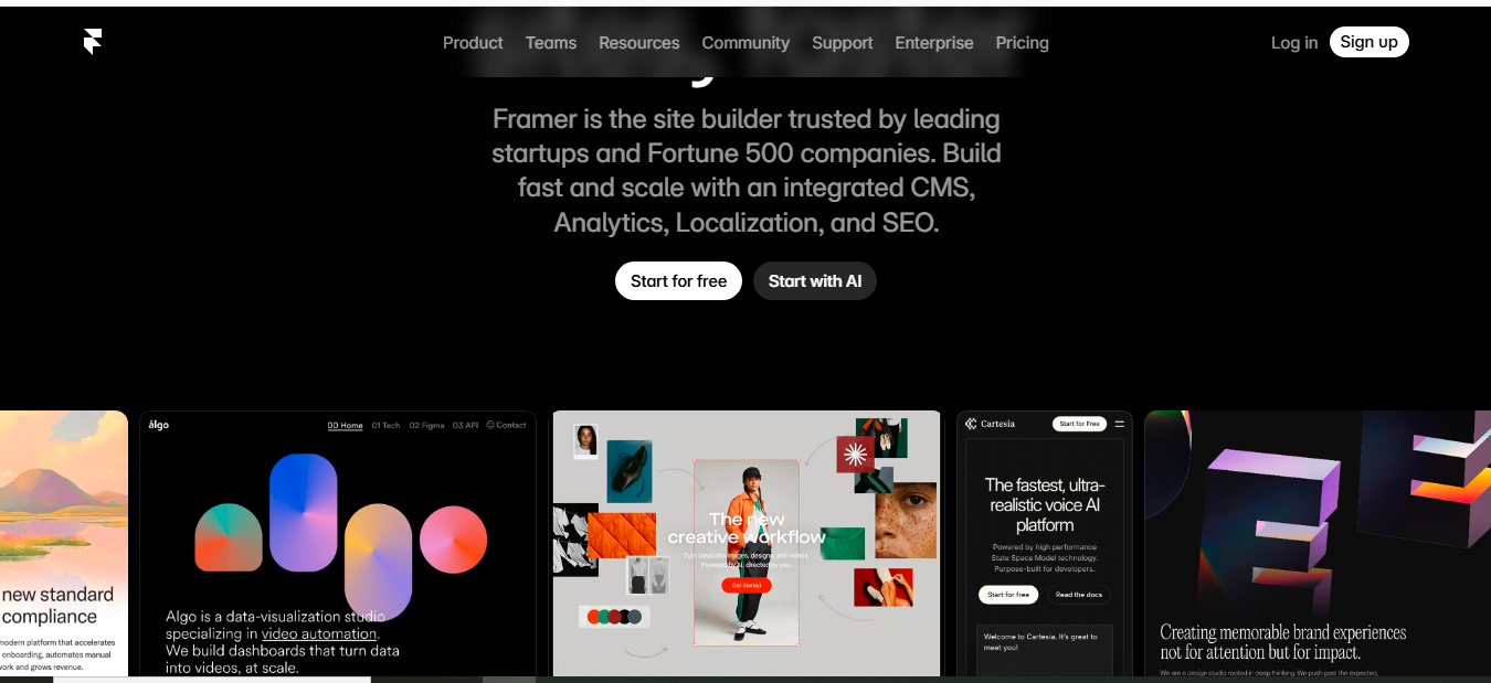
Framer AI – Great for designers who want beautiful animations Visit Framer AI to create animated, responsive sites with smooth interactions.
-
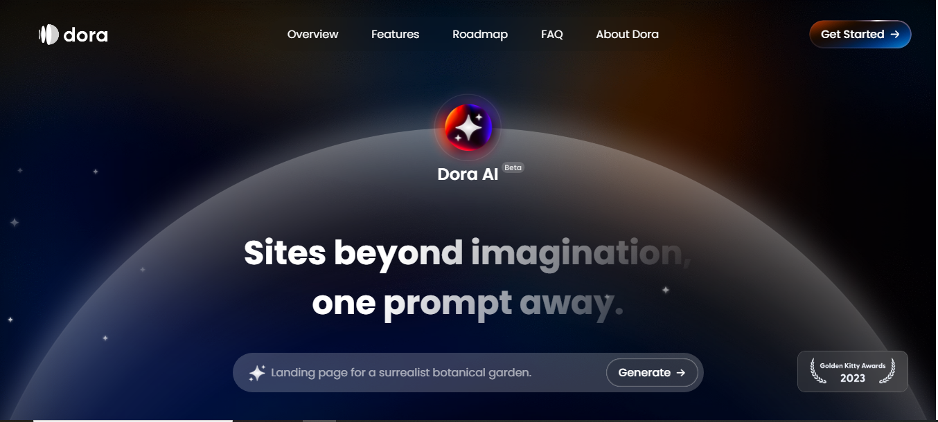
Dora AI – Excellent for creative, 3D-style responsive sites Head to Dora AI when you want visually striking, interactive pages.
-
Galileo AI – Strong at turning text or sketches into responsive designs Try Galileo AI for multiple design variations from one prompt.
-
Wix ADI / Hostinger AI Builder – Best no-code options for non-technical users
We’ll focus on the first five because they produce exportable code you can host anywhere.
Step-by-Step: Using v0.dev to Build Responsive Designs
v0 is one of the fastest ways to get production-quality, responsive React + Tailwind code.
Getting Started:
- Go to v0.dev
- Sign in with GitHub or email
- Choose “Start from scratch” or “Generate UI”
Simple First Prompt: “Create a responsive landing page for a local bakery. Include a hero section with image, navigation bar, featured products grid, and footer. Make it mobile-friendly with a hamburger menu.”
v0 will generate a full page using shadcn/ui components and Tailwind CSS. The output is fully responsive by default, stacks vertically on mobile, shows side-by-side on desktop.
Editing the Output:
- Click any section to regenerate just that part
- Use the chat sidebar: “Make the product cards 2 columns on tablet, 3 on desktop”
- “Add a mobile bottom navigation bar”
- “Change the color scheme to warm tones”
Export Options:
- Copy the React code
- Download as a Next.js project
- Connect directly to Vercel for instant deployment (see Vercel’s full documentation)
Pro Tip: After generation, copy the code into Cursor or VS Code + GitHub Copilot for further refinements.
Using Windframe AI for Tailwind-Focused Responsive Designs
Windframe AI is a solid choice if you're working with Tailwind CSS and want to build responsive prototypes quickly. If your goal is a marketing or product page, you can also follow a step-by-step guide on how to build a landing page using Windframe. It lets you generate designs with AI, then tweak them in a visual editor before exporting clean code.
Getting Started:
- Go to Windframe AI
- Sign up with email or GitHub
- Choose "Generate with AI" or start from a prebuilt template
Simple First Prompt: “Generate a responsive dashboard for a fitness app with sidebar navigation, progress charts, and a mobile-friendly layout that collapses the sidebar on small screens.”
Windframe will create a Tailwind CSS-based design that's already responsive, using flexible grids and media queries under the hood.
Editing the Output:
- Use the drag-and-drop visual editor to rearrange elements, adjust padding, or add components
- Preview on different device sizes (mobile, tablet, desktop) right in the tool
- Follow up with prompts like “Make the charts stack vertically on mobile” or “Add a dark mode toggle”
Export Options:
- Copy the Tailwind CSS and HTML code or either in react, vue code.
- Download as a full project folder
- Integrate with your existing codebase or deploy to platforms like Vercel or Netlify
Windframe speeds things up by handling the initial layout and responsiveness, leaving you to focus on custom tweaks.
Using Framer AI for Designer-Friendly Responsive Sites
Framer AI shines when you want motion and interactions.
Steps:
-
Go to Framer AI
-
Describe your site: “Modern portfolio website for a photographer, dark theme, responsive grid gallery, smooth scroll animations, mobile navigation”
-
Framer generates a fully editable site in its visual editor
-
All layouts are automatically responsive
-
Adjust breakpoints visually (Desktop, Tablet, Mobile views)
Key Advantages:
- Real-time preview on different device sizes
- Built-in responsive components (auto-layout)
- Easy to add hover effects, scroll animations, and page transitions
- Export clean HTML/CSS or publish directly on Framer
Dora AI: Creative Responsive Websites
Dora is ideal if you want something visually striking.
How to Use:
-
Visit Dora AI
-
Type a prompt like “Responsive one-page site for a yoga studio with calming colors, hero video background, schedule section, and mobile-optimized booking form”
-
Dora generates a 3D-style, interactive, responsive page
-
Edit sections, change layouts, adjust responsiveness
-
Dora outputs clean HTML/CSS/JS that you can export and host on Netlify or Vercel.
Galileo AI: From Idea to Responsive Design
Galileo excels at understanding context.
Workflow:
- Prompt: “SaaS dashboard for task management app, light mode, responsive sidebar, mobile hamburger menu, clean data tables”
- Go to Galileo AI
- Galileo generates multiple design variations
- Pick one, then refine with follow-up prompts
- Export as Figma file or code (React/Tailwind)
Writing Better Prompts for Responsive Results
The quality of your prompt determines everything. Good prompts include:
- Purpose of the site
- Target audience
- Key sections
- Desired style and colors
- Specific responsive behavior
Strong Prompt Examples:
-
“Create a responsive e-commerce product page for wireless headphones. Hero with image gallery, specs table, add-to-cart button. Mobile: stack vertically, show one image at a time. Desktop: side-by-side images and details.”
-
“Modern responsive blog homepage with sticky navigation, featured article hero, 3-column grid on desktop that becomes single column on mobile, newsletter signup at bottom.”
-
“Dashboard layout with left sidebar navigation, top header with search and user profile, main content area with cards. Ensure sidebar collapses to hamburger menu on screens under 768px.”
Add constraints: “Use Tailwind CSS”, “Make it accessible with proper contrast”, “Include dark mode toggle”.
Best Practices for Faster Responsive Design with AI
- Start mobile-first in your prompts (“design mobile-first”)
- Always test the generated design in browser DevTools (toggle device toolbar)
- Use consistent component libraries (shadcn/ui, Radix, Tailwind)
- Generate sections separately rather than full pages at once
- Combine tools: Generate layout in v0 → refine animations in Framer
- Version control your code (Git) so you can revert bad AI suggestions
- Add your own custom CSS for fine-tuning
Common Challenges and How to Fix Them
- AI sometimes ignores mobile layouts → explicitly mention breakpoints and stacking order in prompts
- Generated code can be bloated → ask for “clean, minimal code” and remove unused imports manually
- Accessibility issues → follow up with “add proper ARIA labels, alt text, and keyboard navigation”
- Inconsistent styling → generate a style guide first (“create a Tailwind config with brand colors”), then reference it
Real-World Example: Building a Responsive Portfolio Site
I helped a friend (freelance illustrator) build her portfolio.
Prompt in v0: “Responsive portfolio site for children’s book illustrator. Hero with illustration background, about section, gallery grid that shows 1 column on mobile 3 on desktop, contact form, footer with social links.”
Generated a beautiful responsive layout in under 2 minutes. She spent 30 more minutes tweaking colors and replacing placeholder images. Total time: less than 1 hour instead of the usual 2–3 days.
Deployed to Vercel → live in minutes.
Tools Comparison
| Tools | Best For | Code Export | Learning Curve | Pricing |
|---|---|---|---|---|
| v0.dev | Clean code, developers | React + Tailwind | Low-Medium | Free tier + paid |
| Windframe AI | Tailwind prototypes | Tailwind CSS/HTML + React + Vue | Low | Free tier + paid |
| Framer AI | Animated, beautiful sites | Framer / HTML | Low | Free tier + paid |
| Dora AI | Creative 3D sites | HTML/CSS/JS | Low | Paid |
| Galileo AI | Design variations | Figma + code | Medium | Paid |
| Wix ADI | Complete beginners | No-code | Very Low | Subscription |
Conclusion
AI generators have completely changed how we create responsive web designs. What used to take days of CSS work can now be done in minutes with a good prompt followed by light editing. Start with v0.dev or Framer AI, practice writing clear prompts, and always test on real devices.The key is using AI as a powerful assistant rather than expecting perfection on the first try. Combine its speed with your own judgment, and you’ll build better responsive websites faster than ever.
FAQs
Do I need coding skills? Not really. Tools like Wix ADI and Framer let you publish without code. v0 requires basic understanding of React if you want to customize heavily.
Are AI-generated sites mobile-friendly by default? Most are, but always test and refine with specific mobile instructions.
Can I use the generated code commercially? Yes for most tools (check each tool’s license).
How much does it cost? Many have generous free tiers. Paid plans start around $10–20/month for heavy use.
Windframe is an AI visual editor for rapidly building stunning web UIs & websites
Start building stunning web UIs & websites!
