What is Tailwind CSS
By Emmanuel Chinonso - Frontend Engineer and Technical Writer at Windframe

If you’ve searched for modern ways to style web projects, you’ve probably come across Tailwind CSS. At first glance, it might look like just another CSS framework but it’s very different from frameworks like Bootstrap or Foundation. Tailwind CSS is a utility-first CSS framework that gives you low-level building blocks instead of pre-designed components.
That’s the key distinction: Tailwind CSS doesn’t tell you how your UI should look. It gives you the tools to make it look exactly how you want.
The Core Idea Behind Tailwind CSS
Traditional frameworks often ship with pre-built buttons, navbars, grids, and modals. They’re fast to start with, but everything ends up looking the same unless you heavily customize. Tailwind flips the approach: instead of ready-made components, it provides single-purpose utility classes like:
1<div class="p-6 bg-blue-500 text-white rounded-lg shadow-md">2 Hello, Tailwind3</div>
-
p-6→ padding -
bg-blue-500→ background color -
text-white→ text color -
rounded-lg→ border radius -
shadow-md→ shadow size
Each class handles exactly one style. You compose them like Lego bricks. This keeps your HTML expressive while reducing the need to constantly bounce between HTML and CSS files.
Why Developers Actually Like Tailwind
If you’ve ever maintained a large CSS file, you know the pain: naming conventions, fighting cascade issues, and unused classes piling up. Tailwind addresses this by keeping styles close to the markup. Developers don’t have to come up with new class names like btn-primary-large, you just combine utilities.
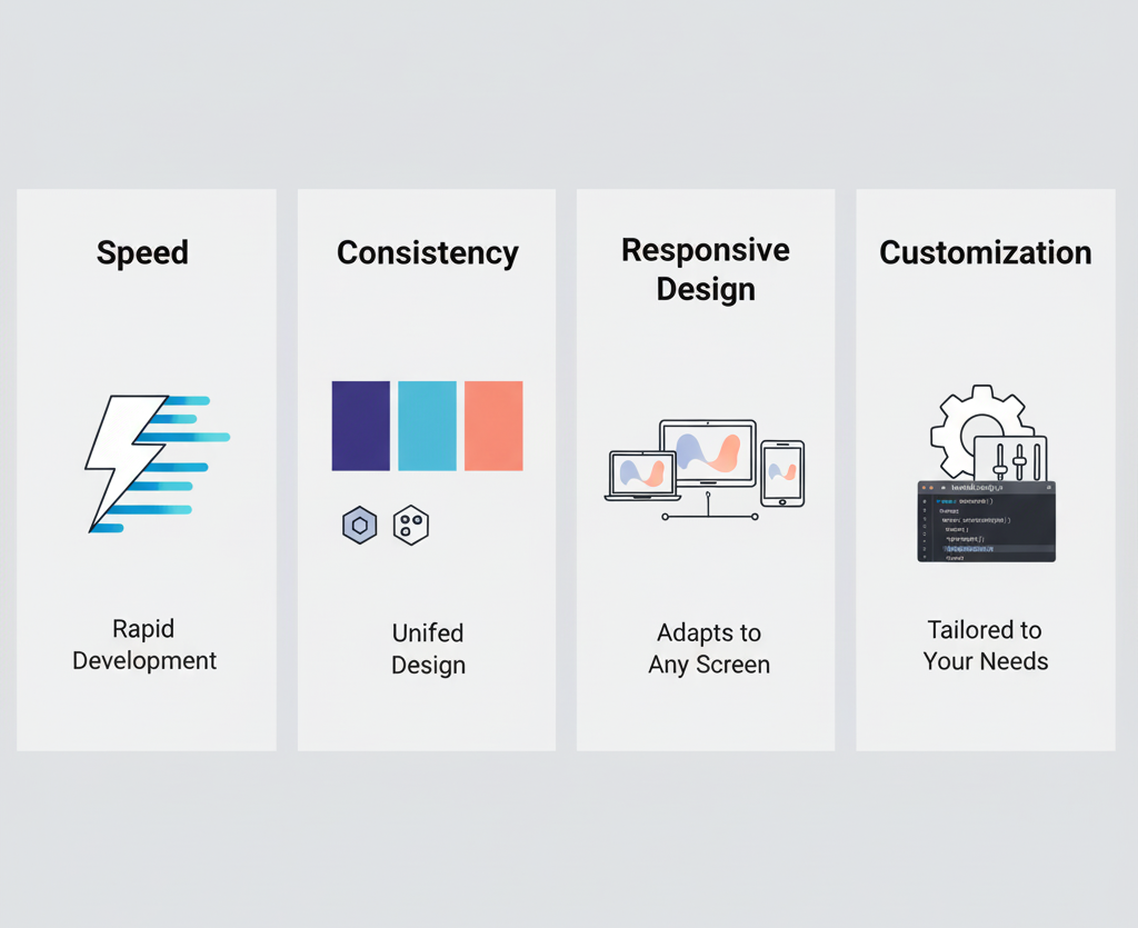
A few benefits that stand out in real projects:
-
Speed– You can design directly in your markup. No need to constantly jump between CSS and HTML.
-
Consistency – Tailwind enforces a design system with its scale of colors, spacing, and typography.
-
Maintainability – Unused styles get purged in production builds, keeping your CSS file tiny.
-
Customization – Everything is configurable in tailwind.config.js, from color palettes to breakpoints.
Tailwind CSS in Action
Let’s say you’re building a responsive card component. In raw CSS, you’d probably write selectors, media queries, and utility classes. With Tailwind, it looks like this:
1<div class="max-w-sm mx-auto bg-white rounded-xl shadow-lg overflow-hidden md:max-w-2xl">2 <div class="md:flex">3 <div class="md:shrink-0">4 <img class="h-48 w-full object-cover md:h-full md:w-48" src="/img/mountains.jpg" alt="Mountains">5 </div>6 <div class="p-8">7 <div class="uppercase tracking-wide text-sm text-indigo-500 font-semibold">Case Study</div>8 <a href="#" class="block mt-1 text-lg leading-tight font-medium text-black hover:underline">9 Finding calm in design10 </a>11 <p class="mt-2 text-slate-500">Using Tailwind CSS utilities, you can rapidly build layouts that respond beautifully to different screens.</p>12 </div>13 </div>14</div>
Notice a few things:
-
Responsive design is built right in (
md:flex,md:w-48), and for more complex layouts, Tailwind’s CSS Grid utilities give you even more control. -
Typography and spacing are consistent with the design system.
-
You can preview and tweak styles immediately without touching a stylesheet.
When Tailwind CSS Really Shines
It’s not magic, and it’s not perfect for every scenario. But Tailwind excels when:
-
You’re building custom UIs where you don’t want the “Bootstrap look.”
-
You care about responsive design and need fine-grained control without writing dozens of media queries.
-
You’re working in a team, and everyone needs to stick to the same design tokens.
-
You want production CSS that stays lean, often under 10kb after purging.
On the other hand, if your project is extremely small and doesn’t need much styling, plain CSS or a simpler utility file might be enough. Tailwind’s real payoff shows up in projects that grow.
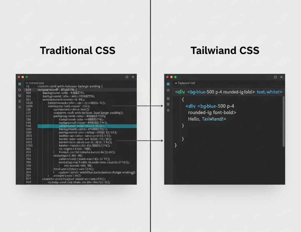
Tailwind CSS vs Traditional CSS Frameworks
It’s tempting to compare Tailwind CSS directly to Bootstrap, but they’re built on different philosophies. Bootstrap says, “Here’s a button, here’s a grid, start coding.” Tailwind says, “Here are the raw materials, build your button however you want.”
With Bootstrap, customization often means overriding default styles. With Tailwind, customization is the default. That’s why designers love it as much as developers: you’re not boxed into someone else’s design system.
The Tailwind CSS Ecosystem
Tailwind isn’t just a set of classes anymore. The ecosystem has expanded:
-
Tailwind UI – A paid library of polished, production-ready components.
-
Headless UI – Free, accessible components for dropdowns, modals, and menus (unstyled but powered with logic).
-
Plugins – For typography, forms, aspect ratio, and more.
This ecosystem is part of why Tailwind has become a staple in modern front-end workflows.
Getting Started with Tailwind CSS
Tailwind CSS has become a staple in modern frontend workflows, especially in React-based frameworks like Next.js, where it pairs naturally with component-driven development.
The simplest way to try Tailwind is via CDN:
1<link href="https://cdn.tailwindcss.com" rel="stylesheet">
But for real projects, you'll want to install it properly with npm, especially if you're using frameworks like Vue, where a proper Tailwind CSS setup is essential. The same applies to backend-driven stacks like Laravel, where Tailwind integrates cleanly into modern Blade-based workflows.
1npm install -D tailwindcss postcss autoprefixer
1npx tailwindcss init
Then configure it in your tailwind.config.js and set up PostCSS. This gives you full access to purging, customization, and plugins.
Conclusion
So, what is Tailwind CSS? It’s a utility-first CSS framework that shifts how developers and designers think about styling. Instead of shipping pre-built UI, it hands you a toolkit to craft exactly what you need, fast, consistent, and maintainable.
If you’re tired of fighting CSS files or bending frameworks to your will, Tailwind CSS might feel like a breath of fresh air. It doesn’t do the design work for you, but it makes doing that work a lot more enjoyable.
Windframe is an AI visual editor for rapidly building stunning web UIs & websites
Start building stunning web UIs & websites!
