How to Implement a React Step Progress Bar Using Tailwind CSS.
By Emmanuel Ovuoba - Product Engineer at Windframe

Introduction
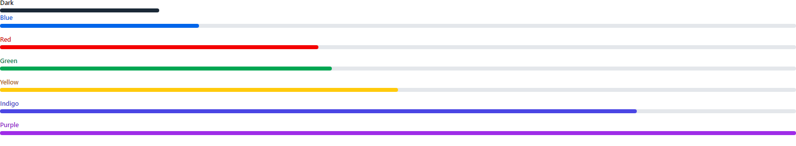
If you’re looking for a way to track user progress through a process, one of the best options is to create a step progress bar. Step progress bars provide a visual representation of how far along a user is in a process, such as filling out a form or completing a task. With Tailwind CSS, you can easily create a React step progress bar that’s visually appealing and easy to customize. We are going to build a progress bar here as an example. Our tailwind progress bar will look like the image below
 .
.
Setting up the Application
To get started, we need to create a new React project using Create React App. Open your terminal and run the following command:
1npx create-react-app progress-bar
Once the project is created, navigate to the project directory and install the Tailwind CSS dependencies:
1cd my-app2npm install tailwindcss postcss-cli autoprefixer
Next, create a new configuration file for Tailwind CSS
1npx tailwindcss init
This will create a tailwind.config.js file in your project directory.
Configure Tailwind CSS
Open the tailwind.config.js file and add the following code to it:
1module.exports = {2 purge: ["./src/**/*.{js,jsx,ts,tsx}", "./public/index.html"],3 darkMode: false,4 theme: {5 extend: {},6 },7 variants: {8 extend: {},9 },10 plugins: [],11};
This code sets up Tailwind CSS to purge unused styles in production, defines a light theme, and configures variants and plugins.
Creating the Progress Bar
We are now ready to build our application. First, we have to create the component for the progress bar.
1const ProgressBar = () => {2 return (3 <div>4 <div className="mb-1 text-base font-medium dark:text-white">Dark</div>5 <div clasName="w-full bg-gray-200 rounded-full h-2.5 mb-4 dark:bg-gray-700">6 <div className="bg-gray-800 h-2.5 rounded-full dark:bg-gray-300 w-1/5"></div>7 </div>8 <div className="mb-1 text-base font-medium text-blue-700 dark:text-blue-500">9 Blue10 </div>11 <div className="w-full bg-gray-200 rounded-full h-2.5 mb-4 dark:bg-gray-700">12 <div className="bg-blue-600 h-2.5 rounded-full w-1/4"></div>13 </div>14 <div className="mb-1 text-base font-medium text-red-700 dark:text-red-500">15 Red16 </div>17 <div className="w-full bg-gray-200 rounded-full h-2.5 mb-4 dark:bg-gray-700">18 <div className="bg-red-600 h-2.5 rounded-full dark:bg-red-500 w-2/5"></div>19 </div>20 <div className="mb-1 text-base font-medium text-green-700 dark:text-green-500">21 Green22 </div>23 <div className="w-full bg-gray-200 rounded-full h-2.5 mb-4 dark:bg-gray-700">24 <div className="bg-green-600 h-2.5 rounded-full dark:bg-green-500 w-5/12"></div>25 </div>26 <div className="mb-1 text-base font-medium text-yellow-700 dark:text-yellow-500">27 Yellow28 </div>29 <div className="w-full bg-gray-200 rounded-full h-2.5 mb-4 dark:bg-gray-700">30 <div className="bg-yellow-400 h-2.5 rounded-full w-2/4"></div>31 </div>32 <div className="mb-1 text-base font-medium text-indigo-700 dark:text-indigo-500">33 Indigo34 </div>35 <div className="w-full bg-gray-200 rounded-full h-2.5 mb-4 dark:bg-gray-700">36 <div className="bg-indigo-600 h-2.5 rounded-full dark:bg-indigo-500 w-4/5"></div>37 </div>38 <div className="mb-1 text-base font-medium text-purple-700 dark:text-purple-500">39 Purple40 </div>41 <div className="w-full bg-gray-200 rounded-full h-2.5 dark:bg-gray-700">42 <div className="bg-purple-600 h-2.5 rounded-full dark:bg-purple-500 w-5/5"></div>43 </div>44 </div>45 );46};4748export default ProgressBar;
Rendering the progress bar
Now that we have the components built up with the Tailwind css classes. The next step is to render the progress bar on our application. here is the code to render it to your application
1import React from "react";2import ReactDOM from "react-dom/client";3import "./index.css";4import ProgressBar from "./ProgressBar";56const root = ReactDOM.createRoot(document.getElementById("root"));7root.render(8 <React.StrictMode>9 <ProgressBar />10 </React.StrictMode>11);
our application should look like the image below.
.
Conclusion
Creating a step progress bar in React and Tailwind CSS is a great way to visually track the progress of a user in a multi-step process. This tutorial showed you how to create a step progress bar that is easily customizable, and looks great on both desktop and mobile.
Windframe is an AI visual editor for rapidly building stunning web UIs & websites
Start building stunning web UIs & websites!
