How to create Tailwind CSS Components for your Website
By Emmanuel Chinonso - Frontend Engineer and Technical Writer at Windframe

In the fast-paced world of web development, creating reusable and maintainable components is essential for building scalable websites. Tailwind CSS, a utility-first CSS framework, empowers developers to craft custom UI components with ease and flexibility. In this guide, we will walk you through the process of creating Tailwind CSS components for your website, complete with code examples and best practices.
Table of content
- Introduction
- Why Use Tailwind CSS for Building Components?
- Prerequisites
- Step 1: Install Tailwind CSS
- Step 2: Configure Tailwind CSS
- Step 3: Build Your First Component
- Other Examples of Tailwind components
- Conclusion
Introduction
Tailwind CSS is a utility-first CSS framework that allows developers to build custom user interfaces without ever leaving their HTML or JSX files. It provides low-level utility classes that can be combined to create unique designs tailored specifically to your needs. With Tailwind CSS, you can rapidly prototype and develop complex layouts while maintaining full control over every aspect of your design.
Why Use Tailwind CSS for Building Components?
There are several reasons why Tailwind CSS stands out as an ideal choice for building components:
- Utility-First Approach : Tailwind CSS offers pre-defined utility classes such as flex,
pt-4,text-center, androtate-90which can be used directly within your HTML or JSX code. - Rapid Development : With Tailwind CSS, you can quickly create reusable components without writing any custom CSS.
- Modern Design : Tailwind leverages the latest CSS features to ensure your components look modern and professional
Prerequisites
Before getting started, ensure you have the following installed on your machine:
- Node.js (v16 or later): Download from Node.js Official Website .
- npm or yarn : Comes bundled with Node.js.
- Basic Knowledge of HTML/CSS : Familiarity with these technologies will help you understand the integration better.
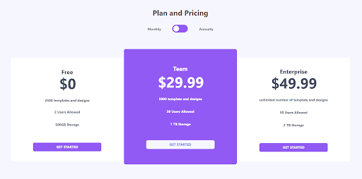
Our pricing component will look like the image below
Step 1: Install Tailwind CSS
To integrate Tailwind CSS into your project, follow these steps:
- Initialize a Project : If you haven't already created a project, initialize one using npm:
1npm init -y
- Install Tailwind CSS : Install Tailwind CSS and its dependencies:
1npm install tailwindcss postcss autoprefixer
- Initialize Tailwind CSS : Generate the necessary configuration files:
1npx tailwindcss init -p
This command creates two essential files:
- tailwind.config.js: For configuring Tailwind options.
- postcss.config.js: For PostCSS configuration.
Step 2: Configure Tailwind CSS
Open the tailwind.config.js file and customize it according to your project requirements:
1module.exports = {2 content: [3 "./src/**/*.{html,js}", // Adjust paths based on your project structure4 ],5 theme: {6 extend: {},7 },8 plugins: [],9};
The content property specifies which files Tailwind should scan for class names. Ensure you include all relevant paths to avoid missing styles.
Step 3: Build Your First Component
Now that Tailwind CSS is set up, let's create a simple pricing component.
1<!DOCTYPE html>2<html lang="en">3 <head>4 <meta charset="UTF-8" />5 <meta name="viewport" content="width=device-width, initial-scale=1.0" />6 <link href="styles/styles.css" rel="stylesheet" />7 <title>Tailwind Pricing Component</title>8 </head>910 <body class="h-full py-16 antialiased bg-primary-very-light font-sans">11 <header class="flex flex-col items-center mb-12">12 <h2 class="text-3xl text-primary-normal font-bold">Plan and Pricing</h2>13 <div class="pt-8 w-3/5 lg:w-1/5 flex justify-around ">14 <p class="text-sm text-gray-500 font-bold mt-2">Monthly</p>15 <div>16 <label for="toggle" class="relative">17 <input type="checkbox" name="toggle" id="" class="hidden" />18 <div19 class="absolute w-16 h-8 rounded-full shadow-inner inset-y-0 bg-purple-500 "20 ></div>21 <div22 class="absolute w-6 h-6 bg-white rounded-full shadow inset-y-0 mt-1 ml-1 "23 ></div>24 </label>25 </div>26 <p class="text-sm text-gray-500 font-bold mt-2 ml-16">Annually</p>27 </div>28 </header>29 <section30 class="flex flex-col lg:flex-row items-start lg:justify-center31 w-full lg:px-10 py-12 "32 >33 <article34 class="bg-white w-4/5 lg:w-custom mb-10 lg:px-4 px-6 py-10 text-center text-primary-dark35 rounded-lg"36 >37 <h5 class="font-bold text-2xl">Free</h5>38 <h2 class="pb-4 flex justify-center font-bold ">39 <span class="text-3xl mt-6 mr-1"></span40 ><span class="text-6xl"> $0</span>41 </h2>42 <ul class="text-sm font-bold">43 <li class="pt-4 pb-4 text-primary-dark">44 2500 templates and designs45 </li>46 <li class="pt-3 pb-4 text-primary-dark">2 Users Allowed</li>47 <li class="pt-4 pb-4 text-primary-dark">500GB Storage</li>48 </ul>49 <button50 class=" uppercase text-center text-sm mt-12 xl:px-24 px-12 sm:px-16 py-2 font-bold51 text-primary-very-light rounded-md bg-purple-500"52 >53 Get Started54 </button>55 </article>56 <article57 class="lg:w-custom w-4/5 mb-10 px-6 py-16 lg:-mt-6 text-white text-center rounded-lg bg-purple-500"58 >59 <h5 class="font-bold text-2xl">Team</h5>60 <h2 class="font-bold pb-4 mt-2 flex justify-center">61 <span class="text-3xl mt-6 mr-1"></span62 ><span class="text-6xl "> $29.99</span>63 </h2>64 <ul class=" text-sm font-bold">65 <li class="pt-4 pb-4">5000 template and designs</li>66 <li class="pt-4 pb-4">20 Users Allowed</li>67 <li class="pt-4 pb-4 ">1 TB Storage</li>68 </ul>69 <button70 class="uppercase text-center text-sm mt-10 xl:px-24 px-12 sm:px-16 py-271 rounded-md font-bold bg-primary-very-light text-primary-blue"72 >73 Get Started74 </button>75 </article>76 <article77 class="bg-white w-4/5 lg:w-custom mb-10 lg:px-4 px-6 py-10 text-center text-primary-dark78 rounded-lg"79 >80 <h5 class="font-bold text-2xl">Enterprise</h5>81 <h2 class="flex justify-center pb-4 font-bold">82 <span class="text-3xl mt-6 mr-1"></span83 ><span class="text-6xl">$49.99</span>84 </h2>85 <ul class="text-sm font-bold">86 <li class="pt-4 pb-4 ">unlimited number of template and designs</li>87 <li class="pt-4 pb-4 ">50 Users Allowed</li>88 <li class="pt-4 pb-4 ">2 TB Storage</li>89 </ul>90 <button91 class="uppercase text-center text-sm mt-12 xl:px-24 px-12 sm:px-16 py-2 rounded-md92 font-bold text-primary-very-light bg-purple-500"93 >94 Get Started95 </button>96 </article>97 </section>98 </body>99</html>
Preview
Plan and Pricing
Monthly
Annually
Free
$0
- 2500 templates and designs
- 2 Users Allowed
- 500GB Storage
Team
$29.99
- 5000 template and designs
- 20 Users Allowed
- 1 TB Storage
Enterprise
$49.99
- unlimited number of template and designs
- 50 Users Allowed
- 2 TB Storage
When we are done styling our pricing component, our webpage should look like the image below.
Other Examples of Tailwind components
Other Tailwind components built with Tailwind are:
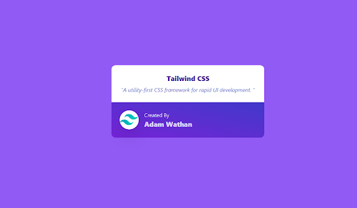
Tailwind Card
1function App() {2 return (3 <section className="App h-screen w-full flex justify-center items-center bg-purple-500">4 <div className="w-full max-w-md bg-white-800">5 <div6 className="rounded-t-xl bg-white px-6 py-6 md:p-6 text-lg md:text-xl leading-87Md:leading-8 font-semibold"8 >9 <p className="text-purple-900 text-xl md:text-xl font-black text-center pb-2">10 Tailwind CSS11 </p>1213 <p14 className="text-indigo-700 text-base md:text-base italic15font-normal text-center"16 >17 "A utility-first CSS framework for rapid UI development. "18 </p>19 </div>2021 <div22 className="flex items-center space-x-4 p-6 md:px-6 md:py-623bg-gradient-to-tr from-purple-700 to-indigo-700 rounded-b-xl24leading-6 font-semibold text-white"25 >26 <div27 className="flex-none w-14 h-14 bg-white rounded-full shadow-2xl28items-center justify-center"29 >30 <svg31 height="54"32 preserveAspectRatio="xMidYMid"33 width="54"34 xmlns="http://www.w3.org/2000/svg"35 viewBox="0 0 256 153.6"36 >37 <linearGradient id="a" x1="-2.778%" y1="32%" y2="67.556%">38 <stop offset="0" stop-color="#2298bd" />39 <stop offset="1" stop-color="#0ed7b5" />40 </linearGradient>41 <path42 d="M128 0C93.867 0 72.533 17.067 64 51.2 76.8 34.133 91.43733 27.733 108.8 32c9.737 2.434 16.697 9.499 24.401 17.44318C145.751 62.057 160.275 76.8 192 76.8c34.133 0 55.467-17.45067 64-51.2-12.8 17.067-27.733 23.467-44.8 19.2-9.737-2.46434-16.697-9.499-24.401-17.318C174.249 14.743 159.47725 0 128 0zM64 76.8C29.867 76.8 8.533 93.867 0 128c12.8-17.48067 27.733-23.467 44.8-19.2 9.737 2.434 16.697 9.499 24.49401 17.318C81.751 138.857 96.275 153.6 128 153.6c34.133 05055.467-17.067 64-51.2-12.8 17.067-27.733 23.467-44.8 19.512-9.737-2.434-16.697-9.499-24.401-17.318C110.249 91.5435295.725 76.8 64 76.8z"53 fill="url(#a)"54 />55 </svg>56 </div>5758 <div className="flex-auto text-base md:text-base font-thin">59 Created By60 <br />61 <span className="text-xl md:text-xl text-purple-200 font-black">62 Adam Wathan63 </span>64 </div>65 </div>66 </div>67 </section>68 );69}7071export default App;
Preview
Conclusion
By following this guide, you’ve learned how to create Tailwind CSS components for your website, ranging from simple buttons to complex navigation bars. Tailwind CSS empowers developers to build beautiful, responsive, and reusable components efficiently, making it an excellent choice for modern web development projects.
Windframe is an AI visual editor for rapidly building stunning web UIs & websites
Start building stunning web UIs & websites!
