How to Create React Tabs with Tailwind CSS
By Emmanuel Ovuoba - Product Engineer at Windframe

Tabs are a common UI element used to organize content and improve the user experience. With React and Tailwind CSS, you can create flexible and customizable tabs that seamlessly integrate into your React applications. We will walk you through the process of setting up a React project, installing Tailwind CSS, creating the necessary components, and styling the react tabs to achieve the desired look and functionality.
Prerequisites
- Basic knowledge of React
- Basic knowledge of Tailwind CSS
- Node.js and NPM installed on your computer
Step 1: Create a new React app
To create a new React app, open your terminal and run the following command:
1npx create-react-app react-tabs-tailwind
This will create a new React app called react-tabs-tailwind.
Step 2: Install Tailwind CSS
To install Tailwind CSS, run the following command in your terminal:
1npm install tailwindcss
Step 3: Configure Tailwind CSS
Create a new file called tailwind.config.js in the root directory of your project and add the following code:
1Copy code2module.exports = {3 mode: 'jit',4 purge: ['./src/**/*.{js,jsx,ts,tsx}', './public/index.html'],5 darkMode: false, // or 'media' or 'class'6 theme: {7 extend: {},8 },9 variants: {10 extend: {},11 },12 plugins: [],13}
This will configure Tailwind CSS for your project.
Step 4: Add Tailwind CSS to your project
Open the index.css file in the src directory and add the following code:
1@tailwind base;2@tailwind components;3@tailwind utilities;
This will add Tailwind CSS to your project.
Step 5: Create a new component called Tabs
Create a new file called Tabs.js in the src/components directory and add the following code:
1import React, { useState } from "react";23const Tabs = ({ children }) => {4 const [activeTab, setActiveTab] = useState(children[0].props.label);56 const handleClick = (e, newActiveTab) => {7 e.preventDefault();8 setActiveTab(newActiveTab);9 };1011 return (12 <div className="max-w-md mx-auto">13 <div className="flex border-b border-gray-300">14 {children.map((child) => (15 <button16 key={child.props.label}17 className={`${18 activeTab === child.props.label19 ? "border-b-2 border-purple-500"20 : ""21 } flex-1 text-gray-700 font-medium py-2`}22 onClick={(e) => handleClick(e, child.props.label)}23 >24 {child.props.label}25 </button>26 ))}27 </div>28 <div className="py-4">29 {children.map((child) => {30 if (child.props.label === activeTab) {31 return <div key={child.props.label}>{child.props.children}</div>;32 }33 return null;34 })}35 </div>36 </div>37 );38};3940const Tab = ({ label, children }) => {41 return (42 <div label={label} className="hidden">43 {children}44 </div>45 );46};47export { Tabs, Tab };
This component takes an array of tabs as a prop and renders the tab navigation and content.
Step 6: Create a new component called App
Open the App.js file in the src directory and replace the existing code with the following:
1import React from "react";2import { Tabs, Tab } from "./Tabs";34const App = () => {5 return (6 <div>7 <Tabs>8 <Tab label="Tab 1">9 <div className="py-4">10 <h2 className="text-lg font-medium mb-2">Tab 1 Content</h2>11 <p className="text-gray-700">12 Lorem ipsum dolor sit amet consectetur adipisicing elit. Maxime13 mollitia, molestiae quas vel sint commodi repudiandae consequuntur14 voluptatum laborum numquam blanditiis harum quisquam eius sed odit15 fugiat iusto fuga praesentium optio, eaque rerum! Provident16 similique accusantium nemo autem. Veritatis obcaecati tenetur iure17 eius earum ut molestias architecto voluptate aliquam nihil,18 eveniet aliquid culpa officia aut! Impedit sit sunt quaerat, odit,19 tenetur error, harum nesciunt ipsum debitis quas aliquid.20 Reprehenderit, quia. Quo neque error repudiandae fuga? Ipsa21 laudantium molestias eos sapiente officiis modi at sunt excepturi22 expedita sint? Sed quibusdam recusandae alias error harum maxime23 adipisci amet laborum.24 </p>25 </div>26 </Tab>27 <Tab label="Tab 2">28 <div className="py-4">29 <h2 className="text-lg font-medium mb-2">Tab 2 Content</h2>30 <p className="text-gray-700">31 Lorem ipsum dolor sit amet consectetur adipisicing elit. Maxime32 mollitia, molestiae quas vel sint commodi repudiandae consequuntur33 voluptatum laborum numquam blanditiis harum quisquam eius sed odit34 fugiat iusto fuga praesentium optio, eaque rerum! Provident35 similique accusantium nemo autem. Veritatis obcaecati tenetur iure36 eius earum ut molestias architecto voluptate aliquam nihil,37 eveniet aliquid culpa officia aut! Impedit sit sunt quaerat, odit,38 tenetur error, harum nesciunt ipsum debitis quas aliquid.39 Reprehenderit, quia. Quo neque error repudiandae fuga? Ipsa40 laudantium molestias eos sapiente officiis modi at sunt excepturi41 expedita sint? Sed quibusdam recusandae alias error harum maxime42 adipisci amet laborum.43 </p>44 </div>45 </Tab>46 <Tab label="Tab 3">47 <div className="py-4">48 <h2 className="text-lg font-medium mb-2">Tab 3 Content</h2>49 <p className="text-gray-700">50 Lorem ipsum dolor sit amet consectetur adipisicing elit. Maxime51 mollitia, molestiae quas vel sint commodi repudiandae consequuntur52 voluptatum laborum numquam blanditiis harum quisquam eius sed odit53 fugiat iusto fuga praesentium optio, eaque rerum! Provident54 similique accusantium nemo autem. Veritatis obcaecati tenetur iure55 eius earum ut molestias architecto voluptate aliquam nihil,56 eveniet aliquid culpa officia aut! Impedit sit sunt quaerat, odit,57 tenetur error, harum nesciunt ipsum debitis quas aliquid.58 Reprehenderit, quia. Quo neque error repudiandae fuga? Ipsa59 laudantium molestias eos sapiente officiis modi at sunt excepturi60 expedita sint? Sed quibusdam recusandae alias error harum maxime61 adipisci amet laborum.62 </p>63 </div>64 </Tab>65 </Tabs>66 </div>67 );68};6970export default App;
In this code, we've added some content to each Tab component using Tailwind CSS classes for styling. The content consists of a heading and a paragraph of text. When a tab is active, its content is displayed below the tab buttons. The Tabs component now maps over its children to find the active tab's content and renders it. Note that the Tab component itself is still hidden and only serves to define the label of each tab.
Step7: Rendering the content on the application
Now, we have to show the tabs we have created on our web page by rendering it on our index.js file.
1import React from "react";2import ReactDOM from "react-dom/client";3import "./index.css";4import App from "./App";56const root = ReactDOM.createRoot(document.getElementById("root"));7root.render(8 <React.StrictMode>9 <App />10 </React.StrictMode>11);
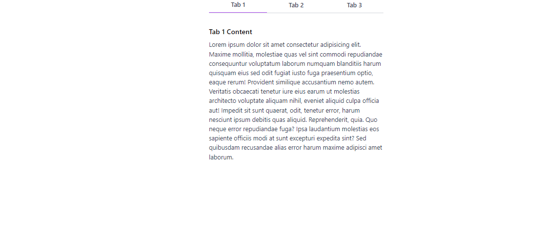
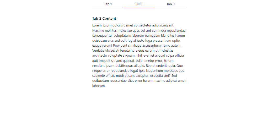
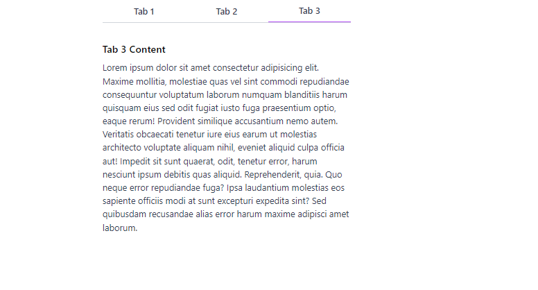
After rendering the application, our react Tabs with Tailwind css will look like the image below.
Conclusion
Creating React tabs with Tailwind CSS is a straightforward process that allows you to build interactive and visually appealing tab components. By utilizing React's component-based architecture and Tailwind CSS's utility classes, you can easily manage tab navigation and render dynamic content based on user interaction. Experiment with different styles and customization options to match your application's designs. With Tailwind CSS, you can easily customize the tabs to fit your specific design needs.
Windframe is an AI visual editor for rapidly building stunning web UIs & websites
Start building stunning web UIs & websites!
