How to create Tailwind CSS React Forms.
By Amarachi Iheanacho - Technical Content Writer at Windframe

Forms have been used throughout modern history, whether they be physical forms or virtual forms. They have been used to collect information for various reasons, whether it be government forms, or health or pension forms, and all have that same underlying rule.
React Tailwind forms are no different. They are usually found on a web application and they allow you to keep in touch with your users, use the data collected from the forms to better satisfy your users, and increase the chances of better decision-making.
In this article, we are going to walk you through building a React Tailwind form. If you want to start from editable layouts instead of writing every field by hand, try the Tailwind Form Builder and export the finished form to React.
Table of Content
- Prerequisites
- What is Tailwind CSS
- Creating our React Project
- Installing Tailwind CSS
- Creating Tailwind CSS form in our App.js
- Conclusion
- Resources
Prerequisites
To make the most of this article, you must have the following:
- A basic understanding of HTML.
- A basic understanding of CSS.
- A basic understanding of React.
- Node and its package manager, npm,
Run the command
1node -v2 npm -v
To verify we have them installed, or install them from here.
- Alternatively, we can use another package manager, Yarn.
What is Tailwind CSS
Tailwind CSS, according to the documentation on their website, tailwind CSS is a utility-first CSS framework. Tailwind CSS helps developers bring designs to life, it is fast and easy to use, with its custom class names that gift our application with ready-to-use styles.
Creating our React project
To create a new react project, we go to our terminal, cd in the directory we want, and then run this command npx create-react-app project-name.
1cd Documents2npx create-react-app project-name
Installing Tailwind CSS
To have tailwind CSS available in your project, cd into the project you created earlier
1cd project-name
next run
1npm install -D tailwindcss postcss autoprefixer
This helps to install the tailwind CSS and its peer dependencies, we then generate our tailwind.config.js and postcss.config.js files by running this command:
1npx tailwindcss init -p
Configuring your templates path
To configure your paths go to your tailwind.config.js, and edit your module.exports object, add the paths to your template files in your content array.
1module.exports = {2 content: ["./src/**/*.{js,jsx,ts,tsx}"],3 theme: {4 extend: {},5 },6 plugins: [],7};
Next add the Tailwind directives to your CSS
Add the tailwind directives in your ./src/index.css file.
1@tailwind base;2@tailwind components;3@tailwind utilities;
After this, we run our project
1npm run start
You should see the image below on your browser when you go to http://localhost:3000/.

Creating Tailwind CSS Form in our Appjs
Simple no labels Tailwind CSS Form
This "simple no labels" form can also be referred to as the default form. Similar to forms built with traditional CSS, Tailwind CSS forms consist of input elements and labels to differentiate the input elements and what information goes into the input elements.
In the form below, we are going to use a lock icon in our buttons, so to be able to use this in our code, we have to install Heroicon in our project. To do that, we have to run the command below.
1npm install @heroicons/react
Next, we import the icon we want LockClosedIcon from @heroicons/react/solid.
1import './App.css';234import { LockClosedIcon } from '@heroicons/react/solid'56export default function App() {7 return (89 <div className="min-h-full flex items-center justify-center py-12 px-4 sm:px-6 lg:px-8">10 <div className="max-w-md w-full space-y-8">11 <div>12 <img13 className="mx-auto h-12 w-auto"14 src="https://tailwindui.com/img/logos/workflow-mark-indigo-600.svg"15 alt="Workflow"16 />17 <h2 className="mt-6 text-center text-3xl font-extrabold text-gray-900">Sign in to your account</h2>18 <p className="mt-2 text-center text-sm text-gray-600">19 Or{' '}20 <a href="#" className="font-medium text-indigo-600 hover:text-indigo-500">21 start your 14-day free trial22 </a>23 </p>24 </div>25 <form className="mt-8 space-y-6" action="#" method="POST">26 <input type="hidden" name="remember" defaultValue="true" />27 <div className="rounded-md shadow-sm -space-y-px">28 <div>29 <label htmlFor="email-address" className="sr-only">30 Email address31 </label>32 <input33 id="email-address"34 name="email"35 type="email"36 autoComplete="email"37 required38 className="appearance-none rounded-none relative block39 w-full px-3 py-2 border border-gray-30040 placeholder-gray-500 text-gray-900 rounded-t-md41 focus:outline-none focus:ring-indigo-50042 focus:border-indigo-500 focus:z-10 sm:text-sm"43 placeholder="Email address"44 />45 </div>46 <div>47 <label htmlFor="password" className="sr-only">48 Password49 </label>50 <input51 id="password"52 name="password"53 type="password"54 autoComplete="current-password"55 required56 className="appearance-none rounded-none relative block57 w-full px-3 py-2 border border-gray-30058 placeholder-gray-500 text-gray-900 rounded-b-md59 focus:outline-none focus:ring-indigo-50060 focus:border-indigo-500 focus:z-10 sm:text-sm"61 placeholder="Password"62 />63 </div>64 </div>6566 <div className="flex items-center justify-between">67 <div className="flex items-center">68 <input69 id="remember-me"70 name="remember-me"71 type="checkbox"72 className="h-4 w-4 text-indigo-600 focus:ring-indigo-50073 border-gray-300 rounded"74 />75 <label htmlFor="remember-me" className="ml-2 block text-sm text-gray-900">76 Remember me77 </label>78 </div>7980 <div className="text-sm">81 <a href="#" className="font-medium text-indigo-600 hover:text-indigo-500">82 Forgot your password?83 </a>84 </div>85 </div>8687 <div>88 <button89 type="submit"90 className="group relative w-full flex justify-center91 py-2 px-4 border border-transparent text-sm font-medium92 rounded-md text-white bg-indigo-600 hover:bg-indigo-70093 focus:outline-none focus:ring-2 focus:ring-offset-294 focus:ring-indigo-500"95 >96 <span className="absolute left-0 inset-y-0 flex items-center pl-3">97 <LockClosedIcon className="h-5 w-5 text-indigo-500 group-hover:text-indigo-400"98 aria-hidden="true" />99 </span>100 Sign in101 </button>102 </div>103 </form>104 </div>105 </div>106 </>107 )108}
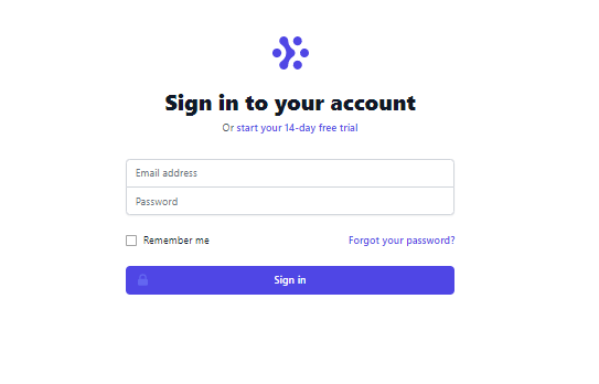
With this, we have created our react Tailwind form that looks a lot like the image below.
Sometimes as a developer you might not want to write elaborate classes as they might be hard to keep up with, another UI library we could use is Contrast. Check out their documentation here to learn more about it.
Other React Tailwind Forms
Tailwind Signup Form
1import React from "react"234export default function FormExample5 = () => {5 return (6 <div className="relative flex flex-col justify-center min-h-screen overflow-hidden">7 <div className="w-full p-6 m-auto bg-white rounded-md shadow-xl shadow-rose-600/40 ring-2 ring-indigo-600 lg:max-w-xl">8 <h1 className="text-3xl font-semibold text-center text-indigo-700 underline uppercase decoration-wavy">9 Sign UP10 </h1>11 <form className="mt-6">12 <div className="mb-2">13 <label14 for="email"15 className="block text-sm font-semibold text-gray-800"16 >17 Firstname18 </label>19 <input20 type="email"21 className="block w-full px-4 py-2 mt-2 text-indigo-700 bg-white border rounded-md focus:border-indigo-400 focus:ring-indigo-300 focus:outline-none focus:ring focus:ring-opacity-40"22 />23 </div>24 <div className="mb-2">25 <label26 for="email"27 className="block text-sm font-semibold text-gray-800"28 >29 Lastname30 </label>31 <input32 type="email"33 className="block w-full px-4 py-2 mt-2 text-indigo-700 bg-white border rounded-md focus:border-indigo-400 focus:ring-indigo-300 focus:outline-none focus:ring focus:ring-opacity-40"34 />35 </div>36 <div className="mb-2">37 <label38 for="email"39 className="block text-sm font-semibold text-gray-800"40 >41 Email42 </label>43 <input44 type="email"45 className="block w-full px-4 py-2 mt-2 text-indigo-700 bg-white border rounded-md focus:border-indigo-400 focus:ring-indigo-300 focus:outline-none focus:ring focus:ring-opacity-40"46 />47 </div>48 <div className="mb-2">49 <label50 for="password"51 className="block text-sm font-semibold text-gray-800"52 >53 Password54 </label>55 <input56 type="password"57 className="block w-full px-4 py-2 mt-2 text-indigo-700 bg-white border rounded-md focus:border-indigo-400 focus:ring-indigo-300 focus:outline-none focus:ring focus:ring-opacity-40"58 />59 </div>60 <div className="mt-6">61 <button className="w-full px-4 py-2 tracking-wide text-white transition-colors duration-200 transform bg-indigo-700 rounded-md hover:bg-indigo-600 focus:outline-none focus:bg-indigo-600">62 Login63 </button>64 </div>65 </form>6667 <p className="mt-8 text-xs font-light text-center text-gray-700">68 {" "}69 Already have an account?{" "}70 <a71 href="#"72 className="font-medium text-indigo-600 hover:underline"73 >74 Sign in75 </a>76 </p>77 </div>78 </div>79 );80}
Preview
Sign UP
Already have an account? Sign in
Tailwind Contact Form
1import React from "react";23const FormExample6 = () => {4 return (5 <div className="relative flex flex-col justify-center min-h-screen overflow-hidden ">6 <div className="w-full p-6 m-auto bg-white rounded-md shadow-xl shadow-rose-600/40 ring-2 ring-indigo-600 lg:max-w-xl">7 <h1 className="text-3xl font-semibold text-center text-indigo-700 underline uppercase decoration-wavy">8 Contact Form9 </h1>10 <form className="mt-6">11 <div className="mb-2">12 <label>13 <span className="text-gray-700">Your name</span>14 <input15 type="text"16 name="name"17 className="1819 w-full20 block bg-white px-4 py-2 mt-221 border-gray-30022 rounded-md focus:border-indigo-400 focus:ring-indigo-300 focus:outline-none focus:ring focus:ring-opacity-4023 shadow-sm24 "25 placeholder="John cooks"26 />27 </label>28 </div>29 <div className="mb-2">30 <label>31 <span className="text-gray-700">Email address</span>32 <input33 name="email"34 type="email"35 className="36 block37 w-full38 mt-2 bg-white px-4 py-239 border-gray-30040 rounded-md41 shadow-sm42 focus:border-indigo-400 focus:ring-indigo-300 focus:outline-none focus:ring focus:ring-opacity-4043 "44 placeholder="john.cooks@example.com"45 required46 />47 </label>48 </div>49 <div className="mb-2">50 <label>51 <span class="text-gray-700">Message</span>52 <textarea53 name="message"54 className="55 block56 w-full bg-white57 mt-2 px-6 py-858 border-gray-30059 rounded-md60 shadow-sm61 focus:border-indigo-400 focus:ring-indigo-300 focus:outline-none focus:ring focus:ring-opacity-4062 "63 rows="5"64 ></textarea>65 </label>66 </div>6768 <div class="mb-6">69 <button70 type="submit"71 className="72 h-1073 px-574 text-indigo-10075 bg-indigo-70076 rounded-lg77 transition-colors78 duration-15079 focus:shadow-outline80 hover:bg-indigo-80081 "82 >83 Contact Us84 </button>85 </div>86 <div></div>87 </form>88 </div>89 </div>90 );91};9293export default FormExample6;
Preview
Contact Form
Conclusion
In this article, we discussed what Tailwind CSS is, and how to install it in your project. Finally, we created a form using the template provided by tailwind CSS in their documentation.
Resources
You may also find the following resources useful:
Windframe is an AI visual editor for rapidly building stunning web UIs & websites
Start building stunning web UIs & websites!
