Tailwind form-How to create and style a Responsive Form using Tailwind CSS
By Emmanuel Chinonso - Frontend Engineer and Technical Writer at Windframe

If you are one of those keeping in the trend of CSS framework, you will notice that tailwind CSS is fast growing in popularity among developers around the world.
It’s different from the other CSS framework in that it makes use of utility-first classes.
There are many components you can find when you use Tailwind CSS but we are going to be looking at one of those components called Tailwind form. Tailwind CSS allows us to create beautiful form components for our websites.
What is Tailwind Form
A tailwind form is a component of tailwind that is used in designing webpages and can be used to create forms used for gathering users' information.
In today’s tailwind CSS tutorial, we will be creating a responsive tailwind form. You can use Windframe to create and customize your Tailwind form.
Table of content
- Prerequisites
- Add Tailwind CSS to project
- Adding a logo to the Tailwind CSS login form
- Adding the Tailwind CSS login form input fields
- Adding the button with
- Responsive Tailwind css Login form
- Responsive Tailwind CSS form Examples
- Conclusion
Prerequisites
- Latest version of Tailwind CSS
- Basic knowledge of HTML
- Basic knowledge of Tailwind CSS
Add Tailwind CSS to project
For us to be able to build our Tailwind CSS form, we must first install it. You can check out our article on how to go about this here, or you can check out the Tailwind CSS docs.
Once the Tailwind CSS is installed, we can link the Tailwind CSS stylesheet to our page by using the link tag on our head element, as shown below.
1<!DOCTYPE html>2<html lang="en">3 <head>4 <meta charset="UTF-8" />5 <meta http-equiv="X-UA-Compatible" content="IE=edge" />6 <meta name="viewport" content="width=device-width, initial-scale=1.0" />7 <title>Login form</title>8 <link rel="stylesheet" href="style.css" />9 </head>10</html>
Now, we can build the rest of our login forms. Adding a logo to the Tailwind CSS form
At this stage, we can go ahead to add some styles to the body of our page. This Tailwind CSS style will serve everything inside our page.
1<body2 class="bg-gray-300"3 style="font-family: -apple-system,4BlinkMacSystemFont, 'Segoe UI', Roboto, Oxygen, Ubuntu, Cantarell, 'Open Sans', 'Helvetica Neue', sans-serif;"5>6 .7</body>
Furthermore, we can go ahead to add the logo to our Tailwind CSS login form.
1<div class="h-screen flex items-center justify-center">2 <form action="" class="w-full md:w-1/3 bg-white rounded-lg items-center">3 <div class="flex font-bold justify-center mt-6">4 <img src="images/avater1.png" alt="" class="h-24 w-24" />5 </div>6 <h2 class="text-3xl text-center text-gray-700 mb-4">7 Welcome Back!8 </h2>9 .10 </form>11</div>
In the code above, we added the header for our form and the image of the header. Some of the tailwind CSS classes we included on this page include
flexwhich allows items to shrink and grow to prevent overfloww-fullgives the form a width of 100%bg-whitesets the background to whiterounded-lggives the edge of the form a rounded lookmd:w-1/3sets the minimum width to 33.333%mt-6, which sets the top margin to 24px and many other classes included.
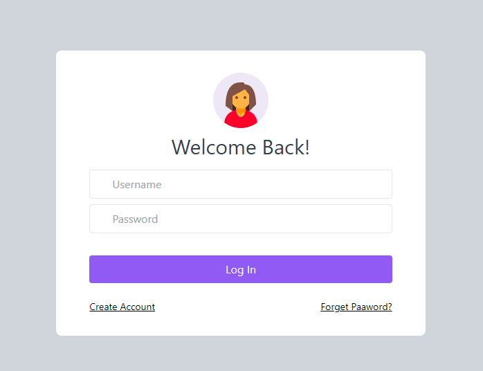
The tailwind form will look like the image below

Adding the Tailwind CSS form input fields
The next step will be to add the input fields and style them using Tailwind CSS.
1<div class="px-12 pb-10">2 <div class="w-full mb-2">3 <div class="flex justify-center">4 <input5 type="text"6 placeholder="Username"7 class="px-8 w-full border rounded py-2 text-gray-700 focus:outline-none items-center"8 />9 </div>10 </div>11 <div class="w-full mb-2">12 <div class="flex justify-center">13 <input14 type="password"15 placeholder="Password"16 class="px-8 w-full border rounded py-2 text-gray-700 focus:outline-none"17 />18 </div>19 </div>20</div>
In our code, we made two inputs Username and Password. We also styled them the same way. Using some Tailwind CSS classes like
borderwhich sets the width of the input to 1pxpx-8set the left and right padding to 32px whilepy-2sets the top and bottom margin to 8px
Adding the button
For the final step, we need to add the button that the user will click to log in. We are also going to include a forget password and create an account link below our button.
1<button2class="w-full mt-6 py-2 rounded bg-purple-500 text-gray-100 focus:outline-none">3 Log In4</button>5<a href="#"6 class="text-sm text-opacity-200 float-right mt-6 mb-4 hover:text-purple-600 underline">7 Forget Password?8</a>9<a href="#"10 class="text-sm text-opacity-200 float-left mt-6 mb-8 hover:text-purple-600 underline">11 Create Account12</a>13</div>14</body>15</html>
The classes we added to the button will have rounded borders with a purple background color, full width, and outline focus with padding and margins.
Our Tailwind form should look like the image below.

Responsive Tailwind css Login form
If you have made mistakes while coding due to the wrong usage of “div” or didn’t place a tag well. You can check our complete code below.
1<body class="bg-gray-300"2style="font-family: -apple-system, BlinkMacSystemFont, 'Segoe UI', Roboto, Oxygen, Ubuntu, Cantarell,3 'Open Sans','Helvetica Neue', sans-serif;">4<div class="h-screen flex items-center justify-center">5 <form action="" class="w-full md:w-1/3 bg-white rounded-lg items-center">6 <div class="flex font-bold justify-center mt-6">7 <img src="images/avater1.png" alt="" class="h-24 w-24">8 </div>9 <h2 class="text-3xl text-center text-gray-700 mb-4">Welcome Back!</h2>10 <div class="px-12 pb-10">11 <div class="w-full mb-2">12 <div class="flex justify-center">13 <input type="text" placeholder="Username"14 class="px-8 w-full border rounded py-2 text-gray-70015 focus:outline-none items-center">16 </div>17 </div>18 <div class="w-full mb-2">19 <div class="flex justify-center">20 <input type="password" placeholder="Password"21 class="px-8 w-full border rounded py-2 text-gray-700 focus:outline-none">22 </div>23 </div>24 <button class="w-full mt-6 py-2 rounded bg-purple-500 text-gray-100 focus:outline-none">Log In25</button>26 <a href="#"27 class="text-sm text-opacity-200 float-right mt-6 mb-4 hover:text-purple-600 underline">28 Forget Password?29 </a>30 <a href="#"31 class="text-sm text-opacity-200 float-left mt-6 mb-8 hover:text-purple-600 underline">32 Create Account33 </a>34 </div>35</div>36</body>3738</html>
Responsive Tailwind CSS form Examples
We can now look at some other examples of Tailwind CSS forms and how to build them.
Responsive Tailwind css Floating labels forms
This Tailwind form design concept was from the Bootstrap Floating labels. You can use the label tag as a visual placeholder for the input element using the peer-placeholder-shown and peer-focus classes. This allows you to use the floating labels on the form.
1<form>2 <div className="relative z-0 w-full mb-6 group">3 <input4 type="email"5 name="floating_email"6 className="block py-2.5 px-0 w-full text-sm text-gray-900 bg-transparent border-0 border-b-2 border-gray-300 appearance-none dark:text-white dark:border-gray-600 dark:focus:border-purple-500 focus:outline-none focus:ring-0 focus:border-purple-600 peer"7 placeholder=" "8 required9 />10 <label11 for="floating_email"12 className="peer-focus:font-medium absolute text-sm text-gray-500 dark:text-gray-400 duration-300 transform -translate-y-6 scale-75 top-3 -z-10 origin-[0] peer-focus:left-0 peer-focus:text-purple-600 peer-focus:dark:text-purple-500 peer-placeholder-shown:scale-100 peer-placeholder-shown:translate-y-0 peer-focus:scale-75 peer-focus:-translate-y-6"13 >Email address</label14 >15 </div>16 <div className="relative z-0 w-full mb-6 group">17 <input18 type="password"19 name="floating_password"20 id="floating_password"21 className="block py-2.5 px-0 w-full text-sm text-gray-900 bg-transparent border-0 border-b-2 border-gray-300 appearance-none dark:text-white dark:border-gray-600 dark:focus:border-purple-500 focus:outline-none focus:ring-0 focus:border-purple-600 peer"22 placeholder=" "23 required24 />25 <label26 for="floating_password"27 className="peer-focus:font-medium absolute text-sm text-gray-500 dark:text-gray-400 duration-300 transform -translate-y-6 scale-75 top-3 -z-10 origin-[0] peer-focus:left-0 peer-focus:text-purple-600 peer-focus:dark:text-purple-500 peer-placeholder-shown:scale-100 peer-placeholder-shown:translate-y-0 peer-focus:scale-75 peer-focus:-translate-y-6"28 >Password</label29 >30 </div>31 <div className="relative z-0 w-full mb-6 group">32 <input33 type="password"34 name="repeat_password"35 id="floating_repeat_password"36 className="block py-2.5 px-0 w-full text-sm text-gray-900 bg-transparent border-0 border-b-2 border-gray-300 appearance-none dark:text-white dark:border-gray-600 dark:focus:border-purple-500 focus:outline-none focus:ring-0 focus:border-purple-600 peer"37 placeholder=" "38 required39 />40 <label41 for="floating_repeat_password"42 className="peer-focus:font-medium absolute text-sm text-gray-500 dark:text-gray-400 duration-300 transform -translate-y-6 scale-75 top-3 -z-10 origin-[0] peer-focus:left-0 peer-focus:text-purple-600 peer-focus:dark:text-purple-500 peer-placeholder-shown:scale-100 peer-placeholder-shown:translate-y-0 peer-focus:scale-75 peer-focus:-translate-y-6"43 >Confirm password</label44 >45 </div>46 <div className="grid md:grid-cols-2 md:gap-6">47 <div className="relative z-0 w-full mb-6 group">48 <input49 type="text"50 name="floating_first_name"51 id="floating_first_name"52 className="block py-2.5 px-0 w-full text-sm text-gray-900 bg-transparent border-0 border-b-2 border-gray-300 appearance-none dark:text-white dark:border-gray-600 dark:focus:border-purple-500 focus:outline-none focus:ring-0 focus:border-purple-600 peer"53 placeholder=" "54 required55 />56 <label57 for="floating_first_name"58 className="peer-focus:font-medium absolute text-sm text-gray-500 dark:text-gray-400 duration-300 transform -translate-y-6 scale-75 top-3 -z-10 origin-[0] peer-focus:left-0 peer-focus:text-purple-600 peer-focus:dark:text-purple-500 peer-placeholder-shown:scale-100 peer-placeholder-shown:translate-y-0 peer-focus:scale-75 peer-focus:-translate-y-6"59 >First name</label60 >61 </div>62 <div className="relative z-0 w-full mb-6 group">63 <input64 type="text"65 name="floating_last_name"66 id="floating_last_name"67 className="block py-2.5 px-0 w-full text-sm text-gray-900 bg-transparent border-0 border-b-2 border-gray-300 appearance-none dark:text-white dark:border-gray-600 dark:focus:border-purple-500 focus:outline-none focus:ring-0 focus:border-purple-600 peer"68 placeholder=" "69 required70 />71 <label72 for="floating_last_name"73 className="peer-focus:font-medium absolute text-sm text-gray-500 dark:text-gray-400 duration-300 transform -translate-y-6 scale-75 top-3 -z-10 origin-[0] peer-focus:left-0 peer-focus:text-purple-600 peer-focus:dark:text-purple-500 peer-placeholder-shown:scale-100 peer-placeholder-shown:translate-y-0 peer-focus:scale-75 peer-focus:-translate-y-6"74 >Last name</label75 >76 </div>77 </div>78 <div className="grid md:grid-cols-2 md:gap-6">79 <div className="relative z-0 w-full mb-6 group">80 <input81 type="tel"82 pattern="[0-9]{3}-[0-9]{3}-[0-9]{4}"83 name="floating_phone"84 id="floating_phone"85 className="block py-2.5 px-0 w-full text-sm text-gray-900 bg-transparent border-0 border-b-2 border-gray-300 appearance-none dark:text-white dark:border-gray-600 dark:focus:border-purple-500 focus:outline-none focus:ring-0 focus:border-purple-600 peer"86 placeholder=" "87 required88 />89 <label90 for="floating_phone"91 className="peer-focus:font-medium absolute text-sm text-gray-500 dark:text-gray-400 duration-300 transform -translate-y-6 scale-75 top-3 -z-10 origin-[0] peer-focus:left-0 peer-focus:text-purple-600 peer-focus:dark:text-purple-500 peer-placeholder-shown:scale-100 peer-placeholder-shown:translate-y-0 peer-focus:scale-75 peer-focus:-translate-y-6"92 >Phone number (123-456-7890)</label93 >94 </div>95 <div className="relative z-0 w-full mb-6 group">96 <input97 type="text"98 name="floating_company"99 id="floating_company"100 className="block py-2.5 px-0 w-full text-sm text-gray-900 bg-transparent border-0 border-b-2 border-gray-300 appearance-none dark:text-white dark:border-gray-600 dark:focus:border-purple-500 focus:outline-none focus:ring-0 focus:border-purple-600 peer"101 placeholder=" "102 required103 />104 <label105 for="floating_company"106 className="peer-focus:font-medium absolute text-sm text-gray-500 dark:text-gray-400 duration-300 transform -translate-y-6 scale-75 top-3 -z-10 origin-[0] peer-focus:left-0 peer-focus:text-purple-600 peer-focus:dark:text-purple-500 peer-placeholder-shown:scale-100 peer-placeholder-shown:translate-y-0 peer-focus:scale-75 peer-focus:-translate-y-6"107 >Company (Ex. Google)</label108 >109 </div>110 </div>111 <button112 type="submit"113 className="text-white bg-purple-700 hover:bg-purple-800 focus:ring-4 focus:outline-none focus:ring-purple-300 font-medium rounded-lg text-sm w-full sm:w-auto px-5 py-2.5 text-center dark:bg-purple-600 dark:hover:bg-purple-700 dark:focus:ring-purple-800"114 >115 Submit116 </button>117</form>
Preview
Responsive Tailwind css underline Form
Another example of the Tailwind form is the underline form. This shows the properties with an underline. The following utilities are used to create the Tailwind underline form.
1<form>2 <div className="relative z-0 w-full mb-6 group border-b border-purple-500">3 <input4 type="text"5 name="floating_first_name"6 id="floating_first_name"7 className="block py-2.5 px-0 w-full text-sm text-gray-900 bg-transparent border-0 border-b-2 border-gray-300 appearance-none dark:text-white dark:border-gray-600 dark:focus:border-purple-500 focus:outline-none focus:ring-0 focus:border-purple-600 peer"8 placeholder=" "9 required10 />11 <label12 for="floating_first_name"13 className="peer-focus:font-medium absolute text-sm text-gray-500 dark:text-gray-400 duration-300 transform -translate-y-6 scale-75 top-3 -z-10 origin-[0] peer-focus:left-0 peer-focus:text-purple-600 peer-focus:dark:text-purple-500 peer-placeholder-shown:scale-100 peer-placeholder-shown:translate-y-0 peer-focus:scale-75 peer-focus:-translate-y-6"14 >First name</label15 >16 </div>17 <div className="relative z-0 w-full mb-6 group border-b border-purple-500">18 <input19 type="text"20 name="floating_last_name"21 id="floating_last_name"22 className="block py-2.5 px-0 w-full text-sm text-gray-900 bg-transparent border-0 border-b-2 border-gray-300 appearance-none dark:text-white dark:border-gray-600 dark:focus:border-purple-500 focus:outline-none focus:ring-0 focus:border-purple-600 peer"23 placeholder=" "24 required25 />26 <label27 for="floating_last_name"28 className="peer-focus:font-medium absolute text-sm text-gray-500 dark:text-gray-400 duration-300 transform -translate-y-6 scale-75 top-3 -z-10 origin-[0] peer-focus:left-0 peer-focus:text-purple-600 peer-focus:dark:text-purple-500 peer-placeholder-shown:scale-100 peer-placeholder-shown:translate-y-0 peer-focus:scale-75 peer-focus:-translate-y-6"29 >Last name</label30 >31 </div>32 <div className="relative z-0 w-full mb-6 group border-b border-purple-500 ">33 <input34 type="email"35 name="floating_email"36 className="block py-2.5 px-0 w-full text-sm text-gray-900 bg-transparent border-0 border-b-2 border-gray-300 appearance-none dark:text-white dark:border-gray-600 dark:focus:border-purple-500 focus:outline-none focus:ring-0 focus:border-purple-600 peer"37 placeholder=" "38 required39 />40 <label41 for="floating_email"42 className="peer-focus:font-medium absolute text-sm text-gray-500 dark:text-gray-400 duration-300 transform -translate-y-6 scale-75 top-3 -z-10 origin-[0] peer-focus:left-0 peer-focus:text-purple-600 peer-focus:dark:text-purple-500 peer-placeholder-shown:scale-100 peer-placeholder-shown:translate-y-0 peer-focus:scale-75 peer-focus:-translate-y-6"43 >Email address</label44 >45 </div>46 <div className="relative z-0 w-full mb-6 group border-b border-purple-500">47 <input48 type="password"49 name="floating_password"50 id="floating_password"51 className="block py-2.5 px-0 w-full text-sm text-gray-900 bg-transparent border-0 border-b-2 border-gray-300 appearance-none dark:text-white dark:border-gray-600 dark:focus:border-purple-500 focus:outline-none focus:ring-0 focus:border-purple-600 peer"52 placeholder=" "53 required54 />55 <label56 for="floating_password"57 className="peer-focus:font-medium absolute text-sm text-gray-500 dark:text-gray-400 duration-300 transform -translate-y-6 scale-75 top-3 -z-10 origin-[0] peer-focus:left-0 peer-focus:text-purple-600 peer-focus:dark:text-purple-500 peer-placeholder-shown:scale-100 peer-placeholder-shown:translate-y-0 peer-focus:scale-75 peer-focus:-translate-y-6"58 >Password</label59 >60 </div>61 <div className="relative z-0 w-full mb-6 group border-b border-purple-500">62 <input63 type="password"64 name="repeat_password"65 id="floating_repeat_password"66 className="block py-2.5 px-0 w-full text-sm text-gray-900 bg-transparent border-0 border-b-2 border-gray-300 appearance-none dark:text-white dark:border-gray-600 dark:focus:border-purple-500 focus:outline-none focus:ring-0 focus:border-purple-600 peer"67 placeholder=" "68 required69 />70 <label71 for="floating_repeat_password"72 className="peer-focus:font-medium absolute text-sm text-gray-500 dark:text-gray-400 duration-300 transform -translate-y-6 scale-75 top-3 -z-10 origin-[0] peer-focus:left-0 peer-focus:text-purple-600 peer-focus:dark:text-purple-500 peer-placeholder-shown:scale-100 peer-placeholder-shown:translate-y-0 peer-focus:scale-75 peer-focus:-translate-y-6"73 >Confirm password</label74 >75 </div>76 <div className="flex justify-between">77 <button78 type="submit"79 className="text-white bg-purple-700 hover:bg-purple-800 focus:ring-4 focus:outline-none focus:ring-purple-300 font-medium rounded-lg text-sm w-full sm:w-auto px-5 py-2.5 text-center dark:bg-purple-600 dark:hover:bg-purple-700 dark:focus:ring-purple-800"80 >81 Submit82 </button>8384 <button85 type="cancel"86 className="text-white bg-purple-700 hover:bg-purple-800 focus:ring-4 focus:outline-none focus:ring-purple-300 font-medium rounded-lg text-sm w-full sm:w-auto px-5 py-2.5 text-center dark:bg-purple-600 dark:hover:bg-purple-700 dark:focus:ring-purple-800"87 >88 Cancel89 </button>90 </div>91</form>
Preview
Responsive Tailwind Input Form with icon
The last Tailwind form in our list will be the input form with Icons. To create this Tailwind form we are going to use some Tailwind utilities and classes.
Code:
1<label2 for="email-address-icon"3 class="block mb-2 text-sm font-medium text-gray-900 dark:text-gray-300"4 >Your Email</label5>6<div class="relative">7 <div class="flex absolute inset-y-0 left-0 items-center pl-3 pointer-events-none">8 <svg9 aria-hidden="true"10 class="w-5 h-5 text-gray-500 dark:text-gray-400"11 fill="currentColor"12 viewBox="0 0 20 20"13 xmlns="http://www.w3.org/2000/svg"14 >15 <path d="M2.003 5.884L10 9.882l7.997-3.998A2 2 0 0016 4H4a2 2 0 00-1.997 1.884z"></path>16 <path d="M18 8.118l-8 4-8-4V14a2 2 0 002 2h12a2 2 0 002-2V8.118z"></path>17 </svg>18 </div>19 <input20 type="text"21 id="email-address-icon"22 className="bg-purple-50 border border-gray-300 text-gray-900 text-sm rounded-lg focus:ring-purple-500 focus:border-blue-500 block w-full pl-10 p-2.5 dark:bg-gray-700 dark:border-gray-600 dark:placeholder-gray-400 dark:text-white dark:focus:ring-purple-500 dark:focus:border-purple-500"23 placeholder="name@flowbite.com"24 />25</div>
Preview
Below is the responsive tailwind input form with icons.
Conclusion
In today's Tailwind CSS tutorial practice, we built a login form using Tailwind CSS. The tailwind CSS form had an image, two inputs (Username and Password), and a login button. However, we styled our Tailwind CSS form using a CSS framework called Tailwind CSS. You can decide to make a really good UI by using Windframe, a drag-and-drop website builder that makes building a website look like a piece of cake.
I hope you enjoyed the Tailwind CSS tutorial.
Resources
Windframe is an AI visual editor for rapidly building stunning web UIs & websites
Start building stunning web UIs & websites!
