Check out our free templates made with AI and polished to perfection in Windframe
Get now
2 months ago
Updated Uizard Prompt — Redesigned LinkedIn CatchUp+ (Web Version, No Right Sidebar) Redesign the current LinkedIn “Catch up” tab inside the 'My Network' section (screenshot provided) into a new smart networking dashboard called “CatchUp+”. Maintain the standard 2-column LinkedIn layout — left navigation and central content — and remove the right sidebar. Replace it with a bottom section that offers user insights, progress tracking, and smart tips. The design should retain LinkedIn’s visual style: clean white/light gray backgrounds, LinkedIn-blue buttons, minimal shadows, and modern sans-serif fonts. 🔹 LEFT SIDEBAR (No Change): Keep all items as shown in the screenshot: Connections, Contacts, Following & followers, Groups, Events, Pages, Newsletters Highlight “CatchUp+” as the selected tab 🔹 TOP HEADER (Content Panel): Replace filter bar: Remove: "All | Job changes | Birthdays | Work anniversaries | Education" Add: pill-style filters – All, Product Managers, Data Analysts, Business Analysts Add: top-right search bar in the content area with placeholder: “Search roles or people...” 🔹 MAIN CONTENT AREA (Stacked Sections): Section 1: Role Summary Cards (Top) Display 3 horizontally aligned cards summarizing key networking segments: Product Managers → “You have 12 PMs in your network – 4 work at companies you applied to” Data Analysts → “You have 8 DAs – 3 applied match” Business Analysts → “You have 15 BAs – 5 applied match” Each card includes: Role icon (🧑💼, 📊, 🧮) 3 overlapping avatar previews CTA: “View connections” (blue button) Last updated badge: “Updated 2 days ago” Rounded corners, soft shadow, gray background Section 2: Smart Feed of People (Below Summary) Vertical feed of profile cards filtered by the selected role Each profile card includes: Profile photo, name, title, company Context prompt: “You applied to Flipkart – message Rahul (PM there)” Badges: “Applied 2 days ago”, “3 mutuals” 📨 Message icon (hover tooltip: “Send message”) ❌ Dismiss icon top-right Responsive spacing and scrollable content 🔹 BOTTOM SECTION (Replace Right Sidebar): 📊 “Your Progress” + Smart Tips Module Progress Tracker Box: Title: “CatchUp+ Progress” Stats like: “4 connections contacted this week” “2 replies received” “1 referral requested” Optional progress bar or tracker bubbles CTA: “View your activity log” Smart Tips Box: Header: “Tips to get better responses” Suggestions: “Reach out within 48 hrs of applying” “Mention a mutual connection” “Be specific in your message intent” Add: small lightbulb icon 💡 or LinkedIn Assistant label Quote or Encouragement Tile (Optional): Motivational line: “Your next opportunity is already in your network.” Author: e.g., LinkedIn Career Coach 🎨 UI STYLE GUIDE: Color Scheme: Light mode, white/gray backgrounds, LinkedIn blue buttons Font: Modern sans-serif (Segoe UI or SF Pro) Cards: Rounded, slight shadow, clean layout Buttons: Rounded, hover highlights Accessibility: Follow WCAG AA guidelines for contrast and spacing Grid: Use 2-column desktop layout with vertical stacking of insights at bottom
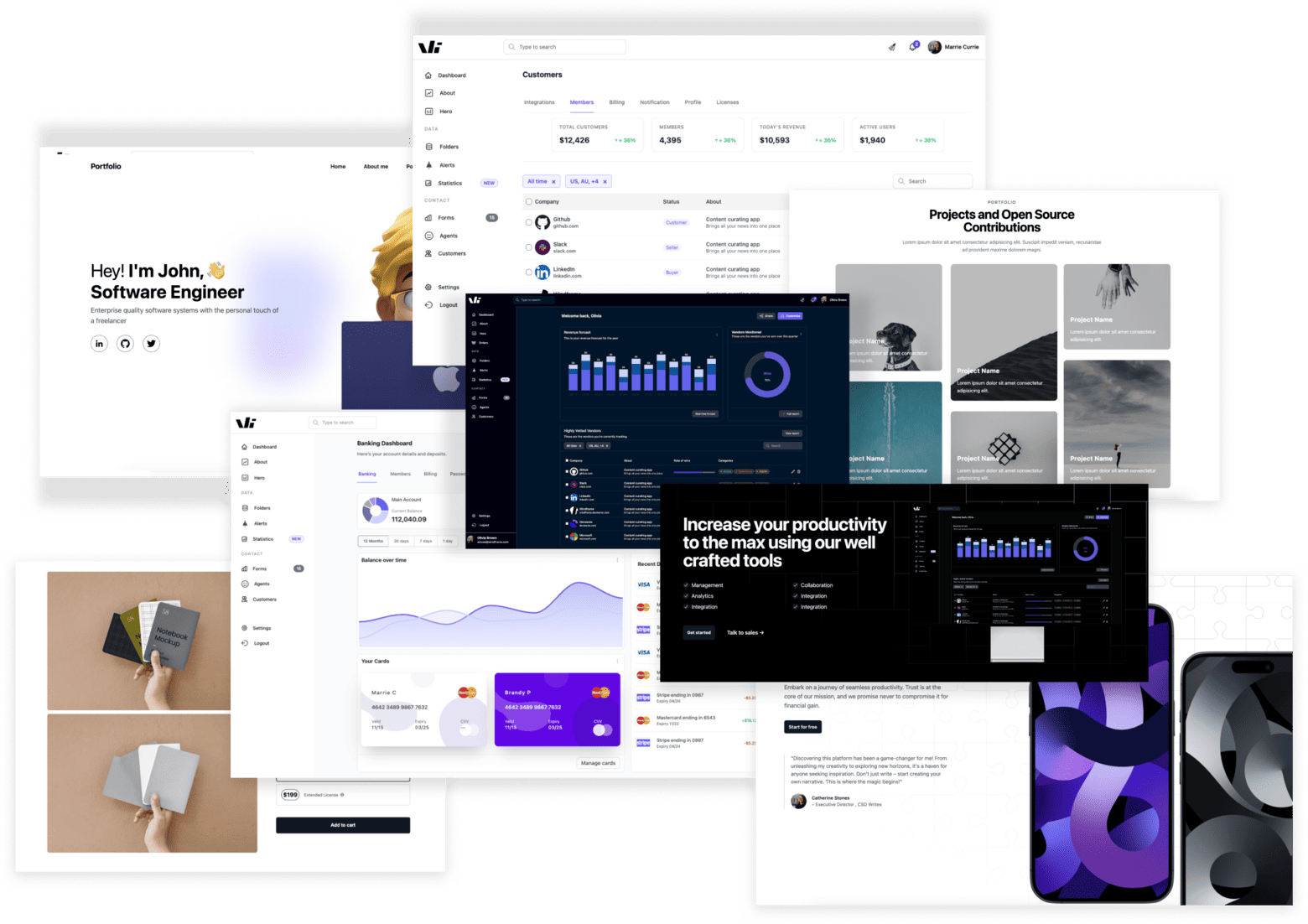
Windframe is a drag and drop builder for rapidly building tailwind css websites and UIs
Start building stunning tailwind UIs!